WellUrban

Personal reflections on urbanism, urban life and sustainable urban design in Wellington, New Zealand.

Monday, October 31, 2005

The age of Aquarium


Normally my posts don't stray too far out of the central city, but the proposed Wellington Marine Education Centre at Te Raekaihau point is undergoing a resource consent process, and the Wellington Marine Conservation Trust are calling for supporters of the project to make a submission in support.

It took me a while to decide what I thought about this. Of course it would be a great asset for the city, but I wondered about the location. A central city waterfront location would be much more convenient for those of us who are car free, and one of the reasons that I support denser inner city development is to reduce the need for development on unspoiled natural sites.

Then I checked their detailed site assessment, and it became clear that a south coast location would be essential for this unique facility. It's not a standard aquarium, with closed tanks that could be anywhere, but something that's integrated into the surrounding ecosystems. I also walked to the site a couple of times, and it's far from unspoiled: it's been mined for gravel and used as a carpark for so long that there's very little on the site that could be called "natural".


I was also a little underwhelmed by the architecture at first, thinking that the drama of the site called for something striking enough to match it (something by Santiago Calatrava could have been truly wonderful). But the understated approach is also a valid one, and the building has been designed so that most of it burrows into the earth. I wrote earlier about the proposed nacre cladding (scroll down to near the end of the post) of the east elevation, and this, combined with its environmental features (planted roofs, stormwater wetlands, vertical wind turbines and solar power), should lift it out of the ordinary.

By all means look at what the opposition is saying about the project, and come to your own conclusions. I have, and I'll be putting in a submission in support. If you'd like to do likewise, download a form, fill it in, and get it in by 4pm on Wednesday.

It's already gone

File under: ,

I saw these billboards in Arthur St while out for a walk the other day.

There goes the neighbourhood
Note the one at top left that says "There goes the neighbourhood". Note also the bare earth, fencing and construction equipment on the right of the picture: this marks the route of the "bypass", from where the neighbourhood has definitely gone.

I doubt that the billboard was intended as a comment on this destruction, and in fact it is advertising Radio Hauraki, a once-rebellious radio station whose target demographic (the sort of middle-aged wannabe bogan who thinks that buying a Harley will get his youth back) is exactly the one that supports the demolition of a creative inner-city community in order to get from Johnsonville to the airport a couple of minutes faster.

Connoisseurs of irony will also have noticed the car yard in the foreground, complete with SUV. What you can't tell from this picture is that the man walking his dog along the bypass route has been one of its strongest supporters, and is still calling for more motorways.

Friday, October 28, 2005

Planet Wadestown


I had hoped not to end the week's blogging with another rant, but as both Russell Tregonning and Pauline Swann had letters published in the Dominion Post yesterday, I felt that I needed to reply. I've already had enough of responding to Ms Swann, but since Tregonning's letter referred to one by Ian Pike that was based (with my permission) on an unpublished one of mine, I felt obliged to write.

One part of Tregonning's letter that's truly bizarre is when he refers to "the cramming of high rises into tiny Waitangi Park". Now, there are many different definitions of a "high rise", and with the exception of one specific to fire-safety purposes, the only concrete definitions require at least 6 storeys, and one requires 25 storeys! Apart from Oosterhuis Lenard's 8-storey blob, none of the proposed buildings in any of the entries exceed 5 storeys.

As for a "tiny" park, have a look at this comparison:

Comparison of Waitangi Park, city blocks and Midland park at the same scale
In central Wellington, a space that's bigger than three city blocks hardly counts as "tiny". If you turned the open space of the planned Waitangi Park into a mid-rise neighbourhood of 4-storey apartments, you could create 300 homes here. At suburban densities that would have taken 30 hectares of sprawl (bigger than the Botanic Gardens), so we're already sacrificing a substantial opportunity for sustainable development in order to provide a very large open park in the centre of the city.

I had to wonder what planet Tregonning comes from if he considers Waitangi Park to be "tiny". Then I realised: he's from Planet Wadestown.

Anyway, here's my reply:
Despite what Russell Tregonning claims, buildings do support open space. That's not a "discredited policy", but a demonstrable principle of good urban design. Midland Park thrives, not despite the buildings around it, but because of them: they provide shelter, activity and a local population.

Why is Ian Pike's comparison with parks in other cities "mischievous", when Tregonning himself brought it up? But it's his description of "cramming ... high rises into tiny Waitangi Park" that is truly bizarre. Where on earth would 3 to 5 stories be described as "high rise"? In Wadestown perhaps, but surely not in downtown Wellington. And this "tiny" park is as big as three city blocks, even if you discount the building footprints, Chinese Garden and promenades. The lawn alone is at least five times the size of Midland Park! In the context of central Wellington that's a big, flat piece of grass, and it will be 90% empty 90% of the time.

The landscape architects have done well to bring complexity to what could have been a dull suburban paddock. But it still needs buildings: to define intimate, sheltered spaces; provide active edges; and to give the park a stunning architectural backdrop.

Mystery bar number 8

File under: , ,

I've been unfairly accused of duplicity regarding the clues to my previous mystery bar, but my accuser is a well-known nutter, so you can safely dismiss the accusations. I do intentionally err on the side of vagueness, but purely to maintain a sense of challenge, enigma, and yes, mystery. It would hardly be a mystery bar if I said "It's upstairs, between the bucket fountain and Murphy's, and it's named after an African country starting with M and ending in occo", now would it?

Anyway, to business. This place had been on the cusp for a while, and didn't seem to know whether it wanted to be upmarket, boho or cheap and basic. Its decor veers between colonial, minimalist and art nouveau, and the staff and events always seemed a little too alternative for most of the clientele. The restaurant had a good menu and impressive wine list (including '99 Larose and even occasionally the odd single-vineyard Côte Rôtie), but the ambience never really suited fine dining.

It's recently had a bit of a rethink, and while the decor hasn't changed, it has a new logo, new chef and new bar manager. It also has a series of themed and "special" nights that seem to be sending it downmarket: "Ladies'" nights and Friday "corporate shouts".

With the departure of the previous bar manager and many of the waiting staff, some of its distinctiveness has now gone. The bar staff used to be lively and creative people (the fact that they often turned up on catwalks or music videos didn't hurt, either), and while the current staff seem competent and pleasant enough, they can't make most of the unique and delicious cocktails on what was an extensive list. I asked for a dry Martini there last night, and while it wasn't dreadful, it was about as dry as a Karori winter.

This used to be a good place for a relaxing evening, sipping a couple of cocktails on a Monday night while perched at the bar having a chat, but it just doesn't seem the same now. It could have emphasised its distinctive features and become something special, but it seems to have veered definitively towards the bland and predictable.

P.S. A quick note for those that have been there with me (yes, you Hadyn): if you recognise it, then hold off for a little while and give the others a chance!

Thursday, October 27, 2005

Speaking for the city


My last letter to the Capital Times seems to have got under the skin of Waterfront Watch, as both Jack Ruben and Pauline Swann have written back with a mixture of bluster and smugness. I'm annoyed with myself for trimming a quote from Ruben's previous letter in order to fit into 200 words, as it's allowed him to accuse me of misquoting him and then dismiss the rest of my letter as "irrelevant".

My reference to Karori and Wadestown seems to have riled both of them, but it wasn't an arbitrary ad hominem attack. It seems relevant to me that none of the self-styled "defenders" of the waterfront live within walking distance of it, and that the qualities of the (mostly affluent) suburbs where they choose to live (quiet, with open space and low-rise buildngs) are not conducive to a dense and lively inner city. But Swann actually seems to think that inner city people should thank the suburban letter writers for deciding what we should want!
I trust Tom Beard and friends take the opportunity to use their "urban energy" to visit Otari/Wilton Bush or Karori Sanctuary as a break from their caffeine fixes and he may not be so critical of those of us who live in Wadestown or Karori who want to provide a recreation opportunity for the inner city dwellers.
Well, I'm just off to take a break from my caffeine fixes to get a roti chenai fix instead. But before that, I've fired off a reply. It's hard to reply to two people at once in a fixed number of words, so it probably doesn't flow very well, but here it is:
How sweet of Pauline Swann to "want to provide a recreation opportunity for the inner city dwellers", but we are quite capable of speaking for ourselves. I didn't choose the city in order to sit on a lawn, any more than Swann chose Wadestown for its hot nightlife. But if you claim to enjoy the city life, why not allow some on the waterfront? There will still be plenty of "peace and quiet", but by improving on the current tiny handful of bars and restaurants, we'll finally have a waterfront that doesn’t die after dark.

Apologies to Cr Ruben for attempting brevity: he wants not just benches, but benches with some railings and sculptures. Big difference. It doesn't negate my arguments about shelter and activity: they are relevant, so address them.

An artists' market? Great! How about under the Queens Wharf sails where there's shelter and complementary activities? Sculptures? Fantastic! But why not throughout the city rather than stuck on a desolate wharf?

It's a bit rich to read a Waterfront Watcher accuse others of "bleating from the sidelines". Run for council? No thanks: I'd rather retain my sanity and remain an independent voice for an urban waterfront.
There are another couple of letters in the DomPost this morning, and I'll get around to replying to those too. If you agree with my stance, please write in as well: editorial@captimes.co.nz and letters@dompost.co.nz. People only tend to write in when they're objecting to something, but surely it's not just meddling fools like me who bother to speak up in support? At the very least, add a comment to this post and let me know how you feel.

Wednesday, October 26, 2005

Led astray

File under: ,

Mural beside St Peter's in Willis StOn a concrete wall beside St Peter's Church in Willis St there's this sweet and innocent looking mural, which looks like it's been painted by the younger lambs in the church's flock. It shows a group of figures of various colours and sizes, holding hands and smiling in a heartwarming display of interracial unity.

But on second glance, there's something wrong with the green figure in the centre. The long arms and radiating antenna hint at alien origins, and the large black grin seems to be paintd by another hand. And what does the slogan on its T-shirt say?

Come to the dark side we've got cookies
"Come to the dark side we've got cookies". Presumably this was not part of the original church-sanctioned mural, but has been added later by nefarious mural-subverting vandals. C'mon guys, that's just mean. Hilarious, but mean.

The House of Electro

File under: ,

This must be the only building in Wellington, and possibly the whole world, that's named after a sub-genre of dance music.


It would be the perfect venue for that Goldfrapp/Peaches/Ladytron gig I know you've all been fantasising about.

Shops we love: Meat on Tory

File under: , ,

Regular WellUrbanites may have gathered that I don't eat in very often, so I don't have much call for grocery shopping. Now that barbeque season is upon us, however, there are times when I need to buy some fresh, raw meat, and vacuum-packed supermarket fodder just doesn't cut it. There's always Moore Wilson, of course, and while Wellingtonians are lucky to have such a fantastic resource, we're not always in the mood to schlep up to Lorne St and battle through the carpark and shopping trolleys.

Meat on ToryLuckily, we have our own very urban version of the traditional neighbourhood butcher's shop. The shelves and fridges of Meat on Tory are of course groaning with meaty goodness, including well-aged beef, dry-cured bacon, prepared meals (such as lamb noisettes stuffed with walnut and mint pesto) and their own range of sausages that offers flavour combinations from the traditional (lamb and mint) to the exotic (tree tomato and bush pepperleaf). But it's not just a carnivore's cornucopia: they also stock Rachel Scott's bread, a small but respectable range of cheeses, and alcohol. Now that's what I call a balanced diet.

You get the sense that this is very much a temple to gastronomy and quality produce. Having knowledgeable staff is always a bonus, and in the way that pubs often have Sky Sport running continuously in the background, they play food-porn videos (Jamie Oliver, Two Fat Ladies) to get you in the mood.

Since the wellingtonist(a) mentioned it back in May, there have been a couple of additions. First, they now offer some ready-to-eat sandwiches (roast beef rolls, bacon butties) to eat in or take away. The shop also now contains a rather good little wine and beer shop called Quaff.

If that last sentence sounds slightly odd, almost as if it's a shop within a shop, then that's exactly what it is. Our enlightened licensing laws have declared it illegal for small delis to sell alcohol (Wine with food? What a preposterous notion!), so Quaff has to be treated as a separate entity.

It works like this: you go up to the mezzanine to select your wine, then come back down to get a sales assistant, then the two of you go back up so you can pay using the separate eftpos machine, then you can go back down to continue your food shopping. It's a process that's more laughable than truly inconvenient, but it shows that despite all the recent liberalisation of our liquor laws, there are still some atavistic legal anomalies to remind us of the times when wine was regarded more as a social evil than as a healthy part of everyday life.

Tuesday, October 25, 2005

Twenty things

File under:

Stephen may have been narrowly dissuaded from venting beverage-related revenge upon me, but the bastard's tagged me instead. Oh well, time to pass on this virulent meme, so here are twenty random things.
  1. This is the first WellUrban post not tagged Wellington. Oops, too late.
  2. People refer to my version of the Dry Martini as the "St John's Martini", but it's not fair: only one person actually needed an ambulance after drinking one.
  3. I bought Kraftwerk's Computer World album because I had the same model of programmable calculator that they used for the melody line in Pocket Calculator.
  4. I was thinking about using Stephen's approach to this "twenty things" thing, but I'm sure that if I did it, it would have ended up sounding like the sort of language poetry I wrote when I went to Alan Loney's workshops. Either that or a bad parody of Underworld lyrics.
  5. Midland Park is a very distracting place on a sunny day.
  6. Someone nicknamed me "Tomsk" because when I was very young I lived in Wimbledon. Then some years later I asked my father about it, and it turns out it was Willesden. And there are no wombles there.
  7. Rhian Sheehan may get geek points for sampling Carl Sagan, but has he ever had a band named after a Carl Sagan quote? Now that's geeky.
  8. I once bought furniture for a party. It was an orange and brown vinyl-covered bar with a carving of stereotyped dusky natives on the front, and I re-covered the stools in faux leopardskin. The party was to mark the passing of Frank Sinatra.
  9. I'm not sure whether I'm a New Zealander, but I know that I'm a Wellingtonian.
  10. When I lived above Satay Village in Ghuznee St, we'd sometimes get them to deliver.
  11. I'm not an architect, but I play one on my blog. Well, no I don't, but it's a kick to see the IP addresses of Frank Gehry's and Norman Foster's practices among my visitors.
  12. I gave up literary criticism soon after Kevin Ireland waved his walking stick and threatened to thump me.
  13. One of my dream holidays is to go storm-chasing in America's Tornado Alley.
  14. Lagavulin is very nice with breakfast. Or instead of breakfast.
  15. There was a time when people paid me to dance rather than paying me to stop.
  16. I have walked every street, alley and court in the City of London, West End and inner East End.
  17. I once tried learning Bulgarian. Yes, there was a woman involved: why do you ask?
  18. If you're planning on going out with a borderline psychotic art dealer who's going to turn into a stalker, try not to choose one who lives next door.
  19. I drank beer for the first time only four years ago. Well, I was in Brussels for the weekend, and it seemed like the thing to do.
  20. I recently unpacked my belongings after moving flat and found that I had no towels, no pillows, and 15 Martini glasses.
Dena, Hadyn, Noizyboy, Jo, Luke: consider yourself tagged.

Jazzed up

File under: , ,

This trio was playing in the dappled sunlight at Midland Park this lunchtime, not just to entertain the lunchtime crowds, but to promote the 9th Wellington Jazz Festival, which kicks off tomorrow with a gala opening at the Opera House.

Not being a true jazz aficionado, I don't know enough about the international acts to get properly excited about them (Esbjörn Svensson? Isn't he the England manager?), but I am looking forward to Skallander at Happy this Friday. I'm more of a fan of Bevan Smith's more electronic projects (Aspen and Signer), but Skallander's floating guitar-based ambience is catchily hypnotic and could make for a unique live show.

This year's festival has the benefit of Cabaret as one of the venues. With its "cocktail bar in an Eastern Bloc airport lounge" decor, it should perfectly suit the Rosebud and red velvet curtains end of the jazz spectrum, leaving the avant-basement ambience of Happy to fulfil all your goatee-stroking needs.

Subversive brollies


In Wellington, an umbrella can seem useless at times, and should always be seen as a disposable item. Though they often fail to keep more than the top 10% of your body dry, this sticker helpfully suggests a new use: to retain your anonymity when under surveillance by CCTV cameras.

As Wellington street art goes, this is very professionally done, and it certainly made me do a double take (especially since this one is on the handle of the giant umbrella on the corner of Cuba and Manners streets). It's an interesting response to the growing number of such cameras in central Wellington: I've already seen posters, graffiti and stencils warning of the civil liberties implications of this proliferating panopticon, but this one takes a more subversive approach by suggesting a means of avoiding detection.

Former mayor (and now National Party list MP) Mark Blumsky has been one of the strongest advocates for more surveillance. It has to be noted that the perpetrators of his pre-election assault somehow managed to escape the cameras, but while some would unkindly suggest that his assailants are more likely to be found on the top shelf at the Last Supper Club, let those who are without gout cast the first stone.

There are various political and artistic responses to the surveillance society, including the notion of sousveillance, but this sticker campaign could be seen as one of the more radical because it seems to offer advice to those engaged in nefarious activities (there's nothing to worry about if you've nothing to hide, right?). There's another unforeseen consequence that might be just as worrying. Some places have already banned the wearing of hoodies: can an umbrella ban be far away?

Friday, October 21, 2005

Waitangi roundup


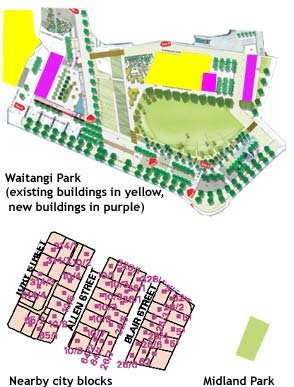
Today is the last day that the designs for the Waitangi Park design competition will be on public display at the Waterfront Project Information Centre in Shed 6 on Queens Wharf. It's also your last chance to fill in a feedback form to let the judges know what you like.

I've already written an overview of the brief and detailed thoughts on each entry:
Now I'll try to give my overall impressions and try to come to some conclusions as to which scheme (or combination of schemes) I think would be best for Wellington. Rather than applying the official criteria, I'll try to use the system that I used for my UrbanEye reviews, and assess the entries according to their urbanist, aesthetic, environmental and social contributions.


Urbanism

One could judge the urbanist values of a development in terms of many criteria, including interactivity, diversity, legibility, compactness, connectedness, multifunctionality, adaptability and liveliness. In this case, the functions and basic footprints have been set by the brief, so some of those qualities will vary little between entries. Hence, I'll concentrate on the extent to which each scheme delivers quality public space.

Oosterhuis Lenard's scheme concentrates on the buildings rather than the spaces around them, and with the exception of the site 1/2 building there is imited ground-level interaction between interior and exterior.

In contrast, UN Studio's site 1/2/3 building is an urban building in a non-urban setting, but their site 4 melts into the landscape in a way that could provide a successful transition from urban streets to the park.

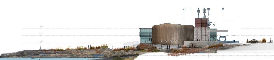
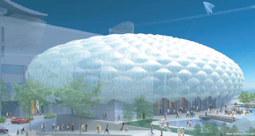
Shin Takamatsu's "activity void", combined with the unorthodox "holey" arcades of the site 1, 2 and 3 buildings, could provide a pleasantly urban space; but the presence of bedrooms along Tory St means that his site 4 building is less than ideal.

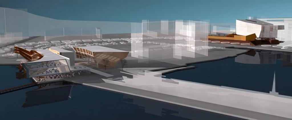
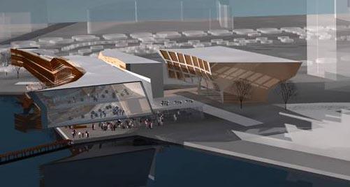
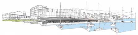
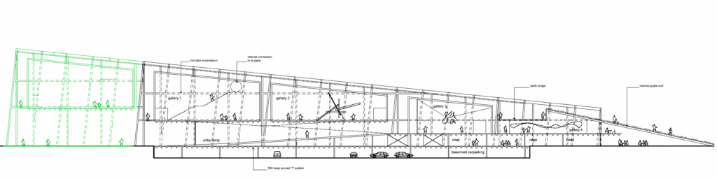
Architecture Workshop and Kerstin Thompson present a scheme that is very conscious of public space and urban coherence, with detailed consideration of views, shelter and pedestrian routes; a deferential site 3 building that works with the Herd St complex; and a site 4 solution that offers the best combination of urban form, mixed use and active edges.

John Wardle tries a very urban approach, creating a series of streets that lead to the water, but (and I never though I'd say this), it's perhaps too urban, given that the site is separated from the city grid. The scheme doesn't make optimal use of sun and views, and while sites 1-3 are wonderfully articulated and present rich interactions between inside and outside, the museum at site 4 is just a little too sombrely monolithic.


Aesthetics

This is highly subjective, of course, but given the expectation of spectacular architecture, I'll try to assess these based upon their individuality and ability to create a memorable image, rather than their contribution towards coherent
streetscapes.

That's certainly Oosterhuis Lenard's strength, and if these were built here, they'd be the only New Zealand example of the international organic "blobitecture" (though one could argue that Athfield's First Church of Christ Scientist should count as an early example). The Site 3 building is the least successful in my eyes, but the reticulated copper facade of the site 4 building would be very striking, and the site 1/2 building could work beautifully on its waterside site.

While UN Studio's site 1-3 building is too blocky for its isolated location, the site 4 building is truly spectacular. Complex yet sleek, sculptural but not monolithic, it would be stunning on first sight yet would retain the ability to provide new surprises with continued viewing.

Shin Takamatsu's buildings are perhaps the most immediately memorable, but the site 4 "cloud" seems like a one-note building and the candy-coloured logos of the other buildings might be too Disneyfied to fit well in Wellington.

Amidst all this heroic form-making, the scheme by Architecture Workshop and Kerstin Thompson can seem a little timid and ordinary. In any other context, the skewed grids of the museum and the faceted roof over sites 1 and 2 would look like
intriguing, creative architecture that creates unique and memorable spaces, but in this company and with these expectations, their lack of overt spectacle could count against them.

On sites 1 to 3, John Wardle offers dynamic lines and daring cantilevers, and his site 4 museum has the chilly beauty of an iceberg. There are also plenty of subtle local references to add depth to the inital impressions.


Environmental

Oosterhuis Lenard's entry has little in the way of environmental statements, and their buildings use some materials that are very expensive in terms of embedded energy, such as copper cladding and Indian marble, so it's safe to say that this is not their strong point.

UN Studio plans to use a heat pump to balance internal temperatures using water from the harbour. There's a comprehensive ventilation strategy and some consideration of solar gain, but otherwise it's a fairly conventional approach to environmental design.

Shin Takamatsu's site 4 building appears to make use of its inflatable outer skin to control natural lighting and ventilation.

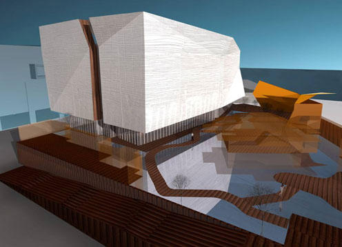
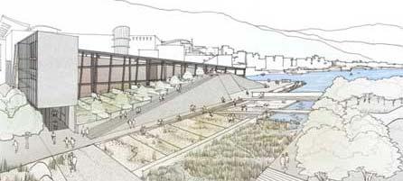
Of all the entries, Architecture Workshop and Kerstin Thompson's goes the furthest to explicitly incorporate active and passive environmental features. Site 3 exploits cross-ventilation, solar water heating and thermal mass, but its most significant environmental contribution is through mixed use (live/work spaces) and restricting car parking in favour of bike storage. Site 4 is intended to be carbon-neutral, and incorporates photovoltaic panels, a double skin for passive control of solar gain, and a grey-water recycling system that integrates with the Chinese garden. This scheme has the potential to be a showcase of sustainable building techniques on an inner-city site.

As far as I can see, John Wardle's scheme makes no explicit attempts at environmentally sustainable design.


Social

The scheme by Oosterhuis Lenard omits the low-cost hostel at site 4, thus potentially reducing the diversity of users in the precinct.

UN Studio not only leave out the hostel, but also leave no space for the open-air market: unless there's a way to reinstate these, this scheme could be seen as the most socially exclusive.

Shin Takamatsu includes the hostel, but in an unappealing location at ground level on a shady street, and the profusion of corporate logos on sites 1 to 3 could be seen as a negative point.

Architecture Workshop and Kerstin Thompson's entry goes out of its way to retain views and enhance public spaces. It has the best solution for the hostel, provides shelter for the market space, and provides for recreational activities in an unpretentious setting.

John Wardle's scheme omits the hostel at site 4, but otherwise has a good integration of public and private uses.


Summary

In my opinion, the most beautiful and individual building of the lot is UN Studio's musuem extension at site 4. Both John Wardle and Oosterhuis Lenard produced schemes for site 1/2 that were a strong aesthetic response to the water's edge site. In many ways, if these schemes were not chosen, it would be a pity to lose the opportunity to have buildings of this calibre in Wellington.

But overall, the scheme by Architecture Workshop and Kerstin Thompson shone through on urbanist, social and environmental grounds. Of the lot, this felt like the scheme that could give the most to Wellington. I've been cheeky enough to suggest a way in which a little bit of spectacle could be added to the museum building, and maybe there's a way in which sites 1-3 could also gain a bit of visual daring.

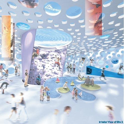
The folded ground already connects with the first floor restaurant of site 3. Imagine this extending, with progressively finer triangulation, around the corner to provide a verandah for the south side of this building, then spreading up to form a crinkled, faceted "skin" around the climbing-wall tower, perhaps even penetrating the facade to become the climbing wall itself. The scheme already plays with the concept of blurring ground and building, and this suggestion just takes it a bit further by "absorbing" the climbing tower into the folded ground.

Whatever the result, I think these buildings will turn a fairweather park into a mixed-use precinct that provides varied opportunities for recreation and other activities around the clock and in all weathers. It's just a question of choosing the right scheme (or combination of schemes) to make the most of the opportunity and provide the right balance of memorable buildings and inviting public spaces.

Thursday, October 20, 2005

Dogside


Most of my recent posts have been on two subjects about which Wellingtonians are known to be passionate: the waterfront, and drinking. So here's one that combines the two.

The space on the north and east sides of the Loaded Hog is finally turning into a branch of One Red Dog. It was always intended to be such, but seemed to have received only a partial fit-out before being left in limbo. It looks as if the owners were waiting for spring to make it a more attractive destination before opening, and in the meantime it's been kept busy as a special events venue (Barmy Army, World of WearableArts etc).

While it's good to see a greater variety of waterfront dining venues, I had hoped for something other than a chain (at least it's not Starbucks!). I also hope that the staff are better-trained than at the Hog or at the Ponsonby One Red Dog. Years ago at the latter venue, I asked for a Martini made with Bombay Sapphire, receiving the reply, "Certainly sir, and would you like some gin in that?"

The Green Room opened some time ago in the old function room of Shed 5. It's going for more of an intimate, boutique bar feeling than Shed 5, and with it's Starck plastic sofas it's the closest the waterfront gets to hipness. On the other hand, the soundtrack tends to be aimed at a Baby Boomer and Generation Jones crowd, and the clientele reflects this. Nevertheless, the outside area is still a pleasant place to be on a still night.

The Odlins building is pretty much complete, though the ground floor tenancies are yet to be leased. Next door, the former Wellington Brewing Company in Shed 22 has been re-branded as a Mac's Bar. The giant mural celebrating Kiwi booze-barn culture has gone, replaced by a row of booths, and while there are hints of the ersatz miner's cottage look of their rivals Monteiths, as a first impression it looks lighter and more contemporary. As long as they still have Verboden Vice, I'll be happy.

People often talk of establishments "going under", but the F69 bar will be literally going under when the frigate is sunk off Island Bay next month. I'm sure that Te Papa will be glad to get their view back, but it's been great to have a bit of life partway along the long, bleak path in front of Te Papa.

Wednesday, October 19, 2005

Eccentric roof


Global "starchitects" don't have a monopoly on unconventional forms. This spiralling metal roof, which looks like a product of the 70s, sits atop an old wood and brick house on a side street in Mt Cook.

Tuesday, October 18, 2005

John Wardle: strange cargo


My last detailed review of the Waitangi precinct schemes examines the proposal by John Wardle Pty Ltd Architects. The masterplan keeps fairly close to the brief, with the only major difference being that sites 1 and 2, while separated by a public passage at ground level, are joined at the upper levels into one elongated, sweeping building.

This building also has a north-south split, which contains a dramatic glassed-in climbing wall that runs through the mass of the building like a canyon or fault line. This linear climbing wall could bring a new dimension to the sport, presenting different angles and overhangs as it winds throughout the building. In places it also passes by what is labelled as "Wellington's longest bar", and this juxtaposition of athletes and barflies could produce some interesting social situations!

This is a striking building, with dramatic zigzags, acute angles and daring cantilevers, and it explicitly calls on geological metaphors such as faceting, stratification, fracturing and erosion. It wraps around and over the promenade next to Clyde Quay, producing a stylish and intimate public space as it does so. The only problem is that it faces east, and thus most of its sunlight would be gone by lunchtime.

For better or worse we're a sun-seeking people: our maritime climate keeps ambient temperatures mild at best, so even in summer we're often seeking a precious combination of direct sunlight and shelter. Flip this around and place it on the OPT or the Outer T of Queens Wharf and you'd have a winner, but in this site and orientation, its potential as a public space is severely limited.

...

The site 3 building, while not being so explicitly geological, is also dynamic and appealing, with exotic angles and a dramatic "mushroom" section. Its placing seems a little strange, though: shifted east to form a narrow alley between it and the site 1/2 building, it leaves a broad space east of the Herd St complex. It may be that in trying to create two public spaces leading to the water, one will end up too dark and narrow and the other too diffuse and with poor orientation.

It also seems to go out of its way to deny the occupants of the apartments any views. Personally, I don't share the Kiwi obsession with panoramic views at all costs, but it seems perverse to come almost to the water's edge, only to build a blank north-facing façade and orient all its apartments towards a building that looms a few metres away. It's an acceptable outlook for a Melbourne laneway or an inner-city alley such as Egmont St, but on such a site it seems like a wasted opportunity.

...

As usual, it's site 4 that's the glamour building. I can understand why most architects would leap at the chance to design a museum rather than a boring old hostel (which has been omitted here). It seems to have received the most design effort, and will present a memorable spectacle, but I'm not entirely convinced by its proportions. Most entries maintained the linear north-south orientation from the brief, except for UN Studio who twisted it around to point two wings at the park. This entry has a shorter and wider version of the transition building, which could leave it looking slightly lost against the long wall of Te Papa, and from some angles it looks too chunky to be elegant.

The geological metaphors continue here: from most angles it's a monolith. It's true that the programme demands a degree of insularity, to protect the artworks within and to avoid overlooking the Chinese garden. It's also true that Wardle has creased and fissured the building mass, as well as imprinting it with a pattern derived from fishing nets and traditional weaving, to give the building some detail and visual interest. But the other entrants all seem to manage, through translucency, materials or scale, to avoid presenting quite such a blank and looming face to the public. It's a form that could work well in other contexts (I could imagine it as a medium-sized auditorium, as for the School of Music), but as a building commissioned for the express purpose of humanising the blank face of Te Papa, it doesn't seem to do the trick.

It seems that Wardle has had more time in Wellington than the other overseas entries, but there are some aspects of the scheme that shows he doesn't have the climatic instincts of a Wellingtonian. For example, the renderings show the end of Tory St, between Site 4 and Te Papa, teeming with outdoor diners. I agree that some retail or bars would help perk this street up a bit, but the lack of sun and views in this relatively narrow space make it unlikely to ever become a Mecca for al fresco dining.

Otherwise, this is a much more intriguing elevation than the southern end. There's a terrace that's partially enclosed by "woven" screens, an expressionist composition of steps, and a warped and folded entrance pavilion that looks like a Richard Serra sculpture. The fissure across the top of the musuem should create a beautiful top-lit atrium between the gallery spaces.


In Wardle's statement, he refers to some of these buildings as being like foreign cargo unloaded on Wellington's docks. There are a lot of local cultural and historical references, but many of them (like the meeting of the museum and entrance pavilion in a "hongi") are likely to be too oblique for the casual observer, so this sense of foreignness might be too strong. In this article I've probably sounded too negative, but most of these are fantastic, breathtaking buildings. It just seems that they don't make the most of the site, either for their own sake or for the sake of the public spaces that they could have, but haven't quite, created.


All renderings used this post have been taken from the John Wardle Pty Ltd Architects page on Wellington Waterfront Ltd's web site.

Brown-trousered fascists

File under: ,

New Right posterOne of the delights of living near Cuba St is the diversity of cultural and political expression, in protests, graffiti and posters. Sometimes this can get a little stomach-turning, though, as in this poster which recently appeared.

If the "New Right" banner doesn't tip you off, the use of the Celtic cross should: if not the National Front itself, this is definitely from a related organisation. I held my nose, took a deep breath, and navigated to the web site listed on the poster. It's the same old mix of barely-disguised racism ("maintain and revive New Zealand's European character"), monarchism, militarism (universal military service) and paranoid anti-communism. But there are some eccentrically daft statements as well, such as:
"The high point of a really New Zealand culture was reached during the 1930s and 1940s and the generation of Poets Rex Fairburn, R A K Mason, Dennis Glover et al. Since world war II and the rise of America, New Zealand’s culture has been stunted and is on a downhill slide."
I wonder what Mason would have thought about this crowd in the 40s, when he edited a communist newspaper? They also advocate euthanasia to eliminate "the criminal underclass", which would surely wipe out their core powerbase. Then there's this gem:

Finally, someone to defend the endangered English "langauge"!

It's easy to laugh at these idiots, but we should be wary in case another Lionel Terry appears. They may be becoming more active, and are planning a leaflet drop, targeted at properties that could potentially be used to settle the Wellington Treaty claim.

Monday, October 17, 2005

Architecture Workshop and Kerstin Thompson: radical deference


The fourth of my detailed reviews of the Waitangi precinct schemes concentrates on the proposal by Architecture Workshop and Kerstin Thompson.

It takes a while to get your head around their masterplan. They have departed considerably from the footprints suggested by the brief: the transition building at Site 4 is longer and thinner and has sprouted an extension to the east; Site 3 sticks close to the Herd St building and extends northward to cantilever over the waterfront promenade; and from some angles Sites 1 and 2 seem to have disappeared entirely!

When you realise how these last two sites have been resolved, you start to realise that this is no ordinary architectural solution. They propose to excavate the ground east of the Herd St building by about a metre; spread out the activities (restaurants, bars, fish market, kayak hire) on this new ground plane; then cover them with a "trafficable roof" that folds over the lot like a piece of origami.
This simple solution has several benefits. It creates a sheltered (if shady) walk along the water's edge while exposing the historic sea wall and bringing people closer to the sea level. It allows for simple, flexible spaces underneath, like stalls in a European covered market. People can walk from the park over the gently sloping roof to reach sunny (if exposed) harbourside spaces or the level 1 cafe terrace of the Site 3 building. It also (and this will be the most important factor for some) maintains views from the park to the water.

There are precedents for this sort of "folded ground plane", such as Foreign Office Architects' Yokohama terminal, and closer to home, the City-to-Sea bridge. Other local influences and allusions for this folded roof could include the Overseas Passenger Terminal, the Clyde Quay boat sheds and even the hills of the Hutt valley (seen from the park, the roof has been designed to create a low "V" that frames and echoes the valley). Seen from the promenade in front of the Herd St building, the roof has an elegant sweep that subtly echoes the Freyberg Pool behind it.

Many of the perspectives for this scheme downplay the roof, perhaps deliberately in order to make it seem more unobtrusive, but I think this will actually be quite spectacular, with endlessly varying appearance depending upon viewing angle and weather conditions, and it could become a favourite and much-photographed part of Wellington. My only reservation is that the surface of the roof is intended to be steel, supposedly recalling the tilting deck of a warship or freighter, and I can envisage this being an unfriendly surface to walk or sit on, as well as noisy for the people underneath! It sounds prosaic, but perhaps some wooden decking would make this a more practical and hence more popular public space.

...

Site 3 is the most conventional building in this scheme, and in fact is probably the most conventional building in the entire competition. That's not entirely a bad thing, since it mostly contains ordinary activities like retail and housing, and rather than clamouring for attention it aims to form a coherent urban composition with the Herd St building. The façades look a little underdetailed, but the architects' statement says that the details will be driven by environmental considerations, so expect the finished building to have a more complex and finely-scaled appearance than is visible in the competition renderings.


It's a pity that more hasn't been done with the southeast corner, which contains the climbing wall. Some of the other entries have taken this as an opportunity (some might say "excuse") to use unconventional forms, and while I mentioned that this building is not intended to be spectacular, it would benefit from the drama and visual interest that a visibly expressed climbing wall could provide. Overall, though, this is a calm and respectful building that should help the large Herd St building look less isolated and overscaled.


Site 4 takes a while to understand, mostly because it represents such a complex integration of building and landscape. The museum building starts off relatively tall near Cable St and slopes down towards the harbour. Beside this, the terraced Chinese garden rises from street level up to the second floor, where the public path passes through a gap in the building to become a raised "earth bridge" before joining an existing raised path on Te Papa's eastern flank.

A simple rectangular building extends eastward along the southern edge of the Chinese garden, containing a teahouse and function rooms at ground level and a hostel above. The brief had no building here, but it makes a lot of sense: the ground floor can address both the garden and the markets; the garden gains some shelter from the southerly; and the Cable St edge gains some shelter and some definition as a proper "street".

The two buildings create what the architects call the "city edge site", and they fill that role with some aplomb. There are sheltered arcades with active edges along both Tory and Cable streets, and the museum building gradually morphs from city grid into the softeness of the gardens. The only thing that looks a little unfriendly on the park side is the high bunker-like walls, made of the same exposed aggregate that flanks the gardens east of Te Papa. I think that the rendering makes these look a little steeper than they would be in reality, but they could still benefit from some fragmentation to break down their scale, possible with planted ledges or even a cascade of water to make this a more inviting edge to the park.

The museum building is the closest this scheme comes to a self-consciously iconic building. The outer "eco-skeleton" of timber and glass (that provides circulation spaces around the gallery boxes) is structured as the intersection of two 3D grids. This seems vaguely reminiscent of Peter Eisenmann, but seems less arbitrary and theoretical in origin. There are plenty of subtle nods towards local character (such as robust ironbark timber, which is also used in the old wharves), but the overall form of the building is unusual enough that it would seem unique and spectacular if we weren't comparing it to the architectural pyrotechnics of the other entrants. But perhaps there is a simple way to make this slightly more imposing and "iconic", if required.
I hope the architects don't mind a bumbling layperson messing with their designs, but I've taken the liberty of proposing an extension to this building (shown in green above). I've continued the grid of the building southwards over the market car parks to the edge of Cable St. The timber and glass frame hovers over the ground, supported by tall angled columns. Within the frame is either another simple gallery box, or perhaps a more open interior: how about a large scale sculpture? Or a Green Wall or "Living Machine" to complement and extend the environmental functions of the Waitangi Park wetlands, while acting as a living laboratory and exhibition of environmental technology. The sight of this "aerial greenhouse" while approaching along Cable St would act as a signpost for the park, while the extension along Tory St would practically and symbolically reach out to the city.

...

This may be the least spectacular of the schemes, but it is the most considered, contextual and humane. More effort has gone into considering views, shelter, promenading opportunities, local precedents and integration with landscape than into constructing eye candy to put on a postcard. The more I look at it, the more I can see that it will create memorable, "iconic" places, in concert with existing buildings and landforms, that in many ways are preferable to aloof architectural "icons". The way in which some of the buildings defer to the surroundings and blur the boundary between built and natural environment is perhaps more radical and "creative" than just going mad with CAD software and tacking on some token local symbolism.

But in the context of this competition and its explicit intention to attract "starchitects", it does lack a little bit of the "wow" factor. If there were a way to combine parts of this scheme with one of the more spectacular buildings from another scheme, or to choose this team but encourage them to push the boat out a bit more, then Wellington could be on to a real winner.


All perspective renderings, together with the architects' statement, are on the Architecture Workshop and Kerstin Thompson page on Wellington Waterfront Ltd's web site.

Friday, October 14, 2005

Just say no to Waterfront Watch


On the waterfront this lunchtime, enjoying the same Wellington sunshine that Hadyn mentioned, and before coming across the phobics' picnic, I took this crummy little photo on my phone. It shows, in all its pixellated, overexposed glory, a dozen or so people eating sandwiches, playing guitar or just generally chilling out in the sunshine while sheltered from the cool southerly by Shed 5.

Lazing around outside Shed 5
When I returned to work, I re-read Cr Ruben's letter to the Capital Times, saying that the Outer T would be better if it were completely open space, as we wouldn't be able to do that sort of informal hanging out if Shed 1 were replaced by a hotel. But look at this artist's impression of the north end of the proposed Hilton:

Gueens Wharf Hilton - north end detailIt has a few things in common with the north end of Shed 5. Sunny? Check. Sheltered from the southerly? Check. Public space close to the water? Check. Proximity to expensive bars and restaurant? Check. So how is it that the same conditions that attract ordinary people to sit in the sun outside Shed 5 are supposed to drive them away from this space?

So, of course, I sent off a rant:
Jack Ruben wants nothing but benches at Queens Wharf, where people can "relax, fish, enjoy the view or read a book". But people will still be able to do this in the public spaces around a hotel, just as they currently do outside Shed 5, seemingly unintimidated by well-off diners inside. At lunch today, there were more people sitting there than on the whole outer T.

People don't gather in the middle of large spaces, but around the edges, especially near visibly inhabited buildings. Commerce and public life can exist together, and besides, why is it acceptable to charge $12 for rock climbing, but elitist commercialism to charge a fraction of that for coffee in a hotel café?

Imagine Cuba Mall or Midland Park without buildings. No cafés, shops or nasty offices and apartments. No shelter, active edges, or workers and residents to keep the place busy when the sun isn't shining. These spaces would be as bleakly deserted as Waterfront Watch's vision for the waterfront. They may want the waterfront to resemble Karori or Wadestown, but those of us who love this city for its urban energy look forward to enjoying more of that vitality by the water's edge.

Face your fears


While walking along the waterfront this lunchtime, I spied a happy group of people having a picnic on the pontoon. But something seemed a little odd. The hammocks were a nice touch, though it seemed like a lot of work to go to for an impromptu picnic. The wooden stumps and "stepping stones" looked decidely eccentric. But it was the rat that took the cake (not literally).

Yes, a rat. A giant furry toy rat. With a long pink tail. A giant furry pink-tailed radio-controlled rat. At a picnic! You can just see its head and tail, as it's being cuddled by the guy with the number 3 on his shirt.

Then I noticed this nearby poster, according to which this event was a free desensitisation service to help people overcome their phobias. Specifically: doraphobia (fur), sciophobia (shadows), herpetophobia (reptiles) and muso- or muriphobia (rats & mice). I can see how most of those apply, but I didn't see any snakes or lizards: perhaps the picnic baskets contained more than just sandwiches.

Somehow I doubt that this was a serious therapeutic exercise. It's more likely to have been some kind of performance art, or perhaps just students taking the piss (I know, it's sometimes hard to tell the difference). Does anyone know any of the particpants?

P.S. If you think that the list of phobias is amusing, take a look at the philias. Warning: possibly not safe for work, and definitely not recommended while eating.

Shin Takamatsu: back to the future


The third in this series of detailed impressions of the Waitangi precinct schemes deals with the proposal by Shin Takamatsu Architect & Associates. Their masterplan is the only one of the five to keep the programme in four separate buildings close to the sites indicated in the brief. The detailed footprints of sites 1 to 3 are primarily generated by lines implicit in existing buildings, but this is followed by a boldly formal gesture. Out of these generally cuboid masses they subtract an ellipsoid volume based upon that of the site 4 building, resulting in walls that curve around a semi-enclosed space.


As a formalist geometric approach, this is unlikely to be consciously appreciated by most of the public. However, and I'm not sure whether this was intentional, the result is actually close to the traditional urbanist approaches of Christopher Alexander and Jan Gehl. By emphasising the space between buildings rather than buildings as individual objects, and thinking of the public realm as figure rather than ground, designers can create positive outdoor spaces that feel like outdoor rooms rather than formless left-over spaces.

This produces a space that Takamatsu calls the "activity void", a jargonistic name for a public space that is somewhere between the intimate enclosure of a city square and the purposeful linearity of a street. Without specialist expertise, I can't tell whether this will be pleasantly sheltered or a howling wind tunnel, but it's certainly a more urban space than the equivalent in the Oosterhuis Lenard or UN studio schemes.

...

The buildings themselves are quite exotic. As slightly distorted cubes, the overall masses may be simpler than Oosterhuis Lenard's slithery invertebrates and UN Studio's intellectual knots, but the walls are pierced by hundreds of circles to give the impression of massive hunks of Technicolor gruyere. Above ground, these are a mixture of operable windows and glass panels etched with Māori motifs or corporate logos (the latter seem almost intentionally calculated to send Waterfront Watch into fits of collective apoplexy).


At ground level, what could have been scaleless and arbitrary decoration actually produces a novel approach to the public/private interface: a series of irregular arches similar to colonnades or arcades, but in a way more integrated into the façade as a whole. I'm finding it hard to envisage what this would actually feel like to walk along, but it's possible that this could create a pleasantly sheltered and active pedestrian route from Oriental Parade to the Overseas Passenger Terminal.

Site 1 contains the restaurants, and site 3 has three floors of short-stay apartments over ground-floor retail. It's site 2 that gets to go crazy inside, with an elevated indoor "playground" that is a Wonkalicious psychedelic fantasia of purple conical climbing walls, an amoeboid paddling pool, half-pipe and mini-golf.


My logical brain doubts the financial, structural and social feasibility of the whole thing, but my inner brat wants to overdose on food colouring and run around with a silly grin on my face.

...

By comparison, site 4 is relatively sedate. The museum is housed in a hovering ethereal ellipsoid, intended to resemble a "long white cloud", resting on a prosaic box that deals with the more earthly functions of teahouse and hostel. Unlike Oosterhuis Lenard's scheme, this produces something physically resembling a streetscape, though the transition from cloud to box seems somewhat abrupt and ragged, and the presence of hostel rooms at ground level seems unlikely to generate a lively edge to Tory St.


If the variable translucency of the fern-imprinted "cloud skin" works as claimed, then this could be a building that creates shimmering variations in appearance depending upon weather and sun angle, as well as producing stunning greenhouse-like spaces within. The form has more in common with the geometric high-tech domes and gherkins of Grimshaw or Foster than with the tortured Continental deconstructionism of Oosterhuis Lenard and UN studio, so perhaps it's a better fit for New Zealand's predominantly anglo-saxon pragmatism.

On the other hand, I stand by my earlier reservations about the Chinese garden, and I'm not convinced by Takamatsu's claims for local metaphors. The fern and spiral motifs are just decorations, and could just as well have been kangaroos and Fosters logos if the site had been across the ditch. The silliest claim for local relevance is the comparison of the cloud and elliptical void to rugby balls! So we have a pair of balls, with the left one being most prominent: this scheme could stand for parliament in Tauranga.

But seriously, the whole scheme is very Vegas, a retro-futuristic corporate confection in eighties dayglo. It's almost tacky enough to be glorious, but I'm not sure it says anything about Wellington. The balmy twilight settings indicate a lack of familiarity with Wellington's climate, and the admittedly spectacular "cloud" is wasted in the shadow of Te Papa. That sort of form would be fantastic in an isolated linear setting such as the Overseas Passenger Terminal or the Outer T of Queens Wharf, and the swiss-cheese façades of sites 1 to 3 might be an interesting approach to try for the School of Music on the old Circa site. But I don't see these particular buildings as the best solution for the Waitangi precinct.


All images have been extracted from PDFs available at the Shin Takamatsu page on Wellington Waterfront Ltd's web site.

Thursday, October 13, 2005

UN Studio: twisted spectacle


The second of my posts on detailed impressions of the Waitangi precinct schemes looks at the proposal by UN Studio. At first glance, it has the simplest masterplan of the lot, condensing all of sites 1,2 and 3 into a single compact building. Around site 4, however, they've made some major changes to the surrounding landscape and its functions. The Chinese Garden has been shifted from east of the transition building to south of it, running right along the edge of Cable St where the open air car park and market are supposed to be. The site 4 building itself twists away from a north-south orientation towards the park, leaving a large elevated "scenic balcony" to the north.


UN Studio decided to save views by having one 4-storey building right at the northeast corner, rather than having three smaller buildings. It looks like a simple block from above, but the lower three floors are actually twisted figure-8s, with the top floor (short-stay apartments) floating over the top. The three public floors (recreation, restaurants and shops) are each divided in two, then joined by interweaving ramps. This looks like it should retain east-west views and access through the block, while creating a spectacular atrium space.


I like this building, but I'm not sure that it's quite right for the site. It looks a little blocky and isolated, leaving a wide and possibly barren space between it and the Herd St building. This would be fantastic in a tighter urban setting, such as sites 8, 9 and 10 at Kumutoto, where its rectilinear envelope could help define positive public space while its swooping ramps would lift it out of the ordinary.

...

Site 4, the museum extension, is something quite special. Its dynamic form shifts between gentle curves and sharp pleats and folds, reminiscent of billowing sails. The sleek, metallic outer skin is slashed by long horizontal windows, letting light into and controlled views out of the museum while preventing the building from becoming too monolithic.


At first I thought that the design was too self-consciously "iconic" at the expense of its relation to the surrounding space: a self-contained building sitting aloof and untouchable on a plinth. But as I study the detailed plans and sections, I'm slowly appreciating the complex way in which it is interwoven with the landscape. There's a public passageway that swoops up from Tory St, under the belly of the building between cafe and foyer, up across a sheltered terrace between the two wings and then to the park. The connection to Te Papa is at ground level, with the land rising over it to form the "balcony".

I also thought that the visual language of knots and folds was a little too predictable, but now that I see how the overall form responds to the site and programme, this is starting to seem appropriate. The brief calls for "an expression of contemporary culture"; a building that "is of this time as well as place and relates to international as well as local culture". In this context, the echoes of Hadid, MVRDV, Gehry and others start to seem more like Zeitgeist than imitation.

...

There's something seductive yet unsettling about the renderings that UN Studio have used: a sleek pristine glow that speaks of unearthly beauty yet dismisses the context with Antarctic coldness. And those purple trees are just plain weird! But if you try to imagine the spaces around the Site 4 building with a little more planting and detailing, it's possible to believe that it might be one of those rare buildings that manages to combine sculptural beauty with an active public interface. They still need to find a way to incorporate the brief's requirements for a hostel and open-air market in the spaces around it, but in any case, this building could be a powerfully transformative addition to the waterfront.


All images have been extracted from PDFs available at the UN Studio page on Wellington Waterfront Ltd's web site.

Blogging under the influence

File under: , ,

As my earlier post indicated, if there's one thing that local bloggers agree on, it's that alcohol is a vital ingredient of Wellington life. It might even be, gasp, more important than coffee! But before I present my plans for a bar-review blog and a wellyblog boozeup, I'll unveil the identity of mystery bar number 7.

Mystery bar number 7This proved to be more of a challenge than recent efforts, and for good reason. It's only been open for a few weeks, it's up a long staircase, and the only signage is one of those flexible pavement signs that is put away when the bar's not open. Stephen's educated guess was the closest: "the *new* *improved* Workingmen's club". It's not a replacement for the Workingmen's club, though it may have taken over one of their rooms. Head upstairs to the club, and instead of heading right to the TAB, turn left and you'll find yourself in Morocco.

The name's a bit of a mystery, and perhaps something of a disappointment if you're expecting tagine kofte, cheap hashish and eager-to-please house boys. There's very little of the exotic Maghreb here, and it was a little too quiet when we visited in the early evening, but the comfy 70s furniture and intriguing cocktail list promise much in the way of laid-back drinking pleasure. Dedicated WellUrbanites may recall my earlier post predating its opening. Get there quick, before the bridge-and-tunnel crowd arrive from Courtenay Place.

Organising a proper wellyblog boozeup might take a bit more notice than this, but who's up for a preliminary round tomorrow night? See you at Morocco, upstairs off Cuba Mall, at 7ish. Bring friends and a robust liver.

The short answer...


Double Standard poster - Is Peter Dunne God?
...is no. Unless you live in Tawa.

But it's good to see The Double Standard back on the walls of the city. It's possible that these are the same people who (under the banner "The National Male") created the infamous "Drunksky" posters during the election campaign, but otherwise I haven't seen them around for a while.

The notorious classic was back in the Muldoon days, when it was an open secret that Rob was conducting an, ahem, intimate friendship with a housewife somewhere in the western suburbs. One day a wild boar was found and killed among the bush and scrub of the surrounding hills, and The Double Standard appeared around the city the next day with the headline:
Rooting Pig Shot in Wilton: PM Unharmed

Wednesday, October 12, 2005

Called to the bar

File under: , ,

Regular readers of The Wellingtonista may have noticed that it's been fairly quiet over there for a while, and wondered what may have been keeping them away from blogging. It's possible that they were just enjoying the sunshine, but it's clear now that at least one of their number has been kept very busy putting a lot of diligent research into the subject of cheap drunks drinks in Wellington. Jo has risked life and liver to seek out options for bargain-basement boozers, including the well-known (at least to readers of Kate's Thirsty Thursdays) free bubbles for "ladies" at Blend on Thursdays, free wine-tastings at Concrete on Wednesdays, two-for-one specials at Chow, and ladies' night at Mermaids. Kate has been conducting her own intrepid research into parsimonious plonk, a dangerous quest that has led her into the wilderness of Sports Cafe and the depths of Syn.

Mystery bar number 1For the less impecunious imbiber, The Sifter recounts some Fernet- and herradura- fueled exploits at Motel, Chow and Boulot. It must have been a good night, because he needs his drinking buddy Stephen of Drinks-After-Work to complete the picture. Stephen takes time out to muse about the increasingly bridge and tunnel character of Courtenay Place, and we discuss the options for civilised drinking away from the white boots and boy racers of the main drag.

Drinks-After-Work has also been promising local bar reviews, but without much progress so far. Perhaps it could finally replace the looked-promising-but-laughably-out-of-date World's Best Bars site, which not only thinks that Q still exists, but believes that Jet is the "bar of the moment"! Maybe the problem with bar reviews is that the more thorough the research, the lower the productivity.

Hic!But the more I think of it, the more this sounds like a worthwhile and civic-minded project. Perhaps I could start by converting my mystery bar posts (numbers 1, 2, 3, 4, 5, 6 and 7 - you're getting warm, Stephen!) into reviews, but I think the task is too onerous for one man and his already overworked liver. So here's a challenge to all the bibulous bloggers of Wellington: post bar reviews on your blog for our information, delectation and intoxication. On the other hand, this work may be of such importance that it deserves a brand new collaborative blog of its own. What do you think?

Building tension


In yesterday's DomPost, a Waterfront Watcher from Wadestown (always Wadestown!) wrote to object to the building plans for Waitangi Precinct. He says "Can you imagine Aucklanders accepting large buildings in the Domain or on One Tree Hill? Or Christchurch residents accepting them in Hagley Park? What about New Yorkers in Central Park?"

It thus appears that he's never heard of Auckland War Memorial Museum, Canterbury Museum or the Metropolitan Museum of Modern Art, all of which are very large buildings in some of the parks he mentions. So, predictably enough, I fired off a quick rant:
Russell Tregonning (Oct 11) claims that Auckland, Christchurch and New York would reject buildings in the Domain, Hagley Park and Central Park. Yet each of those parks already includes a major museum, much larger than the Te Papa extension by the edge of Waitangi Park. Central Park is also surrounded by apartment buildings and has several buildings inside it, including restaurants and gift shops.

The Waitangi Precinct buildings will not be on the park but beside it, on former car parks. Rather than reducing recreational space they will provide new recreational opportunities, including rock climbing and equipment hire, as well as urban forms of recreation (eating, drinking and shopping) suitable for the closest part of the waterfront to the entertainment district. These and other uses will enliven the park at night and in bad weather.

Let's turn the question around: would Auckland have large green parks at the Viaduct Basin? Of course not, yet we will have two large waterfront parks (Waitangi, Frank Kitts) plus several other public spaces (Taranaki Wharf, Queens Wharf and Kumutoto), gardens, playgrounds and a broad promenade. Wellington has some places that are lacking quality public spaces, but the waterfront will not be one of them.


Today's Capital Times is also full of Waterfront Watch, Jack Ruben and Con Flinkenberg sounding off on waterfront issues, but I think I'll stop boring you all with that for now and try to concentrate on subjects dear to you all. Like drinking.