WellUrban

Personal reflections on urbanism, urban life and sustainable urban design in Wellington, New Zealand.

Friday, November 30, 2007

Make your vote count!


I've mentioned it before, but here's a last minute reminder: voting in the Wellingtonista Awards closes on Monday. I can't give too much away about the progress of the voting, but let's just say that my personal favourite for the Best Building award, the Meridian HQ, was doing well in early polling, so if you want to either give it a boost or plump for one of its rivals, get in now and vote!

Thursday, November 29, 2007

Back to the Promenade


Re-opening the tug wharf promenade at KumutotoAfter being closed for reconstruction for most of the year, the Tug Wharf Promenade at Kumutoto reopened this morning. Apart from new lighting and seats, the main feature is a new bridge, supported by a "Cradle" at one end and a "Crane Tower" at the other. This bridge looked disappointingly nondescript in the earlier renders, but there are many more subtleties of shape visible in the final product, and by all accounts there's some innovative engineering going on underneath it all. By replacing a section of the heavy tug wharf with a slender, tapered span, the bridge enables the declaimed "stream mouth" to have better visual (and small boat) access to the harbour, and the tower itself creates a sort of archway that helps to mark a stage in one's movement along the promenade.

New bridge at KumutotoWork on some of the public space north of Kumutoto Plaza will continue for a while longer, perhaps for a few more weeks, but most of the public spaces in this stage of the Kumutoto developments are now open to the public. Significantly, it's now possible to skate or cycle along the water's edge from Whitmore St to Oriental Bay for the first time in years, since the promenade in front of Chaffers Dock closed for Waitangi Park construction and didn't reopen until May. It's a pity that the Mojo won't be open until early January now, since that would have given us a first indication of how the combination of promenade, plazas and buildings will work together as public realm. With any luck, the ground floor of the Meridian building will be fully tenanted before the end of summer, bringing another part of the waterfront to life at last.

Wednesday, November 28, 2007

Density done right: The Altair


It's been a while since I've written a post in this occasional series, but that's partly because there are depressingly few good recent examples to choose from. I've been looking for exemplary inner-suburban infill developments, and while this one is stretching the definition a bit, other infill developers could learn a lot from it.

The Altair Townhouses - street detailThe Altair townhouse development in Newtown's Rintoul St is, at three storeys, what I would call a low-rise medium-density development. It's in a location that's almost perfect for such a typology: close to public transport and amenities, and just close enough to walk to town if you're feeling fit, yet far enough into the suburbs that apartment living would be less appropriate. If we're to encourage more than just childless young people and empty-nesters to live at higher densities, then developments like these, with small private courtyards and shared spaces, will be an essential part of the housing mix.

The Altair Townhouses - detail from the laneOf course, there are plenty of townhouse developments around, but with a few exceptions they are mostly aesthetic disasters of the sort that provokes backlashes against infill. I think that these are an important counterexample because they illustrate one way of being contemporary without being bland or aggressive, and of being lively and friendly without giving in to pastiche. The mass is broken down into smaller units; the two halves of the development have different colours and materials; the façades are deep and animated; and the overall balance between consistency and variety is remarkably well done.

Not everyone will like their rectilinear style, and they're not "in keeping with the historic character" of the neighbourhood in the narrowest sense, but I think it's clear that this is thoughtful architecture with quality detailing and solid materials. Once the development is complete and the trees have grown, this could evolve a character of its own over time.

I said before that this stretches the definition of "infill", and that's because it's a large-scale development on a brownfield site (well, literally speaking Athletic Park was a green field, but you know what I mean) rather than an incremental intensification of one or two quarter-acre sections. The comprehensive nature of this project makes it much easier to plan the site well, to produce a balance of consistency and variety, and to respect the street as urban space, all of which are tricky when you've got a single section on a narrow street frontage to work with.

The Altair Townhouses - courtyardThere are some things I'm not so keen on, such as the street-side parking on the southern half and the ambiguity between public and private spaces: creating new walkways for the general public can be a good thing, as can creating shared spaces for the residents only, but spaces that are unclear tend to work out poorly for both groups. I'm not in a position to judge things such as the quality of workmanship or the appropriateness of the interior planning, and at over half a million dollars for three bedrooms they're hardly a solution to the housing affordability crisis. But this is a much better use of land than the low-rise retirement ghetto that is spreading across the rest of the Athletic Park site, and it's proof that large medium-density townhouse developments don't have to be nasty, flimsy and unimaginative.

The Altair Townhouses - from the street

Monday, November 26, 2007

Visible and risible


There was a shock horror scoop in the Dominion Post today, with the headline Wind farm 'visible from Island Bay to Waikanae'. A leaked report purports to show that the proposed Puketiro wind farm would be visible from all across the Wellington region, and a spokesperson for a group called "Preserve Pauatahanui" said that "the leaked information shows that all Wellingtonians should be concerned".

Theoretical visibility map of the proposed Puketiro wind farmDoes this mean that the wind farm will be a dominating presence across the region? Hardly. The report by Boffa Miskell actually shows the theoretical visibility plans, and in many cases, that's very theoretical indeed. I presume that the planners have thus far done a viewshed analysis based on a Digital Elevation Model, and the result shows those parts of the region with a direct line of sight to the turbines. That doesn't imply that anyone in those locations with normal human eyesight would actually be able to distinguish them at that distance, let alone feel that the modification to the landscape "affects" them in any way.

To put this (literally) in perspective, a 130m-high turbine at Puketiro would be 35km from Island Bay, and a bit of high school trig will tell you that it will subtend about one fifth of an angular degree. That's about half an eyelash held at arm's length. Even with some motion to catch the eye and 50 of them along the ridge, you'd really have to go out of your way to see them, and that's assuming good visibility and no low cloud. Somehow, I don't think the residents of Island Bay will have to worry about the threat to their property values.

On top of all the hyperbole, it's all based on the assumption that wind farms are a blot on the landscape in the first place. Diane Strugnell of Preserve Pauatahanui makes the extraordinary claim that "People are realising that if it goes ahead then they will never see the hills the way they are supposed to be seen". "Supposed"?! Where does this teleological interpretation of landscape come from? Were the hills put there for the aesthetic delectation of human beings? And if so, wouldn't we be "supposed" to see them covered in native forest, rather than the highly modified landscape of exotic forest, grazing lands, fences and roads that characterises the area? Battle Hill Regional Park certainly has historic value, but it's hardly virgin wilderness.

Sunset over the Brooklyn turbineIn any case, I believe we should celebrate the dynamic beauty of the turbines as well as welcoming them as a source of sustainable energy. Build them on Mt Kaukau and along Mt Victoria, so we can proudly point to them and say "that's powering our public transport, and making Wellington a net exporter of energy". Which would you rather see: wind turbines turning on the hillside, or a future dependent on a dwindling supply of fossil fuel?

Thursday, November 22, 2007

Growing a spine


I've mentioned the "urban spine" concept many times before, and the expectation that much of Wellington's population growth will occur along a relatively compact corridor extending from Johnsonville via the CBD and hospital to the airport. The consultation and planning process has already started for Johnsonville, and now attention is moving to the southern parts of the city with the "Adelaide Rd - Planning for the Future" process.

This project looks to the northern stretch of Adelaide Rd, from John St to the Basin, as a site for potential intensification. It's currently right at the start of the consultation process, so there's not much detail yet, but the vision is clear from the brochure (398kB PDF): "This project provides a unique opportunity to transform Adelaide Road into an exciting and vibrant urban village, incorporating a number of different land uses and activities, whilst retaining and enhancing its unique characteristics and features." For most of us who are familiar with Adelaide Rd, there wouldn't seem much worth retaining apart from a few characterful buildings scattered among the car yards and drive-throughs, but this map of the study area shows that it's much more than just Adelaide Rd itself that's being considered.

Adelaide Rd study areaThe consultation is actually looking at a much broader area, extending right up to Wallace St in the heart (such as it is) of Mt Cook. The areas around Wallace, Tasman and Hanson streets have a very different character from the light industrial/bulk retail mishmash of Adelaide Rd; one that is much more sensitive and historic, and intensification there will need to be handled very carefully.

While these early consultation documents don't mention anything as specific as height limits, there have already been some mixed messages floating around in the media. According to this week's Capital Times, "the council is considering whether to increase building height restrictions from 12m to 15-16m", into which one could conceivably fit 5-6 storeys. On the other hand, a Dominion Post article that I discussed back in August said that "it would be low-rise developments, no more than three storeys". As I said back then, three storeys might be an appropriate limit for the smaller-scale residential streets, but I see Adelaide Rd itself as being better suited by 6 storeys: more "urban" than "village".

As well as the core urban form and heritage questions, this study has to deal with connections to adjacent developments such as supermarkets and Memorial Park, and perhaps most vexedly, with transport issues. Adelaide Rd has room to expand to the east by at least one lane with very little demolition or relocation of buildings, but it would seem a waste to use the extra space for something as inefficient as private vehicles. I don't want to get anyone's hopes up, but among the images on the front page is this street section or sections:

Light Rail for Adelaide Rd?!?
Those things on the left look very much like light rail vehicles, so perhaps if you all go and vote for "light rail to the airport" in the Wellingtonista Award's "most needed" category, we'll have a chance of making this real!

I could write more about Adelaide Rd, but I've already covered a lot of that in my entry in the aBc competition. I just have to get around to converting it into a more web-friendly form (and by "web-friendly" I mostly mean "less than 100MB"), then I'll post that here. In the meantime, read the media release and consultation documents, and you have until the 14th of December to make your thoughts known. That may not seem long, but this is just the first stage, with a community workshop to follow next year. Even if you don't currently live or travel through there, you may want to sometime in the future, be affected by the impact of transport planning on the city as a whole, or just be glad that there's an opportunity to plan for sustainable urban growth. So get involved.

Post Meridian


Meridian Energy moved into their brand new building nearly a month ago, and it's been receiving plenty of praise, including a nomination in The Wellingtonista Awards for best building in Wellington. But there's still a lot going on in the ground floor of the building and in the adjacent public spaces, and I'm now in the position to confirm some juicy rumours that I've been hearing for a while.

The upright section of the bridge at Kumutoto - nearing completionFirst, though, a quick update on progress with the public space. Work on the tug wharf promenade and its associated new bridge is newly complete, and should reopen to the public next Wednesday. Work on the Kumutoto "stream mouth" declamation and its surrounding spaces will take a little bit longer, but once the construction area starts to shrink, Kumutoto Plaza (or whatever it will end up being officially named) should start to be a more attractive space to linger in.

The new Mojo in the western annex should help that as well, and at the moment they are hoping to open before Christmas. The schedule's pretty tight, though, and if there are any delays it looks like it won't open until January. A peek through the door reveals a large, curved central bar with what looks like a mezzanine on top (though that may just be storage), and if it's up to the usual Mojo standards (as their new Bond St branch is) it should be something to look forward to.

I'm now allowed to confirm the rumoured tenants for the larger, harbour-side section of the building. The northern end, with the best sun and views, will be a branch of Wagamama. As one can tell from the mixture of comments on the Wellingtonista after Wagamama was nominated as one of the things that Wellington most needs, that will no doubt divide people between those who think that the last thing we need is another international chain and those who are fans of their overseas branches and can't wait to get noodle-slurping. Personally, I think that a cheapish and casual yet reasonably stylish (i.e. better designed than the Port Café) Asian restaurant/bar would be a great complement to the other waterfront dining options.

Meridian building and Kumutoto from the northeastThe southern end will have two tenants: a replacement ticket office for the East by West Ferry, and an Eon Design Centre. I remember Eon when they were just a stylish little furniture shop in Kingsland, but by all accounts their Britomart design centre is something that interior design junkies drool over. As a showcase for contemporary New Zealand design by the likes of Fletcher Vaughan, Esther Diamond and David Trubridge, it could be a destination shop that a lot of people will be excited about. I've just dug up a submission I made back in 2004 about Kumutoto, and this was one of my suggestions for the type of retail that would work there:

Gather the best of local design (fashion, furniture, homeware) and culture (books, magazines, music, art) and sell them in a shop that provides a combined "shop window" for other outlets around the city (e.g. Mandatory, Starfish, Portfolio, Unity Books) as well as new artists and designers. In that sense, it's a bit like the Te Papa shop, but not quite as "souvenir" oriented. Add a combined newsagent and coffee stand (similar to Magnetix on Midland Park), an office that provides advice and promotion for new enterprises, and you could have a showcase for Wellington creativity that also provides practical services and products.

Eon won't be quite that, but given that the Auckland version sells some clothes and books as well as furniture and homeware, it's getting close. I'd like to see them perhaps collaborate with Meridian upstairs and to create a section with a sustainable theme (solar powered gadgets, recycled materials etc).

I don't know when these three tenancies will open, but I hope it's not too far into the new year to miss all of summer. In any case, it looks like Kumutoto is really starting to come along as a proper mixed-use precinct.

Tuesday, November 20, 2007

Mystery bar number 67

File under: , ,

The previous mystery bar didn't take a lot of guessing, though it did attract a lot of comment. It's Alice, which used to be the back room of Boogie Wonderland but is now a bar with its own entrance (at the end of Forresters Lane, beyond Motel) and own theme. The Lewis Carroll concept isn't pushed too far, though it extends to some very pleasant cocktails, including one called The Mad Hatter's Tea Party: a mixture of vanilla vodka and chilled peppermint tea, served in a dainty china teapot with two matching teacups.

Mystery bar #67 - the chandelierToday's mystery bar doesn't have a theme: it's just a pleasant modern design, mixing the minimalism of sleek dark wood with busy wallpaper patterns in a way that's become quite familiar over the last few years. The one really unique touch to the décor is an immense contemporary chandelier, which makes the most of some original ceiling details that could otherwise seem very dated.

It's very light and airy, with a long straight bar and lots of space for both drinking and dining. The wine and beer lists are adequate enough but nothing out of the ordinary, though there's a good range of beers on tap. There's a full menu, with no discernible theme or regional cuisine to the fore, and while there's a slight emphasis on Irish whiskey, the drinks selection is otherwise fairly comprehensive and predictable. The general tone is moderately upmarket without being at all edgy, all of which seems carefully planned to attract the very suity clientèle that is inevitable for the location.

Mystery bar #67 - the bar

Monday, November 19, 2007

Chews update


Hush Puppies open at Chews LaneThe seemingly endless Chews Lane project took a small but significant step the other day with the opening of Hush Puppies. While I'd be more likely to frequent it if it sold the eponymous deep-fried balls of cornmeal and jalapeño rather than shoes, it marks a milestone because it's the first retail unit to open in the new buildings.

The other shops in that building look close to completion too, and that was confirmed by a recent newspaper article stating that all the Willis St retail will be open by Christmas, though that looks a bit optimistic for the southern building. I haven't heard any more about the two units that were just identified as "Fashion" on the most recent retail plan, so apart from the relocated Staxs, Area 51 and Farry's, and two places (Identity and Vincent) that I'll probably be revealing my fashion ignorance by saying that I've never heard of, it's hard to tell whether there's anything particularly exciting to look forward to.

The building itself is not looking that exciting either, at least not on the Willis St side. On the Victoria St side, the stepped-out façade and slightly unexpected angles at the upper levels look set to bring a subtle liveliness to the street. Here, though, on what should be the more public face of the project, it looks like the architects have only been let loose on the verandah, while the rest of the west elevation was designed by accountants. It's still a bit early to judge the complex as a whole, however, and when the apartment levels are eventually constructed above the office floors, perhaps the plainness of the latter will look more like well-judged restraint than a lack of imagination.

What I am looking forward to is the food and drink outlets planned for the lane itself. These will take a while longer, though the aforementioned article promised that they'll be ready in time for The Sevens at the start of February. So far, there have been promises of yet-to-be-named sushi and espresso bars (what are the odds that the latter will be a Mojo?), plus the "Gastro Bar" identified earlier on. The one name that was mentioned in the article was Simply Paris, who have been gradually taking over the city with their delicious patisserie, and will be opening a branch in Chews Lane. Some people will sigh at the prospect of another individual shop expanding into a chain, but I for one am looking forward to the prospect of Merguez sausage baguettes, absinthe cocktails and rich cassoulet making their way into other parts of the city.

Saturday, November 17, 2007

Awarding


It's that time of year again: time for the Wellingtonista awards. The very organised and energetic Wellingtonista people (and me) have put out the call for your votes on the best (and occasionally worst) in Wellington in many vital categories, such as Best Coffee Beans, Hottest Hospo and Supervillain of the Year. WellUrban readers may be most interested in categories such as Best Building, Best Public Space and Best Public Art, but I'm sure that awards such as Best Apparel Store and (of course) Best Drink will also grab your attention.

Voting has just opened, and runs until December the 4th, followed by a stupendous awards party on December the 6th.

Friday, November 16, 2007

When is a shoebox not a shoebox?


When it's a corporate crash pad, of course!

Okay, that's a flippant response, but I still believe that a distinction has to be made between well-designed compact living spaces and crappy tiny flats. I said the same thing back when a heated argument ensued about the Q on Taranaki proposal (and it may well remain just a proposal, since the site is being onsold), and now that plans have emerged for a Wellington version of the Columbard "sleeping studios", the debate has been re-ignited.

Proposed Columbard apartments in Victoria StThere's not yet enough detail about the Columbard (though their website is promising more information) to see whether they will really be anything different from the slapdash cut-down flats that Q seemed to be threatening. But the Auckland version did indeed seem to be different. If you can stand the grating presentation style, this clip from My House My Castle interviews some residents and outlines the layout and design features that make a tiny studio apartment liveable. The Auckland Columbard seemed to be ill-fated since it had to be sold and ended up as an Accor hotel, but that may have more to do with the specifics of the business rather than a lack of demand, since they had high levels of occupancy.

It's one thing when architects and politicians object to so-called "shoeboxes" (a term that I hate), but when fellow developers start campaigning against them (as Craig Stewart and Terry Serepisos have done in today's Dominion Post), one doesn't have to be too much of a cynic to suspect that their concerns are not about social or urban damage, but about competition. Which means that they think there is a market for such spaces in Wellington, and perhaps a 16 sq m apartment with decent natural light might be more attractive than a much bigger one built right up against another building. I tend to agree, and would seriously consider a Columbard-style "sleeping studio" myself. However, there are a lot of factors that have to come together to make a micro-flat desirable.

Location: I've always thought that the ideal location for such a "corporate crash pad" would be around the Manners St area. Too far north into the Lambton or Thorndon Quarters, and the lack of nightlife and other amenities would make it a lonely place to go home to. Right on Courtenay Pl would be too noisy, and too far south in Te Aro would become a bit too much of a walk home from the office for much of the target market. That was part of the problem with Q, and the fact that most of upper Taranaki St is lacking in street life, quality urban design and amenities (such as dairies, cafés and drycleaners) would make it less appealing as a place to crash. The proposed Columbard location seems almost perfect, with plenty of shops, cafés, restaurants and public spaces within a minute's walk.

Design: It's easy to design a liveable apartment when you have square metres to burn, but cramming everything into a compact space takes a lot of forethought and ingenuity. Multifunctional furniture, compact appliances and hidden storage are essential, as is a judicious use of light, spatial flow and colour to prevent the walls from mentally closing in on you. It's too early to say how well the Wellington Columbard will do this, though from the looks of things the Auckland one did quite well. To my mind, while I wouldn't want to see small apartments banned outright, I'd like to see extra-rigorous assessment of design quality on any apartment under about 30 sq m.

Facilities: One thing that can make up for not having much private living space is the provision of good shared spaces. If the weather's inclement, having a café on the ground floor that you can access without going outside can be much more appealing than having a café next door. Shared courtyards or roof terraces would also be desirable, as would secure bicycle racks and other storage facilities. Some such developments also include broadband in the price, which could be a big selling point.

Price: This is the big factor. I'd be willing to forgo the extra space if it meant saving $100 per week on rent, but $20? No way! The Auckland ones are advertised as starting at $220 per week, and given the difficulty of finding a decent semi-furnished one-bedroom or studio flat that close to the CBD for under $300, something around that range might have a few people sitting up and taking notice. Of course, the extra design features mentioned above cost much more to implement than a bog-standard apartment design, so it requires some very expensive real estate for the option to stack up economically. Has Wellington reached that point yet?

There's a lot of hyperbole and loaded language used to describe these studios in the press. "Half the size of an average hotel room" - is an average hotel room really 32 sq m? That sounds a bit optimistic to me. "Smaller than a prison cell" - well, perhaps, but they're talking about a double cell, and these are generally aimed at single people. Besides, the whole point of a prison is that you're locked in, but no-one's going to throw away the key to your apartment, and the expectation is that these will appeal to people who spend very little of their waking time in their flat. It's pretty hard to make a "home" in 16 sq m, but for those of us who would consider such a place, "home" is not defined by the rooms that we rent.
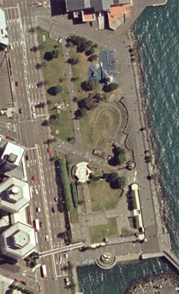
 This is our home:

Wellington panorama at nightWho needs more than a bed and a bathroom when you have all this on your doorstep?

Wednesday, November 14, 2007

Mystery bar number 66

File under: , ,

I was kind of hoping that someone would mistake the previous mystery bar for Matterhorn, because the décor strongly reminded me of it. It certainly appears that Allistar Cox and his team have aimed for a darker and more minimal look for this, the latest branch of Mojo in Bond St, than in some of the other outlets. It also moves a little further away from the daytime café model, as it has a full kitchen, function rooms, beer on tap and is open in the evening towards the end of the week, all of which bodes well for the upcoming branches at Kumutoto and in upper Cuba St.

Mystery bar #66 - the barA lot of my recent mystery bars have been more like cafés with alcohol than "real" bars, but that doesn't apply to this one. It doesn't open until well into the evening, and while some food is obligatory, it's all about the drinks. They specialise in cocktails, with an interesting list that twists and tweaks the classics without getting too silly. They're especially strong on Champagne cocktails, but there's a very comprehensive spirits selection and experienced staff who should be able to mix you any classic drink as well as leading you pleasantly astray with their own concoctions.

It's a themed bar in a way, but they haven't gone overboard. The décor is mostly a mix of elegance and retro kitsch, though there are a few prints and quotations around the walls to remind you of their concept, and a soundtrack and video loops that are a little more individual than you would expect for this part of town. One might almost have hoped for a little more surrealism, though I suppose after a few drinks the split-level floor, mirrors and carpeted walls might become disorienting enough on their own.

Mystery bar #66 - patrons and custom chandelier

Monday, November 12, 2007

Building rumours 20: The Victoria Quarter


There hasn't been much publicity about this, but it could be one of the biggest developments, residential or otherwise, to hit Wellington in a long time.

Victoria Quarter - the courtyard
It's called the "Victoria Quarter", and it's planned to take up all of the large vacant site that currently hosts the Sunday market, bordered by Victoria, Vivian and Willis streets. There's a bit more information on this property website, and larger pictures on this one. It's essentially an apartment development, though with retail on the ground floors. As I wrote earlier, this is already one of the most densely populated parts of Wellington, and this project will add several hundred apartments to the block.

Victoria Quarter - from Willis StAt ten or eleven storeys, it could seem rather massive, but in this context the height might not be inappropriate, given the taller Unicomm building to the north and the relatively wide streets around it. It could be seen more as a bookend to the high city stretching up Willis and Victoria streets than as an intrusion into the low city proper, which tends to be further to the south and east. It's also designed as a cluster of different buildings, with the southwest and southeast corners marked by colour and curves respectively, and each of the individual buildings has a reasonably deep and varied façade. While it's a lot of construction to happen all in one go, all of the above features mean that it will end up looking less like a monolith and more like a city block that has evolved over time.

It looks even better when you compare it to the original massing concepts mooted for the site, such as this "Wellington International Student Centre":

Wellington International Student Centre - early renderThat was presumably just a real estate exercise to see what could be wrung out of the planning rules, but even so, it was a particularly dire throwback to 60s housing estate planning: five anonymous slabs arranged haphazardly through the site, leaving drab fragments of useless leftover space. The current scheme seems like an admirably urban alternative, since it pushes all the mass to the boundaries, helping define the streets around it while leaving space for what could conceivably be a useful courtyard.

Courtyard developments aren't common at this scale (there are more precedents at 4-6 storeys), and I get the feeling that the bright sunlit space shown in the renders is rather optimistic. Nevertheless, it appears to be intended as a public space, with wide enough entrances to make it inviting as a shortcut. It might also be a solution to what I see as the one real possible downside of this development: the loss of the popular market. The landscaping shown in the render may take up too much of the flat space, but otherwise it might still be possible to hold Sunday markets in the courtyard. With the surrounding retail spaces fronting on to both the courtyard and the street, they could attract the sort of businesses (e.g. butchers, delis, speciality stores) that could complement the mostly vegetable-focussed market. It would be good to see the final version explicitly designed for this purpose.

Thursday, November 08, 2007

Bizarro world


The Greater Wellington Regional Council's inaugural Environmental Awards have just been announced. And among the winners, one stands out: the inner-city bypass project team. WTF?!

Granted, they won the very specific Nikau Compliance Award for "consent holders who are using innovative approaches to proactively exceed their compliance requirements to reduce or avoid adverse effects on the environment", and apparently they won "for their innovative measures taken to deal with groundwater and the treatment of stormwater". That's all very well, and I've got nothing against innovative water management, but this is a stunning example of not seeing the wood for the trees. Giving an environmental award to a project that poured millions of dollars and a huge amount of embedded energy into razing a neighbourhood and encouraging private car use just seems like a laughable exercise in greenwashing.

Wednesday, November 07, 2007

Waterfront fatigue


No doubt many of you have had your fill of waterfront posts, but there was a slew of ill-informed letters to the editor in today's Dominion Post that I felt compelled to reply to. There are too many specific errors and misinterpretations to fit into in a 200-word rant, and I thought I'd try to tone down some of my usual vitriol, so I tried to offer a constructive discussion of why good public space design is more subtle and complex than just leaving as much empty space as possible. I'll reproduce the letter below, but first a couple of specific responses that I couldn't fit in.

One correspondent opined that people who currently like the waterfront would not "feel the same once they realised they'd be sitting in front of four- to six-storey buildings, most of mirrored glass, looking directly on to where they were planning to relax". I'm not sure where he gets the mirror glass from, but here are some shots of people who somehow managed to relax despite the oppressive presence of buildings.

Relaxing at Wharf Plaza
Promenade beside Chaffers Dock
Relaxing at Kumutoto PlazaIt's worth noting that in each of these, not all of the ground floor space had yet opened to the public. Once the public space improvements and active edges are complete, these spaces will only get more popular.

Another writer says "Why the park requires updating is a mystery. The 'designs' [love the scare quotes!] depicted are hideous, with hardly any green space able to be used by the public". I'd say that the park requires updating because it's outdated, decrepit and not suited to the 21st Century, but if I said that I wouldn't be able to resist saying that those are the qualities that Waterfront Watch personally relate to. As for "hardly any green space", has this person even looked at the wide expanses of grass in the plans for Options B or D? Compared to a current aerial photo, there's little or any loss of openness, and while the others have less obvious lawn area, there's much more in the way of sheltered and varied recreational spaces. Anyway, despite my weariness over these arguments, here is my polite and measured reply.
One problem with debate about the waterfront is the use of simplistic assumptions rather than actual observations of how people use urban space. The quality of the public realm is not measured in square metres, but through a whole range of qualities relating to subjective experience, comfort, design quality and human interaction. For instance, people tend to congregate around the edges of spaces rather than heading for the centre, so that breaking down a space into a variety of intimate, sheltered places can provide more opportunities for public enjoyment than if it had been left as a featureless field.

There's also an assumption that commercial and residential activity has to be at the expense of recreation, when in reality they can enhance one another and create new interactions. Some also believe that it's best to have panoramic views from everywhere, whereas creating sequences of open and framed views leads to a much more interesting and varied urban experience. And an urban experience is exactly what the CBD waterfront should be: compact, complex and lively, rather than a simulacrum of outer suburbia.

Tuesday, November 06, 2007

Mystery bar number 65

File under: , ,

The previous mystery bar was never going to be all that difficult, given its highly visible location and the anticipation that preceded its opening. As Deep Red identified, and as I confirmed in my rosé roundup, it was indeed the new Zarbo at Chaffers Dock. It's primarily a deli with a café attached, but it has an interesting wine list, some good beers and as confirmed last Friday, they can even make a Daiquiri with a bit of persuasion. It really rounds out the selection of drinking and dining places at Chaffers Dock, and it could give that complex the critical mass of activity that it needs to succeed.

Mystery bar #65 - benchesToday's mystery bar is in a somewhat less high-profile location. It's long and narrow, stretching far back into the building, and has a variety of different spaces. The fitout, by one of Wellington's most fashionable hospitality architects, is dark and sexy, combining elegantly bare concrete with warm-toned wood and leather, with a few minimal flower arrangements to soften the look.

It's one of those places that crosses the boundaries, combining food, drink and coffee in a stylish but relaxed manner. It has long padded benches to encourage mingling, and who knows what might go on in the dark recesses of the back rooms? Overall, the vibe is European, but in a way that has become very distinctively Wellington.

Mystery bar #65 - beer tap

Monday, November 05, 2007

Drink of the month: Daiquiri

File under: , ,

A daiquiri at Sweet Mother's KitchenIt's well into November now, of course, but there was the small matter of 11 posts on architecture to get out before the end of today, so here's the belated drink of the month post. After several months of wine, spirits and even non-alcoholic beverages, it's time to get back to cocktails with one of the best-known concoctions from tropical climes: the Daiquiri.

In its classic form, the Daiquiri is almost simple: just rum, lime juice and sugar syrup. But as is so often the case with cocktails, simplicity does not always equate to ease or reliability, and you're likely to run across many mediocre and even undrinkable versions in your quest for perfection. That's partly due to the existence of often confusing variations, but can mostly be put down to a question of balance. It's even more of an issue with a Daiquiri than it is with a Martini, since while the flavours of gin and vermouth are known qualities, lime can vary with the source and season. Locally, we seem to have gone through a bad run with limes, resulting in many tooth-enamel-stripping drinks in places that should know better.

I mentioned confusing variations, and one thing that clouds the issue is the fact that the so-called "Hemingway Daiquiri" is usually some way on a spectrum between two versions: the Papa Doble and the Hemingway Special. The former doubles the rum and omits the sugar; while the latter also adds grapefruit juice and maraschino. Between all these variations, it's very hard to know what you'll receive, so it may be best to specify the exact ingredients and proportions to your taste (if you can do this without feeling patronising).

Regular readers will know that I don't have a sweet tooth, and that I can be a stickler for tradition, so you'll no doubt expect me to either ignore or excoriate the slew of alcoholic slushies known as frozen Daiquiris. But you'll be wrong: some occasions call for one to abandon one's inhibitions and good taste and embrace the tackiness. As the silly season of office parties and barbeques approaches, go ahead and raid the greengrocers for tropical fruit; go mad with blenders and crushers; and even (if you can mention the phrase without sniggering) buy a packet of rimming sugar. If you want to maintain a shred of dignity, though, go easy on the sugar, use fresh ingredients where possible, and remember that you still should be able to taste the rum.

So, where to sample the Daiquiri in all its glory? Any place with a Latin American theme should have quite a range: Flying Burrito Brothers and Havana spring to mind, and I'll have to give Buena Vista Social Club another go to see how they're faring these days. Good Luck and Imbibe have been known to feature interesting variations, and the usual suspects (Matterhorn, Motel, Hawthorn Lounge) should all deliver good classic versions (though I have to admit that my last Hemingway Daiquiri there was a bit tart for my taste). For the flamboyantly cheesy (though hopefully not literally!) fruit Daiquiris, I suspect that the likes of Electric Avenue and Boogie Wonderland would have wide ranges of sticky retro concoctions. If there are any other places out there that are notable for the quality or uniqueness of their Daiquiris, please let us know.

Last chance feedback


Feedback on the Frank Kitts Park and Kumutoto schemes closes today, so if you haven't done so, today's your last chance to pop down to the Waterfront Project Information Centre and give your feedback. If you can't make it in person, just add your comments here or to the posts on individual schemes, and I'll print out all the posts and schemes later this afternoon and post the lot in the suggestion box.

To summarise, here are my incredibly oversimplified thoughts on each scheme.

Frank Kitts Park
  • Option A: Safe but practical, though the location of the Chinese Garden might be problematic.
  • Option B: Nice clean geometry, with a good tight cluster of buildings, but too much bleakly flat lawn.
  • Option C: One for the hippies.
  • Option D: A good crisp design, but with too much blank lawn and a Chinese Garden that breaks the rules a little too much.
  • Option E: Good spatial arrangements, with some bold touches.
If I had to choose one scheme it would be E (with some of the flow problems and bottlenecks addressed), though A is pleasant enough and I wouldn't object to it winning.

Kumutoto
  • Option A: Some interesting geometry, but the architecture is not compelling enough to make up for its urbanist shortcomings.
  • Option B: Bold and inspiring, but wildly impractical for the climate.
  • Option C: Cheeky and potentially iconic, but perhaps derivative and definitely a political minefield.
  • Option D: Quirkily appealing at Site 8, handsome and urban at Site 9, but unconvincing at Site 10.
  • Option E: Some interesting deviations from the brief, but impractical and overscaled.
  • Option F: Striking design and inventive spaces at Site 8, pleasant and practical at Site 9, and quietly innovative at Site 10.
Since picking and choosing is definitely on the cards, I'd go for Option D or F at Sites 8 and 9, with either Option F or a heavily modified version of Option B at Site 10. While I'm at it, I'd also insist on a ground floor indoor sports space at Site 10, and let Site 8 interact more directly with the water (perhaps with a basement-level "old sea wall bar" after Option A).

Sunday, November 04, 2007

Kumutoto Option F


The final entry is much more conventional, and sticks fairly closely to the brief. The one real gesture towards the spectacular is at Site 8 where a cantilevered "lantern of blue" reaches out to the water.

Kumutoto Option F - site 8The first precedent that sprang to mind was the Seattle Central Library, though that's mostly due to the diamond grid. Other aspects of it reminded me of Will Alsop (again) and even the UN Studio design for Site 4 with its V-shaped plan. The most unusual thing about it, though, is its relationship to the public space. The scheme proposes a new pond, and a cutout with small boat ramp, and this building is suspended over both. There's a cafe near the middle of the building, with views across the boat ramp and between large fin-like columns to the harbour. This creates some unusual spaces, and edges that are far from the typical "active edge" but could nevertheless create an intriguing arrangement of promenades.

The site 9 building is relatively conventional, and in many ways is similar to Option D's "crate", but with brick panels rather than wooden slats to make the echo of Shed 13 even more explicit. It has a series of exposed stairways on the eastern elevation, which look a bit fussy to me, but otherwise it's a good building with a lot of visual interest.

Site 10 looks very conventional, and even boring, but it has some subtle touches that I'm starting to warm to:

Kumutoto Option F - site 10At 7-8 storeys it's slightly over the height specification, though that depends upon floor height and it's not too far out of scale. There are two "crevices" that slice diagonally through the building, allowing natural light deep into the plan, while varied arrangements of angled balconies, brick panels and sliding sunscreens animate the façades. The folded roof appears to be planted, and there's a combination of conference, garden and café spaces that make more of the roof space than most buildings do. It's far from spectacular, but there's no need for spectacle on this particular site.

Overall, it's a decent, friendly sort of building, one that responds to its neighbours without imitating them, would be good to work in, and would be more adaptable than the standard large-floorplate office block. Quietly innovative without being flashy, it's the sort of design that would be most welcome in place of some of the mediocrities underway in Thorndon, and may indeed work very nicely here as well.

Kumutoto Option E


Option E, entitled "Encounter", deviates quite markedly from the brief in both plan and heights. On the overall plan, you can see buildings on sites 9 and 10, but site 8 appears to have been left as an extension of Kumutoto Plaza. Or has it?

Kumutoto Option E - the planThe rectangular outline across site 8 indicates a slab-like extension of the site 9 building, suspended four floors above the ground. It's not cantilevered but supported by columns, and most of it enclosed by enormous sliding glass walls to create something between an atrium and a winter garden.

Kumutoto Option E - winter gardenIt's all very spectacular, and on a day like the one pictured in the renders it could be a very pleasant place. But of course, no-one ever renders a typical Wellington day, and I wonder just how often those gargantuan Ranchsliders could actually be opened up.

I think, though, that it's the Site 10 building that would be most controversial. At 12 storeys it's about twice the height specified in the brief and framework:

Kumutoto Option E - both buildingsThe setbacks at the southern end helps break down the mass a bit, and the roof gardens are a nice touch. But the glass that wraps around the rest of it, while adding some visual variety, just makes it look monolithic again. It could be quite a spectacular building to be inside, with variable-sized floors arranged throughout tall atria, but from the outside it's too dominating for the context. It could work well elsewhere in the city, and perhaps a drastically scaled-down version would be appropriate here, but this is the wrong building for Site 10.

While I admire the willingness of the panel to look at entries that break the rules when there's a compelling design reason for doing so, I don't think that this scheme demonstrates such a rationale. Perhaps it just shows that there were good reasons why the brief was written the way it was. For instance, the Site 10 height limit was set to match the podium of the NZ Post building behind it, and seen from a distance there are a lot of precedents for 5-6 storeys as a consistent height across the waterfront as a whole. Also, the site footprints weren't set arbitrarily, but to create sheltered spaces and an urban network of lanes and squares. The framework would be worth reconsidering if it stood in the way of buildings of such unique architectural brilliance that to pass them up would be a crime; but these are a long way from that.

Saturday, November 03, 2007

Kumutoto Option D


In contrast to some entries, this one sticks fairly close to the brief's defined sites and height limits. It also treats each site totally differently, and in the case of Site 8, proposes a building that's completely out of the ordinary: something called "sprout".

Kumutoto Option D - SproutI takes a while to work out what is going on here. There are two relatively conventional floors, an enclosed apartment level and a relatively open office level, suspended above the ground. The ground floor is an art gallery, open apart from sliding glass walls. Through these levels there rise several irregular "stems" containing stairs, lifts and services, rising to a fourth "floor" of interconnected pods. Each of these pods has a different theme and green building function, from wind and solar power generation to rainwater collection and roof terrace, while the interiors house breakout spaces, meeting rooms and a café.

At first I thought this was too wacky to take seriously. It also leans heavily on at least two architectural precedents: Will Alsop for the suspended slabs and blobby breakout pods; and Toyo Ito for the irregular trunk-like structural/service columns. As it grew on me, though, I saw that it combined to produce a building that is both excitingly unique and surprisingly appropriate for the site. The sense of lightness and transparency matches the water's edge location, while the organic allusions could either refer to kelp or forests. If some of the more fiddly suggestions (such as having each stem clad in a different material) were to be toned down, I think that this building could be a delightful and invigorating addition to the waterfront.

On Site 9, this team has gone for something completely different. Where "sprout" is organic, airy and fanciful, "crate" is solid, tactile and grounded. Based on the concept of wooden crates stacked on the wharf's edge, it mixes residential and live/work spaces to create a densely textured mass.

Kumutoto Option D - cratesI like this a lot, too, but for the opposite reasons. With mixed use, active edges and a solid wall to help define the streets, this is an essentially urban building. The living and working spaces are externally signalled by sliding screens with different directions and types of timber, bringing depth and variety to the surface. Yet it's a simple enough volume that its sloping roofline defines the height transition from Shed 13 up to Site 10, and the rounded northern end is an effective way to both turn the corner and mark the Whitmore St gateway. I'd prefer a little more shelter around the edges, but otherwise this is a high-quality and interesting building that doesn't need to shout about it, and fits well into the urban context.

Site 10 is different again; this time based upon two disparate concepts, "honeycomb" and "crane". The crane theme is obviously derived from the working port nearby, and serves as a structural organiser: the office space takes the form of containers suspended from giant cantilevers. The honeycomb concept seems to be rather arbitrary, and refers only to the wall of transparent bubbles (presumably ETFE or similar) that defines the Waterloo Quay edge.

Kumutoto Option D - honeycombI'm less convinced by this one. The city façade is certainly spectacular in a high-tech way, but the view from the water is of a fairly dull rectangular box. The plans show active edges and public atria, but I just get the feeling that it wouldn't be as appealing a pedestrian environment. That's the problem with these persistent industrial metaphors: container wharves aren't usually people-friendly environments, and in this location, the buildings should work hard to create an urban condition rather than aping the symbolism of industry.

Nevertheless, the fact that each site is treated differently allows the panel to pick and choose. I'd be happy if the designs for either of the other two sites were chosen as part of the overall scheme: either the unspectacular yet subtly clever and humane "crate", or the engagingly mad and really very cute "sprout". Iconic doesn't have to be grandiose.