Nightmare on Taranaki St
 For those of you who wonder how something as ghastly as Q on Taranaki could be okayed by the planners, the answer is: it hasn't. I have it on good authority that the proposal is still at the "pre-application" phase, and that the council's urban designers have told the developers that their design is utterly wrong for the site, and that not only should they rethink their plans but they should try to retain the Murdoch building. Furthermore, the current owner of the land has yet to sell.
I don't think this is the last we've heard of this proposal, but there's some hope that the system can work for the benefit of Wellington's urban fabric. It does seem odd that ArcHaus would promote this design on their website at such an early and speculative stage: surely they're not proud of this design?
Further down the road, though, is another ugly building project that is definitely too late to stop. The steel frame for the Bellagio apartments next to Molly Malone's has almost reached its full 12-storey height. Hold on, wasn't it supposed to be nine storeys? Yes it was, but no longer: the excavations unearthed the remains of Te Aro pa, and the owners were presumably allowed some extra height to compensate for not being able to have underground carparks. It's only now that we've got to see the new version, and here's a rough comparison between the old render on the left, and a new one (taken from a billboard on the street) on the right.
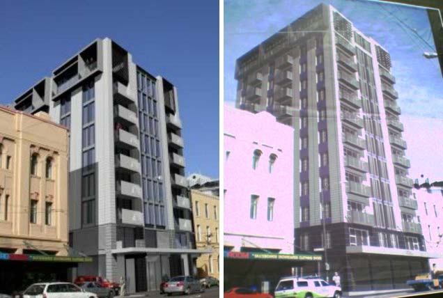 As you can see, it was never going to be exactly pretty. But at least in its shorter incarnation it was less imposing, and something about the detailing seemed to break up its bulk a bit more. It now seems more monolithic, and reminds me of Rutherford House by the railway station, which despite the best efforts of its refurbishers has just served to prove that you can't make a hippo attractive by slathering on some orange lipstick.
But the worst thing about it is that, like the twin lumps of Q, it's clearly not a work of architecture: it's a maximum allowable volume diagram with some balconies slapped on. Twelve stories needn't have been entirely out of context here, if only the building could have exhibited the merest whisker of grace, elegance or imagination. As it is, it looks like one of the Ministry of Works' worst sixties efforts in Thorndon. Wellington doesn't have many physical traces of pre-European occupation, so retaining the pa remnants was essential, but surely there was a better way than this. It smacks of archaeological blackmail: "Give us some extra storeys, or the whare gets it".
posted by Tom @ 5:02 pm
![]()
![]()


18 Comments:
I think that Murdoch building would look pretty good with a bit of a spruce up, and it's also nice to hear those dreadful Q apartments may never get built. I am still holding out hope that the Bellagio will turn out better than it looks in those renders. Maritime tower as well as that new hotel across the road both look pretty decent on real life even though i thought the designs were pretty average.
I think the images of the Q apartments were produced by ArcHaus to help sell the land, as a marketing tool to potential buyers: "here, look what is possible on this site".
ArcHaus are a very successful practice, not necessarily because of design quality, but because they produce exactly what the client/developers want.
Blerugh, that one next to Mollys is pretty bad. Much like almost all of the apartments popping up around Taranaki St really.
Reminds me of the same kind of "design" asthetic which produces the town houses down Aro St. Actually its almost as bad as the horrendous brick bungalow things you see in lots of rural towns' newer developments.
Raffe: yes, that seems to be a possibility, though if they and the devlopers are talking to the council about consent applications already, things may have got a bit further along the process.
"ArcHaus are a very successful practice, not necessarily because of design quality, but because they produce exactly what the client/developers want."
Some of their stuff is actually very good: the Kate Sylvester shop in lower Cuba St is one of my favourite new buildings in Wellington. In fact, it should have been taller to fit into the context, but they seem to have been overly deferential to the windows next door. I guess it's easier to be spatially playful in a small lowrise development than in a multi-storey block with more engineering challenges.
Jimmy: "Reminds me of the same kind of 'design' asthetic which produces the town houses down Aro St." The problem I have with a lot of those is that they're too faux-historical, trying to slap some sort of Victorian detailing onto new buildings. That's pretty unavoidable given the character rules and the locals: the one really good new building in the Aro Valley (the Epuni St house by John Mills) got right up the residents' noses!
Anon: "I am still holding out hope that the Bellagio will turn out better than it looks in those renders. Maritime tower as well as that new hotel across the road both look pretty decent on real life even though i thought the designs were pretty average."
Yes, it's astonished me how many recent buildings (I'd add the Museum Apartments) have looked better than the renders: normally the job of renders is to make the design look better and less obtrusive, but all of those buildings were stuck with very pedestrian renderings that didn't capture the materials very well.
Maximus: I agree about the awfulness of Bellagio (and even its name is cringeworthy). I disagree about the historical value of the whare, though: they may not look like much, but given that almost all traces of Maori habitation have been wiped out from the city, any physical remnant from those times is to be treasured.
There must have been some better solution, though. I don't suppose there was any way for the council to tell the developer "tough luck, you've struck some archaeological treasures, so you won't make as much money from the site." Isn't the risk of building one of the ways that developers justify their profits?
Emphasis on the 'not necessarily'. The Kate Sylvester shop is a very good little building.
You are right about the scale issue, architects (especially in this country) are often flummoxed by bigness, although I have ranted about this before!
"Tutankamen with several thousand years of history and several inches of solid gold is indeed a treasure worth treasuring. Stumps of ponga are not so."
Local Maori might think differently about the only physical remnants of what may have been the homes of their ancestors. I agree that they're visually unimpressive, but with NZ's brief European history and a Maori history that used mostly perishable materials, we've got a different context, and these are unique.
"t is not as if the developer would have been surprised. He knew that the site was on the old Pa. He had a heritage report done, which reinforced teh likelihood of finding some remains. The law says if you find some treasure, it should be kept in place if possible. Therefore, he should have no grounds for the extra floors. The Council should just say to the developer - tough shit, you've found a whare. Keep it, and keep to your height."
I agree totally!
"Why can't the Council just have some guts and say, "No way to 2 extra floors" and "No way to such a crap design" ?"
As fasr as I'm aware, that's what they're doing in the case of Q.
I have a unique perspective on the Bellagio - every morning I walk into my kitchen to see builders less than 5 meters away hammering away on the site.
Being located in the building on the left from the pictures, down the side alley and at the top - we stood to get some sun with the original design via our skylites, but now we will certainly lose the lot.
Anon: lucky you! Are you in the factory section of the Vicino apartments, on the other side of Halleys lane? Those ones on the southern side were never as blessed with light as the northern side, but the Bellagio, even in its earlier form, was always going to obliterate most of that.
"to me, that's just insulting to the iwi, and not worth bloody having" - the Tenths Trust were heavily involved in process, and while one always has to take quotes in a press release with a grain of salt, phrases like "We are very excited about what has been achieved" don't sound like the words of an insulted iwi.
You're right, though, that the developers shouldn't have been given so much extra height to compensate. And they certainly shouldn't have been given a bloody award for it!
On a slight tangent, what do you think of the other development battle that the Tenths Trust are having at the moment? They want to build an office building on their land in Pipitea St, but the Old St Paul's people are complaining that the shade will "damage the structural integrity" of the church. Old St Paul's is certainly something that we don't want threatened, but does this sound like a real problem or just hyperbole from the (pakeha) heritage people?
"The problem I have with a lot of those is that they're too faux-historical, trying to slap some sort of Victorian detailing onto new buildings"
Oh I couldn't agree more, I suppose the look I was attempting to describe can be summed up with 'ugly'.
The whole Aro st thing really ticked me off, mostly because there seemed to be a move to impose a design consistency that just did not exist on the street. And so the faux-historical buildings look far more out of place and icky than all the rest of the houses which actually do look historical because they were designed according to the styles of the times they were built.
I love the way old buildings look, not because I think the designs are classic, but because the design says 'I am old'. For that reason I have a weird appreciation for 60s & 70s era concrete cubes.
"it sounds like a beat up to me"
My thoughts exactly! I'm no expert on the structural properties of 100-year old wood, but to suggest that a few extra hours a day of shading will cause the whole thing to collapse seems a little far-feteched to me.
"Do you have any info on the proposal you could post?"
There was a small rendering of it in the DomPost last year, but you couldn't tell much other than that it was very slick and glassy with an interesting pointy end (I think that's the proper architectural jargon). I'm pretty sure it was an Athfields design. Perhaps the design variations being sought by the St Paulites will actually make it better: sometimes the slopes and angles introduced by sun and view planes can result in much more interesting shapes than the old "extrude the site plan to maximum height" typology.
Something else I've heard from the Tenths Trust is that they want a dedicated building for the Treaty of Waitangi as part of the "Capital Precinct". Sounds like a great idea to me (better than having to navigate the depths of the Archives building), but I can imagine both Kerry & Helen blowing gaskets at that suggestion.
Jimmy: "I love the way old buildings look, not because I think the designs are classic, but because the design says 'I am old'. For that reason I have a weird appreciation for 60s & 70s era concrete cubes."
I very much agree, and there are a couple of old modernist buildings in Aro St that I like as much as the old cottages. One is the little two-storey box next to the School of Philosophy (IIRC). The other is the Pukehinau Flats. Half of me thinks they're ghastly, but the other half things they're gloriously mad. Does anyone know whether they're by Roger Walker? They look like they're either his work, or by someone heavily under the influence (of Roger, of course).
Right at the bottom of Aro St, between Epuni and Willis. You'll recognise them straight away from this photo: they're the ones that look like blue lego.
"They're the ones that look like blue lego."
Im equally in two minds about them, whoever came up with the design must have been as mad as a hatter. Especially when they've been built as low cost housing. Wonder if the same person is responsible for the tower opposite Preston's on Arlington St? Unfortunately for the occupants its always been painted one shade or another of puke.
"Wonder if the same person is responsible for the tower opposite Preston's on Arlington St?"
That's definitely by Ian Athfield, from 1970. David Kernohan in Wellington's New Buildings referred to it as "the idiosyncratic sight of a proposed Philippine's squatters town (he had recently won a major housing competition there) set atop and around a mundane concrete frame. It was a tentative attempt to apply domestic forms and innovation to a large scale building. While it provided some interesting shapes it lacked coherence because it did not address the large building as a whole. The rhythms, interesting of themselves, proved discordant."
Lewis E. Martin, in Vivid Buildind, was considerably kinder: it "has a calm regularity and a gently syncopated rhythm of windows and bands; until it suddenly explodes, at the top and one end, into a whole village of shapes."
I haven't been able to find anything written about the Pukehinau flats, which leads me to believe that they're not by Ath or Walker: porthole windows were just "in" at the time.
"Unfortunately for the occupants its always been painted one shade or another of puke."
Yup. There's a photo on the council website of the Puke(hinau) flats painted an uninspiring off-white, implying that it's the current colour scheme that transforms a clumsy and dated building into something really quite jaunty. I'm not sure if the same would work for Arlington, though: I tend towards Kernohan's judgement on that one.
Ahhh, it makes total sense that its an Athfield design. I think the part that I hate the most about it is the ugly glass conservatory type things on it smilar to that which kept sprouting outside once perfectly adequate houses all around my home town.
does anyone know who the archrctect of "Puke on "Willis street.
Mary
Post a Comment
<< Home