Skin deep
 Maritime Tower at 10 Customhouse Quay was controversial from the start, with some allegations that the resource consent process had been manipulated in an unsuccessful bid to get a couple of extra storeys. Now that it's been complete for a while and is starting to feel like part of the cityscape, it's time to appraise its effects.
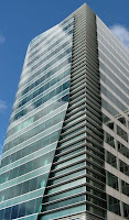
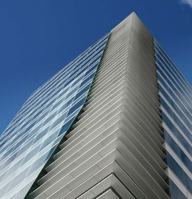
There's a lot to like about it. While the overall massing is unremarkable, the surface treatment lifts it above what we've come to expect from a spec office building. The "sail" is not quite as dramatic as one might have hoped, but it emphasises the curve of the northeast corner and helps give it an almost Moderne streamlined effect from some angles. From a distance one could almost get the impression that it has a slender lenticular plan rather than the near-square plot of the actual building, though this illusion disappears rather rapidly on approach. The blue-green glass, while it's starting to become a cliché, is quite appropriate for the near-waterfront setting and is one reason why, in my opinion, the real thing looks significantly better than the renders.
 It's still far from perfect. While the quality of detailing is generally what lifts it above the norm, there are a couple of false notes. The top of the sail, where it clears the rest of the building, has some clumsy joins. The corner of the tower is faceted, since the window panels are flat, but the pale blue glass that wraps around the verandah is actually curved, and to my eye the effect is quite dissonant.
 Worse than that, the southern elevation is almost completely blank. I know that this anticipates the possibility that another building could one day be built right up to this edge, but in the meantime we're stuck with a looming grey wall for what will be the most commonly seen aspect of the building.
Above all that, one thing grates with me in particular. While Conservation House has attracted some well-deserved praise for its "green" features (locally from the Architectural Centre, and internationally from Grist.org), and the Meridian HQ looks like it will be even better once it's complete, Maritime Tower plays with some of the imagery of green design without delivering. If I remember correctly (and it's hard to tell, since the pages about this project have disappeared from Warren and Mahoney's website), the sail was originally intended to have been part of a double-skin façade. It now seems clear that this element is now purely ornamental, as it's sealed at the bottom and it looks very much like there's no second curtain wall behind it, meaning that the tower will have to rely on mechanical ventilation. Also, the horizontal louvres are too shallow and in the wrong places to provide any useful shading.
It's perhaps a sign of how little we've come to expect from commercial architecture that, despite all my grizzling, I actually rather like it. There are many angles from which it's surprisingly delicate or dramatic, and it has subtleties of colour and rhythm that set it apart from the run of the mill. Is it better than the modest historical building that it so controversially replaced? I'd tentatively say yes, based as much on the extra density and activity that it will bring (a café will open on the ground floor next month) as on architectural merit, though I suppose that fans of stripped classical won't agree. It could have done with being either narrower or taller (perhaps those extra floors would have been a good idea after all?) to give it more appealing proportions, and the courage to have gone through with some real environmental design rather than cosmetics, but nevertheless it's a lot better than it could have been, and a huge leap ahead of most of the apartment towers that are on the way. Perhaps we can now look at this as the bottom line for half-decent office design, and demand greater things from whatever comes next.


7 Comments:
Having had our office move from BP House to ABN-Amro, formerly Castrol House to Fulbright House in the last year, I've had a lot of exposure to this building and this area in general. It's not an eyesore, and that's pretty much all I hope for with new corporate towers to be honest. I kinda like it. I always thought it was a little pedantic to complain about a pretty inoffensive mid-rise glassy tower on the waterfront when right next to it is a Shell/Mobil, one of the ugliest blocks in the city and on the other side that big awful grey monolith which somehow takes up 3/4 of that block.
But I don't hate it.
"It's not an eyesore, and that's pretty much all I hope for with new corporate towers to be honest."
True. Wouldn't it be nice if developers and owners actually took some pride in their buildings? There was a time when it was a source of great corporate and individual kudos to have the tallest or most spectacular building; now it's all about rentable square metres, and external appearance doesn't seem to be a selling point.
On the other hand, the property company's website actually describes the design as "iconic" and even "avant garde". Oh, puh-lease! Do they really believe that?
"Having had our office move from BP House to ABN-Amro..."
Incidentally, do you know anything about the changes on the ground floor? There's a retail space being created from what was a funny little "garden" on the corner, and I've seen it advertised for lease as a potential cafe space. Do you know whether there's a confirmed tenant?
perhaps someone from WAM would like to say what happened with the ESD initiatives that are so obviously missing from this building? It held out so much hope - its all been dashed against the shore - its just a big dumb box after all, with single glazing and no external louvres, and presumably air conditioning whirring away, chewing up the energy like there's no tomorrow... which, if we were all to build buildings this inefficient, there won't be...
"right next to it is a Shell/Mobil, one of the ugliest blocks in the city"
I remember when I was in DC not seeing many gas stations, they were mostly invisible. The guy I was with told me there was some kind of constraint on either building gas stations within DC or on their design. Not sure if its true or not, but the gas stations I do remember were all quite small and old fashioned looking, rather than the large supermarket plus gas pump type set up.
w/r/t ABN Amro building, I saw the same advertisement you did and the property manager/maintenance type guy that used to wander around couldn't tell me anything further in our brief chat in the lift. There's actually another little office/retail space right next to it (to the right of the entrance) which has just been vacated too. So yeah, sorry, no help.
I couldn't imagine the building owner at ABN AMRO spending any money on this space (and quite a bit looks like it has been spent) without a confirmed tenant. I heard it was to be a "cafe-bar". I'm not crying myself to sleep about the loss of that rubbish tip... err... garden...
"I couldn't imagine the building owner at ABN AMRO spending any money on this space (and quite a bit looks like it has been spent) without a confirmed tenant."
That seems likely. I wonder whether it's a bit like the space above Untouched World on the corner of Featherston and Brandon streets: there was a tenant lined up for the space, but they pulled out before it was finished. The space has only recently been let, and according to the license application it will be some sort of pub or bar called "D4", run by a company called "Your Round Ltd". I don't know any more about it, but it doesn't sound too promising!
"I'm not crying myself to sleep about the loss of that rubbish tip... err... garden.."
I agree: I've often though that the corner was a waste of space, and that it would be easy to insert some sort of retail or hospo space their. A few people grumbled when those corner spaces (there were quite a few on Featherston St and Lambton Quay) started to get filled in, but really, a shop or cafe with an active edge makes for a much better street than those grubby little corners of "public space" that were pretty much useless.
If s cafe or bar does go ahead there, then along with the Ground Floor cafe in the BP building and Trade Kitchen (opening next month), there will be three consecutive corners of the currently somewhat desolate Customhouse Quay with a little bit of life. That will do more than the "Greening the Quays" to help the Quays become a proper street rather than a mini-motorway, and improve the connections between the Golden Mile and the waterfront. More please!
Post a Comment
<< Home