Building rumours 8: 140-144 Vivian St
There's been some uncertainty for a while about the future of the vacant lot at 140-144 Vivian St. It used to be home to one of Wellington's red-light institutions, which was already slated for demolition when it mysteriously burned down. Since then there have been occasional advertisements for an apartment block with the bizzare name of "Duel on Vivian", but for the last two years the site seemed to be an entry in an urban weed-growing competition. There are now some new renderings available, and the proposed building now looks quite a bit different.
 The first difference is that the building appears to be lower, at six storeys rather than seven. Instead of having an imitation second storey at street level, with balconies behind that and the main tower set back, the building goes straight up from the street with a setback at the penthouse level. The Vivian St elevation is detailed very differently, and while it's hard to tell from these images, it looks like the slight indentations along the sides weren't present on the first version, which surely would have been asking for trouble if the neighbouring sites were developed.
There are quite a few things I like about the new version, and some of them are more visible from a different angle:
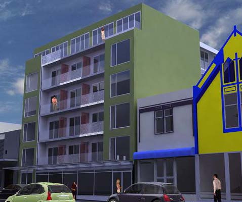 First of all, the height is more appropriate, certainly much more so than some of the things proposed for Taranaki St. The setback of the top floor, and the inset balconies in the middle, break down the mass and stop it looking like a simplistic lump. The insets at the sides give the impression from the street of a much shallower building, rather than one that goes far back into the block, further reducing its apparent bulk. There are also some subtle (if somewhat arbitrary) departures from symmetry, making it less predictable. Above all it seems honest, with none of the floorless fake balconies or suburban pitched roofs of the Knigges Ave atrocity across the road.
Not everything's good, of course. The penthouse floor is poorly resolved and looks like an afterthought. The ground floor looks squashed, and the verandah is too low compared to its neighbours. There are still some big blank walls visible from the street, though presumably they'll be covered in billboards before long. And what's with that sludge green colour scheme?!
So, this is far from a work of architectural genius, and it's best described as very average. But if this were the average standard of new residential developments in the inner city, I think we'd be a lot better off than we are at the moment. I don't think we want a city crammed with architectural show ponies, all clamouring for attention and striving to be different from their neighbours. Most great cities are full of buildings that individually are dull to the point of invisibility, but that together make coherent and liveable streetscapes.
It certainly would be a nice change to have a few Wellington apartment buildings that aspired to greatness, but overall I think that what would benefit our city most is an improvement in the quality of the average building, from mean and almost wilfully uninspired to unassuming but decent. This building could certainly be better, and with very little effort it could be a quite distinguished addition to the street. But even as it is, with the passage of time and the character that only comes from human habitation rather than architecture, a district composed of buildings a bit like this could become a great high-density neighbourhood.
posted by Tom @ 5:03 pm
![]()
![]()


4 Comments:
Nice article Tom, certainly Vivian Street could do with some changes because nearby Ghuznee is coming along nicely. By the way have you noticed Century City have put up some bit posters on the old Deka builing on Cuba Street with arrows poiting in each direction. Perhaps that $60 million development is not to far away - that's one i'm looking foward too.
maximus, seems to be an Archaus job, the floor plan on the real estate website has their title block on it...
Archaus eh... how do these guys get all the work, they're hardly what you would call 'quality'. Total crap might be a better name for most of their work.
Yes, you can just see the Archaus logo on the plans. I suppose they get the work because they seem happy to do whatever the developer wants, with no fussing around with trivialities like aesthetics, quality public realm, amenity for the residents. Most of their stuff seems to be entirely developer-driven, trying to squeeze every saleable square metre outof the allowable envelope while minimising costs. The one exception is the Kate Sylvester shop on lower Cuba, which I think is a really lovely and spatially interesting little building.
While this one doesn't seem too bad (certainly compared to Q), I wonder whether the recent changes to the design have been forced upon them by the planners. Does anyone know?
And completely off topic (or is it?): for the first time I got a real word for my word verification: "agony".
Post a Comment
<< Home