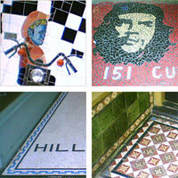
A rich mosaic
 I've long been a fan of the Left Bank for its good urbanism and variety of independent shops. Some people criticise it for its so-called "cheap" architecture, and while in general I think that the use of humble materials is appropriate for the Cuba quarter, I have to agree that the concrete bases of the verandah columns do look rather stark.
I've mentioned before that I have enough of a Modernist sensibility to be wary of the arbitrary use of decoration, especially when a developer whacks on a few pseudo-Classical details to make it look "classy". On the other hand, I'm a sucker for quirky and individual adornment of buildings, especially when they give a sense of the activities carried out within. Thus, I'd like to suggest the following: the owners of the Left Bank could get together with the shopkeepers and local artists, perhaps with some council funding or promotion, and decorate these columns with mosaics or tiles representing the nearest shop.
 I know what you're thinking: we're not Barcelona or Lisbon, so surely the use of mosaics and tiles would be an inappropriate use of imported techniques, a desparate attempt to steal the colourful heritage of foreign cultures. But a look up and down Cuba St reveals that Te Aro actually has a long and living tradition of these arts. Many of the older shops decorated their doorways with intricate patterns of plain hexagonal tiles or glazed tiles with colourful floral motifs. Mid-century buildings often went for square tiles in muted colours. Since the 1980s, the favourite mode seems to be bright mosaics, often taking the "Cuba" theme very literally, and sometimes incorporating found objects ranging from bottle tops to headlights. I've posted some flickr photosets of mosaics and tiles from Te Aro to illustrate this rich tradition.
 Here's a rough mockup to show how a simple design could enliven one of the Left Bank columns. In this case I've chosen a chili to represent Satay Kingdom, but the point would be that each proprietor would work with an artist (or do it themselves, if they're keen) to create a design that represents their business, heritage or personality. In a street that contains a bookshop, a hairdressing salon, clothes shops, jewellers, and a chestnut roaster among others, this could result in a rich variety of designs. Offbeat Originals, with their retro ceramics, have already started with a mosaic on their floor, so this is a scheme that could add colour and local character to the street.
Update: last year I developed this idea a bit further, and designed a poster for the Urban Life Art Competition that proposed this as a community art project. My entry didn't get anywhere, but some of you might still be interested in the poster. The full version was A3, but click on the picture below to see a scaled-down, compressed (but still 311kB) image.


3 Comments:
That is a v. cool idea. And you know, until i looked at your blog and photos, i never appreciated how much interesting tile work there is already in the cuba quarter!
I wish they had taken you up on your idea. Especially with the historical precedent.
:) LOL!
Post a Comment
<< Home