Coulda been a contender
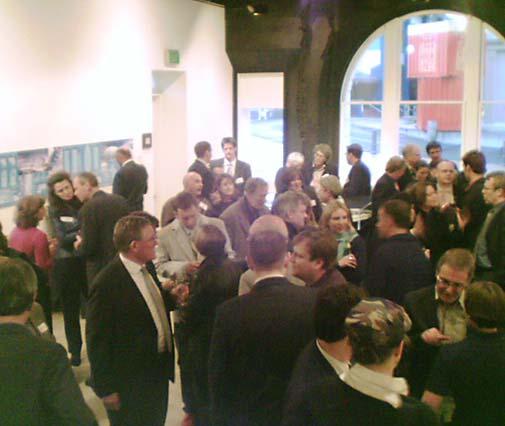 Last night the exhibition of shortlisted entries for the competition to design new buildings around Waitangi Park opened at the Academy of Fine Arts on Queens Wharf. There's an article with images on page A5 of today's Dominion Post (not on stuff.co.nz, unfortunately), but that's just a fraction of the plans and renderings to look at: if you're patient, you can download them from the Wellington Waterfront Ltd website. There's a lot to take in, and my head's still spinning with all the amazing images, so it'll take a while for me to sort out my own thoughts on which designs I'd like to see become a reality. In the meantime, here are my first impressions of the entries.
Overall, I was surprised by how little I was surprised. Some of the designs might be outlandish when judged according to most people's experience of the built environment, but to anyone with some familiarity with the various architects' work, their approaches seem quite familiar. It's a brief with some contradictory requirements: iconic structures, but at a human scale; creating an urban environment on sites that are severed from the urban fabric by parks and roads; creating density while making the most of sun and views. I think most of the entries struggled to resolve these issues, but I'll need some more time before I decide who I think has come up with the best solution.
Oosterhuis_Lenard: Rotterdam, The Netherlands (Download visuals)
This team promised spectacular form-making and didn't disappoint, delivering a slithering trio of blob-tastic shapes. Once I looked more closely at the uses of the buildings, the forms started to make sense, much more so than they would for standard office or residential buildings. For example, the eastern building had an overhanging crag that made a spectacular outdoor climbing wall, while on the other end it extended a curving pseudopod out over the water, reaching for the sun and views while gradually dematerialising into an open framework like a wireframe rendering. There's also an exuberant use of materials, including triangular wooden panels, green marble cladding and an irregular copper lattice over glass.
On the downside, I think this entry did the least to define positive urban spaces, remaining as three very separate buildings in space. They're certainly spectacular, but their overt blobbiness is starting to look very late 90s, so that by the time they are built we could end up with some very dated-looking attempts at landmarks.
UN Studio: Amsterdam, The Netherlands (Download visuals)
Lots of twisting and folding, as can be expected. It's a look that's becoming familiar overseas, not just from UN studio itself, but with echoes of Zaha Hadid, MVRDV and a bit of Niemeyer-in-a-blender. Not that there's anything wrong with that, but it's starting to get a bit too international to make a memorable icon for Wellington.
The strongest image I took away was of an interior atrium for the museum extension, one that looked like a molten version of the spiral in the New York Guggenheim. The buildings seemed like they were shrinking away from the public space a little, rather than embracing them, and there's a stark whiteness to the renderings, giving a clinical feel that might not be welcoming enough for such an important public space.
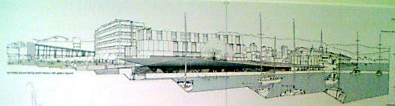
Shin Takamatsu Architect and Associates Co Ltd: Kyoto, Japan (Download visuals)
Ths entry was certainly spectacular, and its relatively simple forms (based upon ellipsoids) were much easier to grasp and take away as a mental image. The museum extension was an enormous translucent quilted zeppelin that had set itself down beside Te Papa. The transition from such simple Euclidean forms to the messy ordinariness of street life is always difficult, and while it rested rather arbitrarily on a much more linear surface structure, this did at least create a more urban streetscape than the previous two entries. Takamatsu had also specified a "contemporary" Chinese garden with glowing translucent landforms: this sounds spectacular, but I wonder how the Chinese community would feel about being dictated to by a Japanese architect?
East of Herd St, the buildings were simple blocks with an ellipsoidal bite taken out of them, leaving a well-defined elongated plaza or street leading to the Overseas Passenger Terminal. These buildings were punctured into swiss-cheese by hundreds of circles: some windows, some etched with Māori designs or corporate logos, with large holes at street level creating irregular arches around a collonade. Teathered above these were a couple of giant balloons, sitting straight upright in a calmly idyllic night-time rendering, making it very obvious that Takamatsu has never been to Wellington!
Architecture Workshop Ltd/Kerstin Thompson Architects Joint Venture: Wellington, New Zealand/Melbourne, Australia (Download visuals)
On first glance, this entry seemed disappointingly unspectacular, but that shouldn't be surprising given AW's discrete, considered, almost deferential approach to landscape. This is bound to be Waterfront Watch's favourite (or least-loathed) scheme, since the easternmost buildings are almost completely sunk into the ground, thus preserving views from the park towards Point Jerningham. The roof for these buildings then becomes a "folded ground plane" which the renderings show inhabited by playful children.
This is nice in theory, but the surface will be steel rather than grass, and the balustrades at the water's edge will have to be carefully handled to avoid spoiling the effect. Looking east from the promenade near Chaffers Marina, the roof plane is a striking blade that matches Freyberg pool and recalls AW's Peregrine winery.
In contrast to this deference, this was the only scheme to extend part of the transition building eastwards along Cable St, so Waterfront Watch won't like that. The museum part of this building consisted of a series of volumes held together by a 3D wooden grid or "carapace", one that slopes down towards the sea while a terraced Chinese garden rises to meet it. I like the slightly off-vertical columns of this carapace, and it reminds me vaguely of a hakari stage, the only multi-storey traditional Māori building type, which I've long thought to be a useful precedent for this site. The building seems to address Tory St, Cable St and the Chinese garden well, but as the garden rises, it presents the rest of the park with a huge, steep bunker-like slope of exposed aggregate: something needs to be done with this to make it more friendly.
John Wardle Pty Ltd Architects: Melbourne, Australia (Download visuals)
This was always going to be intriguing, and I think it will take a lot more study to unravel all the subtle allusions to local character that Wardle has embedded in his use of form, textures and material. The easternmost buildings spread angular arms around a dockside plaza that looks wonderful in the renderings, but would lose most of its sun by about 11am. They also create what I think is one of the most exciting features: a glassed-in "canyon" climbing wall that extends horizontally as well as vertically, wrapping around bars and restaurants to bring different forms of recreation together into what should be a spectacular space.
In a way, this is the most "urban" of the lot, creating three well-defined streets leading to the waterfront. I think he may be a bit optimistic about our weather and Wellingtonians' acceptance of closed spaces, though: it almost seems like he's trying to bring Melbourne's wonderfully intimate laneways to our waterfront, and while I'd love that myself, I don't see a lot of locals flocking to outdoor cafés in the space between Te Papa and the transition building.
That's a bewildering lot of contrasting styles and solutions to consider, and I don't envy the judges:
- Ian Athfield (architect, member of Wraight Athfield Landscape Architects Ltd who designed Waitangi Park)
- Professor John Hunt (Professor of Architecture at the University of Auckland, member of Auckland City's urban design panel)
- Chris McDonald (architect, urban designer, member of the waterfront Technical Advisory Group)
- Maggie Barry (broadcaster, gardening enthusiast)
- Fran Wilde (Chair of Wellington Waterfront Ltd)
- Jenny May (Te Papa Board member)
- design excellence
- creativity and imagination – elevating the city’s reputation as a centre of creativity
- expression of contemporary culture
- contribution to the critical advancement on architecture and urbanism
I'd like to see as many people as possible taking part in this process and actively debating what could be one of the most exciting developments that Wellington has seen for a long time. So, get on down to Queens Wharf to see the entries, leave your comments here to start a discussion, and remember to drop your feedback forms into the box!
posted by Tom @ 8:38 am
![]()
![]()


2 Comments:
This comment has been removed by a blog administrator.
Ah, the post I was waiting for. Well, since this morning when I read the paper.
Nice run down. In the paper the Shin Takamatsu entry looked the nicest, but you could only see the one building.
I also applaud the environmentally sustainable design aspect. Why build an expensive new building and then have to pay sh*tloads to heat it during every southerly breeze. National Geographic had a good piece about how to achieve this a couple of months back.
Post a Comment
<< Home