High-rise highlights
File under: architecture, Wellington
 The latest issue of Architecture New Zealand has plenty that's of interest to Wellingtonians. There's a five-page article by Christine McCarthy, celebrating Wellington's high-rise offices of the 50s, 60s and 70s, that elaborates on the walking tour that was part of last year's Architecture Week. Specific buildings include the Racing Conference building (voted "best dressed building" by the Architectural Centre), the Manchester Unity building (dubbed "a vertical cemetery" by Ian Athfield, for reasons which become obvious when you look at the façade) and the often-overlooked Petherick Tower on Maginnity Street.
Someone asked me why the article's photos were all in black and white, and I couldn't quite work it out myself. Is it to give the images a period feeling? Is it to follow the Modernist emphasis on form over colour and decoration? Is it to hide the slight grubbiness that's apparent in some of the surfaces when you see them in colour?
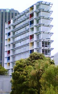
 Speaking of colour, there's also an analysis by Tommy Honey of the colourful new Summit on Molesworth apartment block in Pipitea. Honey likes it almost as much as I do, though unlike me he gets a chance to look inside and bemoans the formulaic layout of the apartments themselves.
There are more architectural critiques in My Wellington's City Space section. Jellicoe Towers is praised for its daring slenderness ("an undeniably inspiring and unsettling building") while the Von Zedlitz building gets a richly deserved bollocking. Criticising the architectural quality of VUW's Kelburn campus is a bit like shooting brutalist fish in a concrete barrel, though, and Dennis Welch probably made such an exercise redundant when he described the campus as "a series of planning mistakes cunningly disguised as halls of learning".
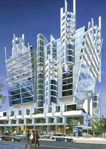
 On the other hand, if you're mad keen on high-rises and want to see more of them in Wellington, then you'll love SkyscraperCity's Wellington forum. I know that I often come across as a rabid advocate of high density and tall buildings, but even I believe that some of Wellington's recent developments are the wrong building in the wrong place, whereas some of the contributors' statements ("more glass = class", "great to see more cranes over Wellington") don't exactly speak of critical and nuanced urbanism. It's a very useful and interesting site, though, and it often posts renders of proposed buildings that aren't visible elsewhere on the web (such as this image of Roger Walker's explosion in a bling factory on the corner of Dixon and Victoria). Some of these may never happen (for example, does anyone have any insider knowledge of whether "The Needle" proposal opposite Post Office square is going ahead?), but even the abandoned projects give a fascinating alternative view of a Wellington that could have been.


2 Comments:
re the Bling - Ye Gods, i hope not.
re the Needle - got the bash ...
I've noted your reference on our site thread with a posting. You right about my comments re: glass=class. How i've changed since 2004..
Cheers,
'flyin_higher'
Skyscrapercity forums co-moderator
Post a Comment
<< Home