The real OPTion
Back in February I speculated that a particular scheme had been selected for the Overseas Passenger Terminal (OPT) redevelopment. I soon found that I was wrong, but it's only now that the chosen scheme has been announced. There's an article on page A3 of today's Dominion Post, and more detail is available on the council's website in preparation for Monday's meeting to discuss the plan.
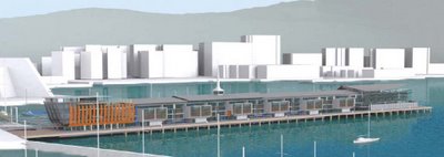
I'll write about this in more detail once I've had a chance to read the reports in full, but for the moment, here's the only available image:
 The architects are Ian Athfield and John Hardwick-Smith of Athfield Architects, and the developer is Willis Bond & Co, who also carried out the redevelopment of the Odlins building. The decrepit state of the existing structure means that this will almost be a new building, but with some of the more distinctive original elements (the spire, parts of the roof, the first floor interior at the seaward end) refurbished and retained. The ground floor will house the existing marine businesses and some restaurants, and there will be 95 apartments above. The result will have a similar footprint to the existing building, but will be between 3 and 6 metres higher.
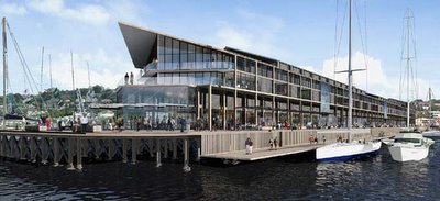
For interest, here are the other two shortlisted proposals. This proposal, by Bates Smart architects, was regarded as adding too much height:
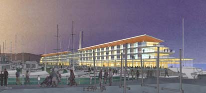
 I don't know much about the other option (below): I just found it on the website of architectural illustrator Stantiall Studio.


2 Comments:
Perhaps I'm nitpicking but in the second picture there doesn't seem to be any access from the ground level of the OPT down to the water level (i.e. the yachts beside the OPT).
To be honest, from the concept drawings available I'd say the design they've chosen is the ugliest of the three. The southern end in particular doesnt look particularly inviting.
Post a Comment
<< Home