Future waterfront 4: quality design
Here's the final part of my talk on ideas for the future of the waterfront, this time concentrating on the theme of "quality design". Most of my suggestions are fairly conservative, but there's one idea, based upon one of your comments, that is really out there. But I guess that's the point of a "blue skies" session!
Quality design
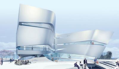
We haven't had the best track record of this on the waterfront, and a lot of that is due to the sort of misguided contextualism that led to Queens Wharf being designed as a couple of ugly tin sheds. The waterfront's true context is the city and the sea, not a collection of old sheds, and we need to encourage adventurous architecture that lives up to its surroundings. I still have my reservations about the Hilton design, but the Waitangi competition produced some truly exciting designs, and it should be Wellington's priority to make them happen.

I believe that new buildings should be environmentally as well as aesthetically exemplary. By building to a moderate density on a brownfield site close to public transport and city amenities, Kumutoto is already making a step towards sustainability. But while the Meridian building at Site 7 sounds like it's making some advances in green design, it's still possible to do better. I'd like to see other Kumutoto buildings incorporate features such as planted roofs, "living machines" (which are "vertical wetlands" for cleaning waste water), as well as solar and wind power. You could combine these with a public ecological museum, a shop and a research centre, but crucially the building should be a "museum of itself", putting its principles into practice.
If you really want to talk about "blue skies thinking", you could combine this eco-centre idea with one of the proposed special attractions: a viewing tower. There's nothing particularly "green" or special about a tower per se, but a "Wellington Wind Tower" powered by its own wind turbines and solar panels could be something unique. It needn't be very tall: the Ferris wheel that was here over summer was only about eight storeys high, yet it provided some lovely views. Kumutoto would be one possible location, where it could be incorporated into an office building, but if you want to get crazy about combining multiple functions, how about the south side of the Events Centre TSB Bank Arena?
At the lower levels, it could morph seamlessly into a bridge across to Willeston St, with the "green machine" vegetation acting as a public winter garden and the eco-centre providing human activity. An undulating glass wall could wrap around the south side of the Arena, providing a more attractive backdrop to Frank Kitts Park. From here it could sweep up into the tower, with wind-powered glass elevators travelling through the greenery up into the tower and viewing platform. Turbines, perhaps of the vertical-axis Savonius type, could be integrated into the design, as could photovoltaic panels arranged in patterns designed by artists.
Okay, so that's quite likely to be tacky, expensive and structurally impractical, but I'm just throwing out nutty ideas here. Wellington doesn't necessarily need a big-bang attraction to bring people to the waterfront: the framework's combination of mixed-use buildings and quality public spaces should do that anyway. But if you want "blue sky ideas", there's several all rolled into one.


2 Comments:
Fantastic blog, and wonderful to see this sort of writing in Wellington.
I'm a student at the Massey design school, currently sorting out some research for my degree project next year- working with a friend in AKL we have started a blog which investigates blue-sky possibilities for future NZ urban areas.
Thought you might be interested in what I've come up with so far, and have some of your own ideas.
congratulations on such an engaging website,
Nick
http://power.nilut.com/
Hi Nick,
Thanks for the compliments! I've had a look at your blog Future Ecology Designed before, (during the "Pod" episode, I think), and liked what you said about the HP2IA "self-sustaining" communities: without density and mixed use, it's just sprawl with solar panels. BedZED is a much better example.
The Meridian building and the DOC HQ in the old Mid City are good examples of taking green principles to the mainstream, in that they're not too scary or "hemp sandals" for business people, and of course by being urban they are already making a good start. That's important, but I still there's an opportunity to create buildings that visibly showcase innovative green design. The "viewing tower" part might be whimsical, but the rest is all very serious and attainable.
Post a Comment
<< Home