Shops that pass in the night 11
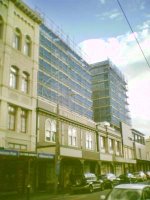
 Cuba Street is continuing to evolve, and some of the shifting around is due to big changes at the upper end. We're yet to see much activity around Car-O Drive, but the first retail units in The Wellington complex are just coming on line. The first retailer to move in was unsurprising, as the superette has just shifted back a couple of doors from the temporary location it used during the development. But the next move might seem unexpected: Eyeball Kicks is shifting from its Ghuznee St home.
I say that it's unexpected, because some people (including me) have worried that the shops in the new units will not be as independent, characterful or otherwise "Cuba Street" as they had been. That was partly due to the cost of the rebuilding driving up rents, and partly because of the developer's statements that the bypass would "improve" upper Cuba St: something that sounds very much like code for making it slicker and more lucrative. While "The Kick" could be described as an upmarket boutique (especially if you've thought about buying one of their limited-edition prints or collectibles), it certainly fits in with the sort of store that once inhabited the same spaces (such as Boudelicious or Hunters & Collectors). That's an encouraging sign for upper Te Aro, and it'll be interesting to see what opens in the remaining spaces, most of which appear to have been leased already.
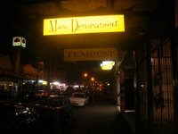
 Another "very Cuba Street" shop is Miss Demeanour down at number 160. While they've no plans to leave anytime soon, the owner Jennie Woodford was quoted in the Dominion Post about the effect of rent rises, and said "If someone comes in with a really good offer I know that I will be without a livelihood. I will not be able to get somewhere else with such a good rent." Real estate agents are confident that increasing foot traffic, and hence turnover, will offset the rent rises, though I'm not so sure for some of the more specialised or marginal businesses.
The article quoted another concerned Cuba St person: "Cheap rents attract funky new businesses. These businesses give the street its reputation. With Cuba St popular, people come to experience the atmosphere created by these cool little places. What happens when high rents force them out to somewhere cheaper? We might lose our soul." Well said. Interestingly, that quote was from architect Karen Krogh, who owns the building next door to Miss Demeanour and plans to demolish it for an eight-storey apartment building. Can we take it from the quote that Krogh's dedication to Cuba St will extend to keeping the rents in the replacement retail tenancy low, and not just putting pictures of Che Guevara on the facade?


4 Comments:
Nice posting and one that replicates a conversation Liz and I had as we wandered up/down Cuba Street for the first time in a long time the other week. It is subtly changing character but it ("the cultuer") seems to be hanging on and maybe it'll win ... who knows, I hope it does.
Hahaha - what a hypocritical biarch. You rule Tom.
Hmm, I wouldn't be quite so harsh. Let's give her some benefit of doubt, and assume that she'll be keeping rents low in the redeveloped retail space: if not, then we could certainly call her up for hypocrisy.
I just walked down Cuba St this lunchtime. I was particularly struck by the degree to which the new building's facade (the bit to the right of the old Wellington Hotel facade as you look at it)looks so unlike its neighbours. It's not an inherently ugly building (if a little predictable), but boy does it look out of place. And all that sheet glass!
Post a Comment
<< Home