Building rumours 17: towers of the imagination
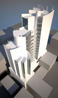
Regular readers will know that we haven't exactly been kind to ArcHaus around here, but here's a surprising find: a project on their website that exhibits more than a little grace, drama, complexity and invention.
 I get the feeling, though, that this project will go no further. Unlike their other featured projects, this is just labelled "Inner City Residential Concept", and bears all the hallmarks of a "what if" scenario rather than a serious development proposal. It is described thus:
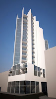
This concept design was a reaction to a tight Wellington inner city corner site. Using the space and the movement inherent in the site the concept was produced of a building that unrolls as the views progress. The curving form was designed to respond to the surrounding more sensitive environment by never turning a blank wall to its surroundings, the delicate curves allowing the building to unfold, even on the site boundaries. The height of the building was based upon use of the discretionary limits to allow the massing which would reflect a building that evolves from the rear towards the front of the site.Does anyone know whether this might indeed be going ahead, and if so, where it would be? I've tried to work out from the context where this might be, and thought first of all of the old Il Casino site, but it doesn't quite fit.
 I'm not completely won over by this design: the shimmering whiteness may just be the product of a simplified rendering, but it all looks a bit more Gold Coast than Wellington. While the separate treatment of tower and base is a good approach to combining sculptural gestures with the more down-to-earth requirements of street-edge urbanism, the latter seems undeveloped and the juxtaposition is a little too arbitrary. I'd also like to know more about "the surrounding more sensitive environment" before deciding how appropriate its 18-storey scale might be.
But otherwise: wow! This an energetic and even gleeful design, showing modulations in all three dimensions and positively revelling in its verticality. One can almost imagine the downtrodden architects at ArcHaus, traumatised after having to grind out yet another envelope-filling, minimum-spec lump, letting all their creative impulses burst free from the oppression of cynical volume-maximising instructions from developers, and remembering that their CAD software does have a curve function after all. The result is exhilarating, and perhaps even a little overwrought, though some subtle variations in materials could temper the spatial exuberance with some elegance and finesse and produce something really special.
With my earlier provisos in mind, this could be a rare example of "discretionary limits" freeing up the architectural imagination rather than being used purely as a loophole to get more dosh out of the site. It's just a pity that this, of all the ArcHaus projects currently proposed, seems the least likely to go ahead.


11 Comments:
"...and remembering that their CAD software does have a curve function after all."
Hahaha - brilliant!!
Also my guess is where Restaurant 88 is on the conrner of Ebor, just down the road from those new(ish) apartments. Who knows?!
An interesting design, which would look even better with some interesting colours and textures.
A pity that the street-level view doesn't look as good as the birds eye view...
And a pity that I don't expect to see it built...
yes, it does look like the corner of Ebor, except that the light is coming from the wrong direction.... unless that's very strong moonlight from the south.
Its a far more imaginative scheme than most of theirs, and indeed more so than most architects in NZ - but i suspect it shows that the real drag on creativity is the client and their petty expectations, rather than the architects alone.
But surely, if Archaus are capable of designing something like this, why do they still produce such drivel for other clients? Have they no balls to say: "No thanks, we don't produce crap buildings any more." Perhaps they need to start to say that now...
I'm sorry - but this is bad. There is a reason more achitecture firms aren't doing stuff like this, they all the huge pretentious phalluses after PoMo died. There is nothign finessed about this building, it is one big punchline - "I know, how about a carcol?!" Take all of the first and second year architecture studio students in the world and review their portfolios and you will find 30% are made of this same theme.
All this buiding is missing is an oversidezed 10 story palladian window, some huge swans, and a faux sail and it would be fantastic.
Great progect and wonderfoul blog!
Anon: it could certainly be described as overwrought, but I don't think it's quite as bad as you make out.
I'm not quite sure how to parse your sentence "There is a reason more achitecture firms aren't doing stuff like this, they all the huge pretentious phalluses after PoMo died." - do you mean that you think this is PoMo? Your comments about Palladian windows and swans would seem to imply that, but it doesn't look PoMo to me at all. If anything, it has a tinge of the sort of brashly expressive modernism that I associate with Harry Siedler, but I'm no expert.
I guess it's just refreshing to see something more imaginative in an apartment project than all the "just draw the maximum allowable volume and stick some balconies on" schemes that we've become used to.
Its seems very paper architecture to me. I cant see apartments working, theres to many crazy curves, but also large blank areas, it just seems to hard to divide into reasonable spaces.
"Take all of the first and second year architecture studio students in the world and review their portfolios and you will find 30% are made of this same theme."
This comment struck me as a little weird. Why 30%? What is the theme exactly? iconography? pomo?
Unfortunately the property crash in the US will likely drag our economy into recession with it, and buildings like these will likely remain in fantasyland.
IMHO this growth phase of the property cycle is just about played out, we probably have a decade or so of little or no building of substance.. A rerun of the 90s is likely.
BTW "Envelope-filling, minimum-spec lumps" - haha love it!
Lots of very happy looking apartment spruikers on the corner of Tory/Wakefield last nite,
Looks like the latest new site is the old fish factory( now carpark) in Tennyson st,
Being marketed as republicapartments.co.nz
From the blurb, it looks lie a similar set up to the warehouse pairing, they are selling the front block now as "all north facing" etc, and I suspect there will be a second block on the site facing south if the numbers all stack up.
I agree some of their earlier work was a little to be desired but now some of the older established firms are lagging behind...churning out the same old tried true tested safe building concepts - dumdeedum
it only takes one "imaginary" concept that suddenly makes a company surpass all others and sorry to the critics but archaus are definately getting a positive name for themselves around wellington - well done!!!
Good Job! :)
Post a Comment
<< Home