Hilton consent
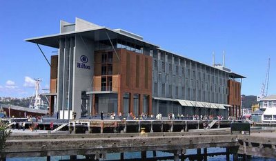
Saturday's Dominion Post carried a large illustrated article about the resource consent application for the Queens Wharf Hilton. There's yet to be the expected outburst from Waterfront Watch about this, though on a bit of a tangent, Waterfront Watcher Rosamund Averton has a letter in today's Dom suggesting that the Stadium should be painted in paua patterns - perhaps she's been reading my earlier posts and taking them a bit too seriously? I expect the complaints to start hitting the letters pages in the next couple of days.
In the meantime, I'm taking some time to study the application in detail. The Greater Wellington council site has a news release about the application, but so far the link to the application itself doesn't work. In any case, the online applications only have outlines of the consents sought, without all the illustrations and supporting reports: you have to go to the library to see the full, phonebook-sized document. I'm not as whole-heartedly in support of this application as I am for other waterfront developments, so I'll have to think carefully about the pros and cons before putting in any submission.
One of the negative reactions that the article referred to was an old comment by Russell Walden calling the design "abysmal". As I said in my first post on the subject, I can't claim that this is breathtakingly beautiful architecture, but I do think it's reasonably elegant, with massing and detail that breaks up what could have been a monolith.
 However, one thing seems to have changed from the earlier ideas. The brown sections were to have been clad in oxidised Cor-ten steel, which gradually evloves over time and has an appealing, almost velvety texture. At the time this surprised me, as I thought that Cor-ten was a poor choice for exposed coastal environments, and it now appears that these will be simply painted rust-brown. This would be more practical, and might still carry an allusion to weathered maritime surfaces, but is far less interesting. This set me wondering about whether a more exciting surface treatment might be possible.
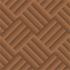
Another report in the application was one by Raukura consultants about Māori issues. In this, they suggested that more could be done to evoke Māori heritage, perhaps through artworks in the lobby. They also recounted local history, including the role of the nearby Kumutoto kainga as a harakeke (flax) market and of Queens Wharf itself as a port for exporting the bundled harakeke. This made me think: why not use the concept of harakeke weaving as a surface treatment?
 I'm not suggesting that the building be clad in actual flax (though it might work: who knows?). Instead, perhaps they could take a lead from New Plymouth's Puke Ariki museum, and use woven metal as an outer screen. By using strips of oxidised cable, you could even bring back the maritime reference and keep the colour, while bringing more texture to the façade, recalling local Māori and Pakeha history, and integrating artwork into the building itself rather than adding it as an afterthought.
...
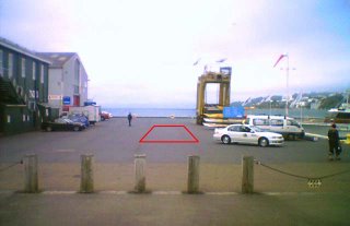
 One aspect of the proposal that has people worried is traffic. The design includes a tunnel that joins to the existing car park under Queens Wharf Square, meaning that taxis and other surface traffic won't have to travel outside Shed 6. This image shows (very roughly) the location of the tunnel entrance: it's beyond the main pedestrian promenade along the outside of sheds 5 and 6, and will allow clear space along the southern side next to the kayak pontoon.
Some people are alarmed that, despite this tunnel, trucks would be constantly lumbering around Shed 6 to service the hotel. However, the traffic consultants' report shows that (based upon the Auckland Hilton's experience) the majority of servicing will be by light vans that can use the tunnel, and the rare visits by trucks can be scheduled outside of peak pedestrian times. They also note that all light vehicles (including taxis and private cars) will be required to use the tunnel, and that this would be reinforced by rising bollards at the Hunter St entrance. Thus there would actually be a net reduction in vehicle traffic around Shed 6: that's got to be good for everyone.
...
I was slightly concerned that the increased height (compared to Shed 1) might create more wind around the building, but now that the detailed wind analyses are available, that proves not to be the case. In a couple of wind directions there will be a slight increase around a couple of corners, but the overall effect will be to create more shelter than Shed 1 does now. Shading analyses also show that the extra height won't do much to diminish sunshine onto surrounding areas, especially at critical times such as lunchtime and early evening. All of that, combined with the upgraded public spaces and more visible presence of people, should make the surrounding areas into people magnets as I suggested earlier.
Which leaves my one outstanding worry: what will happen to the sportspeople who currently use Shed 1? Even though it was only ever leased as a temporary venue, their needs should be considered, and they are correct that losing a CBD indoor sports facility would be a loss to the city. I've suggested one possible solution, which seems to have gained some qualified support from both Wellington Waterfront and the sports enthusiasts involved. When I put in my submission on the Resource Consent application, I certainly intend to make it a condition of my support that a suitable replacement venue be found or created within a similar distance of the CBD.


4 Comments:
Wonder if Paris will be in for the opening? ;)
"Reasonably elegant"? It's a turd of a building that would be more at home with the hideous old Stalinist architecture of the Government end of town.
Ouch!
Paris won't sleep with you if you keep bad mouthing her inheritance...ah, who am I kidding, she'll sleep with anyone.
It was designed by Lawrence Sumich, who did the Latitude 37 apartments at Viaduct Harbour, and some other luxury waterfront homes. Looks like he has a bit of a thing for sliding shutters, and he's included them in the Hilton design, which could help the main elevations look a bit more varied and dynamic than the static renderings suggest.
Rodger: it's vaguely modernist and very rectilinear, but I think that's all it shares with the worst of the Ministry of Works lumps in Thorndon. It has a lot more detail and variation in mass and materials, some purely decorative elements (canopies and towers), and most importantly it has a positive relationship to the surrounding spaces rather than sealing itself off. I think it could be improved quite simply by including a bit more texture or local references (something like my vague suggestion). Then again, I'm not an architect, so I may be talking bollocks.
Post a Comment
<< Home