Icing on the cake tin?
 Local free rag The Wellingtonian is starting a campaign to redecorate the exterior of the Westpac Stadium. I'd always thought that Warren & Mahoney's award-winning design had a simple clarity, creating a sleek steely ring that responded appropriately to the robust industrial nature of its railyards setting. But I stand corrected: apparently it's a "large grey cake tin ... painted a ho-hum shade", and in need of being "tarted-up". I agree that the concourse is a bleak and windswept place when it's unpopulated, but by far the best solution to this is to bring shelter and everyday use to the space by building an indoor stadium over the top. I've never had a problem with the Stadium itself.
On the other hand, maybe there is some merit in turning the exterior of the Stadium into a giant artwork. As the council's community arts coordinator Eric Holowacz says, "Strange, unimaginable and often wonderful things happen when art and civic environments come together ... The world's great cities ... can provide bold examples of visionary works of art fusing with the built environment". But this "fusing" is not what the tone of the article suggests: they seem to be advocating "colourful drawings" to disguise the Stadium, the way a mural might brighten up a dull wall, rather than a subtle abstract artwork that respects and enhances the architecture.
I know that I've supported community-based art in public places (murals around a building site or on a substation; mosaics on the bases of columns), but this is at a human scale and at street level, not several stories high on a major public building. This is the place where Jerry Collins puts in his bone-crunching tackles, not the Wadestown community centre! A world-class sports venue needs a bit of gravitas, not prettification and cute drawings of footballs.
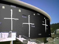
 Okay, so if he have to decorate it, which New Zealand artists might create interesting results? Ralph Hotere is known for his use of corrugated iron, though perhaps his vision is too dark for the happy-happy-joy-joy look that The Wellingtonian is promoting. If you want colour, then Gretchen Albrecht might relish the chance to work with the edge of an oval rather than its face. It's a pity that John Drawbridge is no longer with us, given his Wellington sensibilities and experience with large-scale murals. I'd suggest et al, but the underside of the Stadium already resembles some of their installations.
Or we could take an architectural approach to surface. Waitangi contenders UN studio have used iridescent film and discs to bring a colourful, shifting quality to buildings. Herzog and de Meuron do wonderful things with stadia (such as the glowing "rubber dinghy" Allianz Arena), and also used translucent panels of multicoloured polycarbonate to turn the Laban dance centre into a plastic lantern. Future Systems turned the Birmingham branch of Selfridges into what's been called "a sequinned blob of space fungus". Perhaps we could do a Kiwiana take on this and use polished paua shells instead of shiny metal domes.
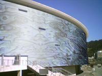
 But why just plonk on individual paua shells? How about cladding the entire stadium in it? There's an experimental process for growing mother-of-pearl onto structural materials, and the controversial Marine Education Centre building might have one wall clad with this synthetic nacre: see the east elevation (444kB PDF) and the architects' report (294kB PDF). Let's cover the whole stadium in mother-of-pearl, so that the crowds can enter through the pearly gates.
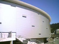
Part of the rationale for the campaign is to stop people calling it the "Cake Tin". In that case, we could simply paint the whole thing gold and call it "My Precious", or for a more up-to-date take on Wellywood, paint it a pure, glowing white and call it "The Halo".


0 Comments:
Post a Comment
<< Home