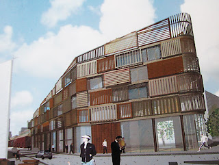
Kumutoto Option D
In contrast to some entries, this one sticks fairly close to the brief's defined sites and height limits. It also treats each site totally differently, and in the case of Site 8, proposes a building that's completely out of the ordinary: something called "sprout".
 I takes a while to work out what is going on here. There are two relatively conventional floors, an enclosed apartment level and a relatively open office level, suspended above the ground. The ground floor is an art gallery, open apart from sliding glass walls. Through these levels there rise several irregular "stems" containing stairs, lifts and services, rising to a fourth "floor" of interconnected pods. Each of these pods has a different theme and green building function, from wind and solar power generation to rainwater collection and roof terrace, while the interiors house breakout spaces, meeting rooms and a café.
At first I thought this was too wacky to take seriously. It also leans heavily on at least two architectural precedents: Will Alsop for the suspended slabs and blobby breakout pods; and Toyo Ito for the irregular trunk-like structural/service columns. As it grew on me, though, I saw that it combined to produce a building that is both excitingly unique and surprisingly appropriate for the site. The sense of lightness and transparency matches the water's edge location, while the organic allusions could either refer to kelp or forests. If some of the more fiddly suggestions (such as having each stem clad in a different material) were to be toned down, I think that this building could be a delightful and invigorating addition to the waterfront.
On Site 9, this team has gone for something completely different. Where "sprout" is organic, airy and fanciful, "crate" is solid, tactile and grounded. Based on the concept of wooden crates stacked on the wharf's edge, it mixes residential and live/work spaces to create a densely textured mass.
 I like this a lot, too, but for the opposite reasons. With mixed use, active edges and a solid wall to help define the streets, this is an essentially urban building. The living and working spaces are externally signalled by sliding screens with different directions and types of timber, bringing depth and variety to the surface. Yet it's a simple enough volume that its sloping roofline defines the height transition from Shed 13 up to Site 10, and the rounded northern end is an effective way to both turn the corner and mark the Whitmore St gateway. I'd prefer a little more shelter around the edges, but otherwise this is a high-quality and interesting building that doesn't need to shout about it, and fits well into the urban context.
Site 10 is different again; this time based upon two disparate concepts, "honeycomb" and "crane". The crane theme is obviously derived from the working port nearby, and serves as a structural organiser: the office space takes the form of containers suspended from giant cantilevers. The honeycomb concept seems to be rather arbitrary, and refers only to the wall of transparent bubbles (presumably ETFE or similar) that defines the Waterloo Quay edge.
 I'm less convinced by this one. The city façade is certainly spectacular in a high-tech way, but the view from the water is of a fairly dull rectangular box. The plans show active edges and public atria, but I just get the feeling that it wouldn't be as appealing a pedestrian environment. That's the problem with these persistent industrial metaphors: container wharves aren't usually people-friendly environments, and in this location, the buildings should work hard to create an urban condition rather than aping the symbolism of industry.
Nevertheless, the fact that each site is treated differently allows the panel to pick and choose. I'd be happy if the designs for either of the other two sites were chosen as part of the overall scheme: either the unspectacular yet subtly clever and humane "crate", or the engagingly mad and really very cute "sprout". Iconic doesn't have to be grandiose.


3 Comments:
The only design that has really impressed me so far is the wooden beam one. By the way i have seen Will Alsop's OCAD building in real life and i can't imgine anything like that fitting in on Kumutoto.
I'm probably stretching the likeness to the OCAD building: there is a kind of "floating slab", but it's much smaller, only one floor above the ground, and the space beneath it is enclosed by glass. If anything, it resembles some sort of futuristic treehouse more than a slab on sticks: and I kind of like the idea.
I also liked the designs for site 8 and 9, but not site 10 and mentioned this in the feedback form that the public can fill in at the waterfront information office. None of the designs appealed to me in their individual entirety, but I liked several of the individual buildings from the various designs.
Post a Comment
<< Home