Kumutoto Option F
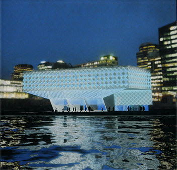
The final entry is much more conventional, and sticks fairly closely to the brief. The one real gesture towards the spectacular is at Site 8 where a cantilevered "lantern of blue" reaches out to the water.
 The first precedent that sprang to mind was the Seattle Central Library, though that's mostly due to the diamond grid. Other aspects of it reminded me of Will Alsop (again) and even the UN Studio design for Site 4 with its V-shaped plan. The most unusual thing about it, though, is its relationship to the public space. The scheme proposes a new pond, and a cutout with small boat ramp, and this building is suspended over both. There's a cafe near the middle of the building, with views across the boat ramp and between large fin-like columns to the harbour. This creates some unusual spaces, and edges that are far from the typical "active edge" but could nevertheless create an intriguing arrangement of promenades.
The site 9 building is relatively conventional, and in many ways is similar to Option D's "crate", but with brick panels rather than wooden slats to make the echo of Shed 13 even more explicit. It has a series of exposed stairways on the eastern elevation, which look a bit fussy to me, but otherwise it's a good building with a lot of visual interest.
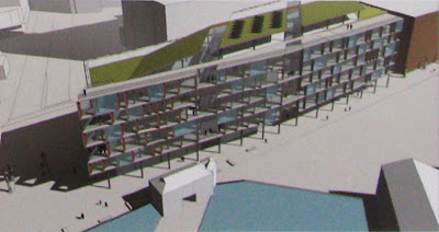
Site 10 looks very conventional, and even boring, but it has some subtle touches that I'm starting to warm to:
 At 7-8 storeys it's slightly over the height specification, though that depends upon floor height and it's not too far out of scale. There are two "crevices" that slice diagonally through the building, allowing natural light deep into the plan, while varied arrangements of angled balconies, brick panels and sliding sunscreens animate the façades. The folded roof appears to be planted, and there's a combination of conference, garden and café spaces that make more of the roof space than most buildings do. It's far from spectacular, but there's no need for spectacle on this particular site.
Overall, it's a decent, friendly sort of building, one that responds to its neighbours without imitating them, would be good to work in, and would be more adaptable than the standard large-floorplate office block. Quietly innovative without being flashy, it's the sort of design that would be most welcome in place of some of the mediocrities underway in Thorndon, and may indeed work very nicely here as well.


1 Comments:
That building looks like it would liven up the waterfront at night. maybe that's why the render shows the building in the dark. the waterfront could do with some more colour during the evening.
Post a Comment
<< Home