Architecture Workshop and Kerstin Thompson: radical deference
The fourth of my detailed reviews of the Waitangi precinct schemes concentrates on the proposal by Architecture Workshop and Kerstin Thompson.
 It takes a while to get your head around their masterplan. They have departed considerably from the footprints suggested by the brief: the transition building at Site 4 is longer and thinner and has sprouted an extension to the east; Site 3 sticks close to the Herd St building and extends northward to cantilever over the waterfront promenade; and from some angles Sites 1 and 2 seem to have disappeared entirely!
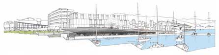
When you realise how these last two sites have been resolved, you start to realise that this is no ordinary architectural solution. They propose to excavate the ground east of the Herd St building by about a metre; spread out the activities (restaurants, bars, fish market, kayak hire) on this new ground plane; then cover them with a "trafficable roof" that folds over the lot like a piece of origami.
 This simple solution has several benefits. It creates a sheltered (if shady) walk along the water's edge while exposing the historic sea wall and bringing people closer to the sea level. It allows for simple, flexible spaces underneath, like stalls in a European covered market. People can walk from the park over the gently sloping roof to reach sunny (if exposed) harbourside spaces or the level 1 cafe terrace of the Site 3 building. It also (and this will be the most important factor for some) maintains views from the park to the water.
There are precedents for this sort of "folded ground plane", such as Foreign Office Architects' Yokohama terminal, and closer to home, the City-to-Sea bridge. Other local influences and allusions for this folded roof could include the Overseas Passenger Terminal, the Clyde Quay boat sheds and even the hills of the Hutt valley (seen from the park, the roof has been designed to create a low "V" that frames and echoes the valley). Seen from the promenade in front of the Herd St building, the roof has an elegant sweep that subtly echoes the Freyberg Pool behind it.
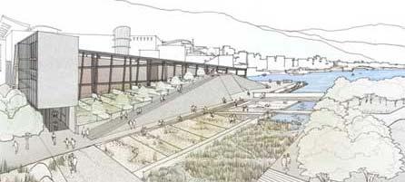
 Many of the perspectives for this scheme downplay the roof, perhaps deliberately in order to make it seem more unobtrusive, but I think this will actually be quite spectacular, with endlessly varying appearance depending upon viewing angle and weather conditions, and it could become a favourite and much-photographed part of Wellington. My only reservation is that the surface of the roof is intended to be steel, supposedly recalling the tilting deck of a warship or freighter, and I can envisage this being an unfriendly surface to walk or sit on, as well as noisy for the people underneath! It sounds prosaic, but perhaps some wooden decking would make this a more practical and hence more popular public space.
...
Site 3 is the most conventional building in this scheme, and in fact is probably the most conventional building in the entire competition. That's not entirely a bad thing, since it mostly contains ordinary activities like retail and housing, and rather than clamouring for attention it aims to form a coherent urban composition with the Herd St building. The façades look a little underdetailed, but the architects' statement says that the details will be driven by environmental considerations, so expect the finished building to have a more complex and finely-scaled appearance than is visible in the competition renderings.

It's a pity that more hasn't been done with the southeast corner, which contains the climbing wall. Some of the other entries have taken this as an opportunity (some might say "excuse") to use unconventional forms, and while I mentioned that this building is not intended to be spectacular, it would benefit from the drama and visual interest that a visibly expressed climbing wall could provide. Overall, though, this is a calm and respectful building that should help the large Herd St building look less isolated and overscaled.
…
Site 4 takes a while to understand, mostly because it represents such a complex integration of building and landscape. The museum building starts off relatively tall near Cable St and slopes down towards the harbour. Beside this, the terraced Chinese garden rises from street level up to the second floor, where the public path passes through a gap in the building to become a raised "earth bridge" before joining an existing raised path on Te Papa's eastern flank.
A simple rectangular building extends eastward along the southern edge of the Chinese garden, containing a teahouse and function rooms at ground level and a hostel above. The brief had no building here, but it makes a lot of sense: the ground floor can address both the garden and the markets; the garden gains some shelter from the southerly; and the Cable St edge gains some shelter and some definition as a proper "street".
 The two buildings create what the architects call the "city edge site", and they fill that role with some aplomb. There are sheltered arcades with active edges along both Tory and Cable streets, and the museum building gradually morphs from city grid into the softeness of the gardens. The only thing that looks a little unfriendly on the park side is the high bunker-like walls, made of the same exposed aggregate that flanks the gardens east of Te Papa. I think that the rendering makes these look a little steeper than they would be in reality, but they could still benefit from some fragmentation to break down their scale, possible with planted ledges or even a cascade of water to make this a more inviting edge to the park.
The museum building is the closest this scheme comes to a self-consciously iconic building. The outer "eco-skeleton" of timber and glass (that provides circulation spaces around the gallery boxes) is structured as the intersection of two 3D grids. This seems vaguely reminiscent of Peter Eisenmann, but seems less arbitrary and theoretical in origin. There are plenty of subtle nods towards local character (such as robust ironbark timber, which is also used in the old wharves), but the overall form of the building is unusual enough that it would seem unique and spectacular if we weren't comparing it to the architectural pyrotechnics of the other entrants. But perhaps there is a simple way to make this slightly more imposing and "iconic", if required.
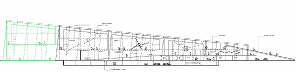 I hope the architects don't mind a bumbling layperson messing with their designs, but I've taken the liberty of proposing an extension to this building (shown in green above). I've continued the grid of the building southwards over the market car parks to the edge of Cable St. The timber and glass frame hovers over the ground, supported by tall angled columns. Within the frame is either another simple gallery box, or perhaps a more open interior: how about a large scale sculpture? Or a Green Wall or "Living Machine" to complement and extend the environmental functions of the Waitangi Park wetlands, while acting as a living laboratory and exhibition of environmental technology. The sight of this "aerial greenhouse" while approaching along Cable St would act as a signpost for the park, while the extension along Tory St would practically and symbolically reach out to the city.
...
This may be the least spectacular of the schemes, but it is the most considered, contextual and humane. More effort has gone into considering views, shelter, promenading opportunities, local precedents and integration with landscape than into constructing eye candy to put on a postcard. The more I look at it, the more I can see that it will create memorable, "iconic" places, in concert with existing buildings and landforms, that in many ways are preferable to aloof architectural "icons". The way in which some of the buildings defer to the surroundings and blur the boundary between built and natural environment is perhaps more radical and "creative" than just going mad with CAD software and tacking on some token local symbolism.
But in the context of this competition and its explicit intention to attract "starchitects", it does lack a little bit of the "wow" factor. If there were a way to combine parts of this scheme with one of the more spectacular buildings from another scheme, or to choose this team but encourage them to push the boat out a bit more, then Wellington could be on to a real winner.
All perspective renderings, together with the architects' statement, are on the Architecture Workshop and Kerstin Thompson page on Wellington Waterfront Ltd's web site.
posted by Tom @ 12:21 pm
![]()
![]()


0 Comments:
Post a Comment
<< Home