Waitangi precinct: designs in depth
Now that I've had some time to get familiar with the entries for the Waitangi Precinct design competition, I've started to write some detailed analyses of my impressions. I'm not trying to second-guess what the judges will say or strictly apply the competition criteria, and I'm not trying to tell anyone what to think. I'll just record my own thoughts, hopefully in a way that will stimulate some informed debate, so please add your own comments.
To start with, here's a quick summary of the full brief, with an indication of which functions were required where.

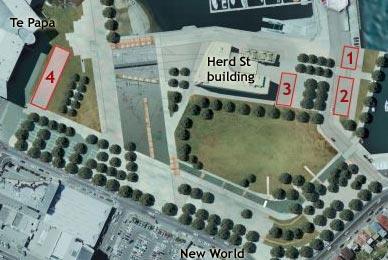
The brief indicated these four sites on this map, but was quite clear that these were first approximations only, and the entrants were invited to combine or modify these locations if that produced a better functional or aesthetic result. These are the expected functions of the four sites:
Site 1
Ground: Delicatessen style stores and/or eat-in or take-away food outlets.
Other levels: Family and fine dining seafood restaurants; possibly office space or residential accommodation.
Site 2
Recreational activities such as kayak hire, rock climbing, mountain bike hire; possibly recreation-related retail or interactive activity outlets. Commercial offices at upper levels only.
Site 3
Ground: Creative café (daytime coffee, nighttime restaurant/bar, capable of hosting live performances, demonstrations or exhibitions), recreational hire outlets, retail. Possibly a gymnasium/health club.
Above ground: Serviced or private apartments.
Site 4
Ground: Low cost hotel/hostel accommodation, or exhibition space and retail.
First floor: Chinese tea house and/or function centre (opening to Chinese Garden).
Above ground: Contemporary art exhibition/gallery space; possibly museum storage, office space or apartments.
I've already written a background on the entrants' previous work and a quick summary of my first impressions. I've also written some polemic posts about the controversy that continues to surround the Waitangi precinct, a little about the playground and how it could have been improved, and a (fairly old) article about the park as a whole. Finally, here are all my detailed thoughts on each entry:
- Oosterhuis Lenard
- UN Studio
- Shin Takamatsu Architect & Associates
- Architecture Workshop and Kerstin Thompson
- John Wardle Pty Ltd Architects


0 Comments:
Post a Comment
<< Home