Oosterhuis Lenard: strangely familiar
The first of this series of detailed impressions of the Waitangi precinct schemes covers the proposal by Oosterhuis Lenard. The overall approach is easy to read, with three separate buildings sitting simply on the ground and staying fairly close to the footprints in the brief. It's the buildings themselves that are hard to understand, at least initially.

Sites 1 and 2 become one structure, in two sections joined by an open bridge. To my mind, this is the most impressive building of the scheme. As the furthest site from the city grid, it seems the most appropriate location for a wildly organic form. The blobby cantilevered forms that characterise Oosterhuis Lenard's work seem hard to justify for an ordinary programme such as offices or apartment, but add a daring edge to functions such as climbing walls and dining terraces. The interior of the climbing tower would be a truly spectacular space, and the sense of dematerialisation as the restaurant twists out over the harbour could be quite breathtaking.
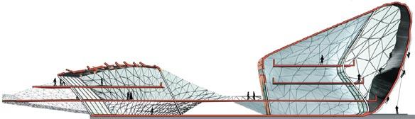
Broad expanses of glass allow views into and through the building, and the wooden cladding could be seen as responding to a maritime heritage. I like the sense of public flow under and over the building, though the expanse of open triangulated grids and "convertible roof" seem a little ambitious for the exposed location. I don't for a minute buy their claims that it represents a hei-matau (fishhook): if anything, it could be seen as a taniwha, with a hint of the Overseas Passenger Terminal and Freyberg pool. But the more I imagine it, the more I can see it working in this location.
...
I'm far less impressed by Site 3. There's nothing in the programme to demand such a contorted form, and its blobbishness does nothing to address the Herd St building and help form a cohesive urban grouping. Unlike the Site 1/2 building, when the ground floor tenancies are closed it would be aloof from the public space. The shape seems unique at first, but if you know Oosterhuis Lenard's work, it might seem strangely familiar:
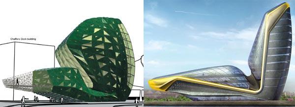
On the left is the Site 3 proposal: on the right is Oosterhuis Lenard's proposal for a hotel on Dublin's waterfront. Oosterhuis Lenard described the latter in terms of flexing arm muscles and sports car seats. We get a small, squat version, and they call it a koru. They want to clad it in green marble imported from India, supposedly to connect it to the park, but hardly a gesture of sustainability and local character!
...
Site 4 is the transition building, joining Te Papa to the park. The split at the north end, with the upper level flowing towards Te Papa and the lower level slithering across the Chinese Garden, makes that purpose clear while also generating an interesting form. The irregular web of copper cladding could be quite beautiful, and the gradient from copper to glass is an ingenious way of resolving the need to avoid overlooking the Chinese Garden with the desire to make the most of the view.

Unfortunately, I don't get much sense of ground-level connection with the surroundings. There's supposed to be retail on the Tory St side, but it doesn't look like an appealing streetscape. There's also no attempt to provide low-cost hostel accommodation as preferred by the brief.
...
Overall, I'm not a fan of this entry. The shapes and materials say little about Wellington, the attempts to justify these shapes in Maori iconography seem unconvincing, and the buildings seem to have been plonked onto the ground with little attempt to create welcoming public space around them. The one part that does impress me is the Site 1/2 building, which could be truly striking, memorable and appropriate for the site. Otherwise, this scheme doesn't belong here.
All images of this scheme are extracted from PDFs available at the Oosterhuis Lenard page on Wellington Waterfront Ltd's web site.
posted by Tom @ 4:58 pm
![]()
![]()


0 Comments:
Post a Comment
<< Home