John Wardle: strange cargo
My last detailed review of the Waitangi precinct schemes examines the proposal by John Wardle Pty Ltd Architects. The masterplan keeps fairly close to the brief, with the only major difference being that sites 1 and 2, while separated by a public passage at ground level, are joined at the upper levels into one elongated, sweeping building.
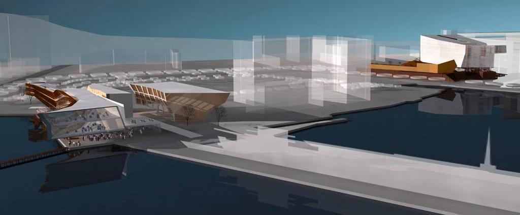 This building also has a north-south split, which contains a dramatic glassed-in climbing wall that runs through the mass of the building like a canyon or fault line. This linear climbing wall could bring a new dimension to the sport, presenting different angles and overhangs as it winds throughout the building. In places it also passes by what is labelled as "Wellington's longest bar", and this juxtaposition of athletes and barflies could produce some interesting social situations!
This is a striking building, with dramatic zigzags, acute angles and daring cantilevers, and it explicitly calls on geological metaphors such as faceting, stratification, fracturing and erosion. It wraps around and over the promenade next to Clyde Quay, producing a stylish and intimate public space as it does so. The only problem is that it faces east, and thus most of its sunlight would be gone by lunchtime.
 For better or worse we're a sun-seeking people: our maritime climate keeps ambient temperatures mild at best, so even in summer we're often seeking a precious combination of direct sunlight and shelter. Flip this around and place it on the OPT or the Outer T of Queens Wharf and you'd have a winner, but in this site and orientation, its potential as a public space is severely limited.
...
The site 3 building, while not being so explicitly geological, is also dynamic and appealing, with exotic angles and a dramatic "mushroom" section. Its placing seems a little strange, though: shifted east to form a narrow alley between it and the site 1/2 building, it leaves a broad space east of the Herd St complex. It may be that in trying to create two public spaces leading to the water, one will end up too dark and narrow and the other too diffuse and with poor orientation.
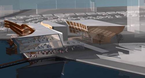 It also seems to go out of its way to deny the occupants of the apartments any views. Personally, I don't share the Kiwi obsession with panoramic views at all costs, but it seems perverse to come almost to the water's edge, only to build a blank north-facing façade and orient all its apartments towards a building that looms a few metres away. It's an acceptable outlook for a Melbourne laneway or an inner-city alley such as Egmont St, but on such a site it seems like a wasted opportunity.
...
As usual, it's site 4 that's the glamour building. I can understand why most architects would leap at the chance to design a museum rather than a boring old hostel (which has been omitted here). It seems to have received the most design effort, and will present a memorable spectacle, but I'm not entirely convinced by its proportions. Most entries maintained the linear north-south orientation from the brief, except for UN Studio who twisted it around to point two wings at the park. This entry has a shorter and wider version of the transition building, which could leave it looking slightly lost against the long wall of Te Papa, and from some angles it looks too chunky to be elegant.
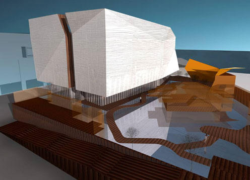 The geological metaphors continue here: from most angles it's a monolith. It's true that the programme demands a degree of insularity, to protect the artworks within and to avoid overlooking the Chinese garden. It's also true that Wardle has creased and fissured the building mass, as well as imprinting it with a pattern derived from fishing nets and traditional weaving, to give the building some detail and visual interest. But the other entrants all seem to manage, through translucency, materials or scale, to avoid presenting quite such a blank and looming face to the public. It's a form that could work well in other contexts (I could imagine it as a medium-sized auditorium, as for the School of Music), but as a building commissioned for the express purpose of humanising the blank face of Te Papa, it doesn't seem to do the trick.
It seems that Wardle has had more time in Wellington than the other overseas entries, but there are some aspects of the scheme that shows he doesn't have the climatic instincts of a Wellingtonian. For example, the renderings show the end of Tory St, between Site 4 and Te Papa, teeming with outdoor diners. I agree that some retail or bars would help perk this street up a bit, but the lack of sun and views in this relatively narrow space make it unlikely to ever become a Mecca for al fresco dining.
 Otherwise, this is a much more intriguing elevation than the southern end. There's a terrace that's partially enclosed by "woven" screens, an expressionist composition of steps, and a warped and folded entrance pavilion that looks like a Richard Serra sculpture. The fissure across the top of the musuem should create a beautiful top-lit atrium between the gallery spaces.
…
In Wardle's statement, he refers to some of these buildings as being like foreign cargo unloaded on Wellington's docks. There are a lot of local cultural and historical references, but many of them (like the meeting of the museum and entrance pavilion in a "hongi") are likely to be too oblique for the casual observer, so this sense of foreignness might be too strong. In this article I've probably sounded too negative, but most of these are fantastic, breathtaking buildings. It just seems that they don't make the most of the site, either for their own sake or for the sake of the public spaces that they could have, but haven't quite, created.
All renderings used this post have been taken from the John Wardle Pty Ltd Architects page on Wellington Waterfront Ltd's web site.
posted by Tom @ 5:07 pm
![]()
![]()


0 Comments:
Post a Comment
<< Home