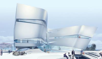
UN Studio: twisted spectacle
The second of my posts on detailed impressions of the Waitangi precinct schemes looks at the proposal by UN Studio. At first glance, it has the simplest masterplan of the lot, condensing all of sites 1,2 and 3 into a single compact building. Around site 4, however, they've made some major changes to the surrounding landscape and its functions. The Chinese Garden has been shifted from east of the transition building to south of it, running right along the edge of Cable St where the open air car park and market are supposed to be. The site 4 building itself twists away from a north-south orientation towards the park, leaving a large elevated "scenic balcony" to the north.

UN Studio decided to save views by having one 4-storey building right at the northeast corner, rather than having three smaller buildings. It looks like a simple block from above, but the lower three floors are actually twisted figure-8s, with the top floor (short-stay apartments) floating over the top. The three public floors (recreation, restaurants and shops) are each divided in two, then joined by interweaving ramps. This looks like it should retain east-west views and access through the block, while creating a spectacular atrium space.

I like this building, but I'm not sure that it's quite right for the site. It looks a little blocky and isolated, leaving a wide and possibly barren space between it and the Herd St building. This would be fantastic in a tighter urban setting, such as sites 8, 9 and 10 at Kumutoto, where its rectilinear envelope could help define positive public space while its swooping ramps would lift it out of the ordinary.
...
Site 4, the museum extension, is something quite special. Its dynamic form shifts between gentle curves and sharp pleats and folds, reminiscent of billowing sails. The sleek, metallic outer skin is slashed by long horizontal windows, letting light into and controlled views out of the museum while preventing the building from becoming too monolithic.

At first I thought that the design was too self-consciously "iconic" at the expense of its relation to the surrounding space: a self-contained building sitting aloof and untouchable on a plinth. But as I study the detailed plans and sections, I'm slowly appreciating the complex way in which it is interwoven with the landscape. There's a public passageway that swoops up from Tory St, under the belly of the building between cafe and foyer, up across a sheltered terrace between the two wings and then to the park. The connection to Te Papa is at ground level, with the land rising over it to form the "balcony".
I also thought that the visual language of knots and folds was a little too predictable, but now that I see how the overall form responds to the site and programme, this is starting to seem appropriate. The brief calls for "an expression of contemporary culture"; a building that "is of this time as well as place and relates to international as well as local culture". In this context, the echoes of Hadid, MVRDV, Gehry and others start to seem more like Zeitgeist than imitation.
...
There's something seductive yet unsettling about the renderings that UN Studio have used: a sleek pristine glow that speaks of unearthly beauty yet dismisses the context with Antarctic coldness. And those purple trees are just plain weird! But if you try to imagine the spaces around the Site 4 building with a little more planting and detailing, it's possible to believe that it might be one of those rare buildings that manages to combine sculptural beauty with an active public interface. They still need to find a way to incorporate the brief's requirements for a hostel and open-air market in the spaces around it, but in any case, this building could be a powerfully transformative addition to the waterfront.
All images have been extracted from PDFs available at the UN Studio page on Wellington Waterfront Ltd's web site.


0 Comments:
Post a Comment
<< Home