Shin Takamatsu: back to the future
The third in this series of detailed impressions of the Waitangi precinct schemes deals with the proposal by Shin Takamatsu Architect & Associates. Their masterplan is the only one of the five to keep the programme in four separate buildings close to the sites indicated in the brief. The detailed footprints of sites 1 to 3 are primarily generated by lines implicit in existing buildings, but this is followed by a boldly formal gesture. Out of these generally cuboid masses they subtract an ellipsoid volume based upon that of the site 4 building, resulting in walls that curve around a semi-enclosed space.

As a formalist geometric approach, this is unlikely to be consciously appreciated by most of the public. However, and I'm not sure whether this was intentional, the result is actually close to the traditional urbanist approaches of Christopher Alexander and Jan Gehl. By emphasising the space between buildings rather than buildings as individual objects, and thinking of the public realm as figure rather than ground, designers can create positive outdoor spaces that feel like outdoor rooms rather than formless left-over spaces.
This produces a space that Takamatsu calls the "activity void", a jargonistic name for a public space that is somewhere between the intimate enclosure of a city square and the purposeful linearity of a street. Without specialist expertise, I can't tell whether this will be pleasantly sheltered or a howling wind tunnel, but it's certainly a more urban space than the equivalent in the Oosterhuis Lenard or UN studio schemes.
...
The buildings themselves are quite exotic. As slightly distorted cubes, the overall masses may be simpler than Oosterhuis Lenard's slithery invertebrates and UN Studio's intellectual knots, but the walls are pierced by hundreds of circles to give the impression of massive hunks of Technicolor gruyere. Above ground, these are a mixture of operable windows and glass panels etched with Māori motifs or corporate logos (the latter seem almost intentionally calculated to send Waterfront Watch into fits of collective apoplexy).

At ground level, what could have been scaleless and arbitrary decoration actually produces a novel approach to the public/private interface: a series of irregular arches similar to colonnades or arcades, but in a way more integrated into the façade as a whole. I'm finding it hard to envisage what this would actually feel like to walk along, but it's possible that this could create a pleasantly sheltered and active pedestrian route from Oriental Parade to the Overseas Passenger Terminal.
Site 1 contains the restaurants, and site 3 has three floors of short-stay apartments over ground-floor retail. It's site 2 that gets to go crazy inside, with an elevated indoor "playground" that is a Wonkalicious psychedelic fantasia of purple conical climbing walls, an amoeboid paddling pool, half-pipe and mini-golf.
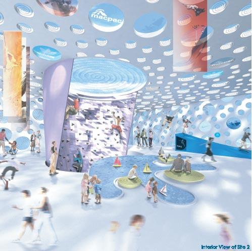
My logical brain doubts the financial, structural and social feasibility of the whole thing, but my inner brat wants to overdose on food colouring and run around with a silly grin on my face.
...
By comparison, site 4 is relatively sedate. The museum is housed in a hovering ethereal ellipsoid, intended to resemble a "long white cloud", resting on a prosaic box that deals with the more earthly functions of teahouse and hostel. Unlike Oosterhuis Lenard's scheme, this produces something physically resembling a streetscape, though the transition from cloud to box seems somewhat abrupt and ragged, and the presence of hostel rooms at ground level seems unlikely to generate a lively edge to Tory St.
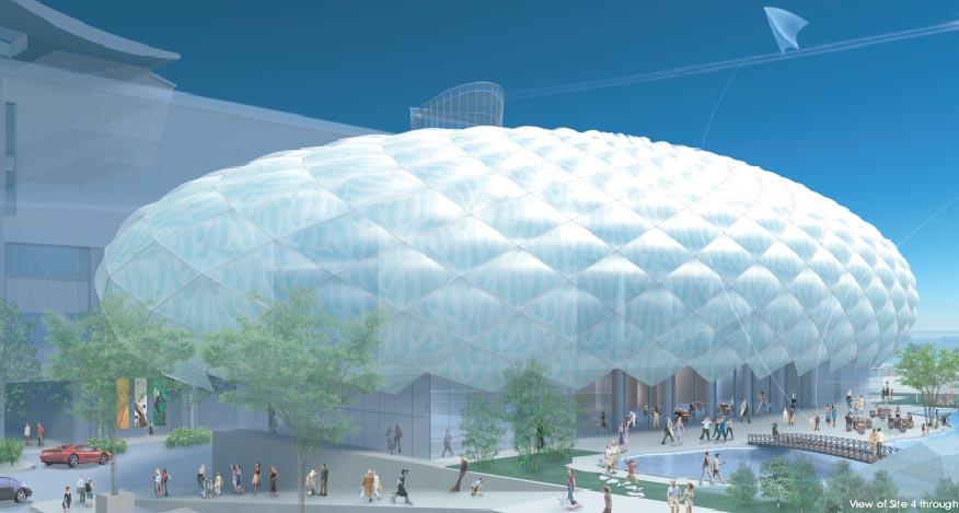
If the variable translucency of the fern-imprinted "cloud skin" works as claimed, then this could be a building that creates shimmering variations in appearance depending upon weather and sun angle, as well as producing stunning greenhouse-like spaces within. The form has more in common with the geometric high-tech domes and gherkins of Grimshaw or Foster than with the tortured Continental deconstructionism of Oosterhuis Lenard and UN studio, so perhaps it's a better fit for New Zealand's predominantly anglo-saxon pragmatism.
On the other hand, I stand by my earlier reservations about the Chinese garden, and I'm not convinced by Takamatsu's claims for local metaphors. The fern and spiral motifs are just decorations, and could just as well have been kangaroos and Fosters logos if the site had been across the ditch. The silliest claim for local relevance is the comparison of the cloud and elliptical void to rugby balls! So we have a pair of balls, with the left one being most prominent: this scheme could stand for parliament in Tauranga.
But seriously, the whole scheme is very Vegas, a retro-futuristic corporate confection in eighties dayglo. It's almost tacky enough to be glorious, but I'm not sure it says anything about Wellington. The balmy twilight settings indicate a lack of familiarity with Wellington's climate, and the admittedly spectacular "cloud" is wasted in the shadow of Te Papa. That sort of form would be fantastic in an isolated linear setting such as the Overseas Passenger Terminal or the Outer T of Queens Wharf, and the swiss-cheese façades of sites 1 to 3 might be an interesting approach to try for the School of Music on the old Circa site. But I don't see these particular buildings as the best solution for the Waitangi precinct.
All images have been extracted from PDFs available at the Shin Takamatsu page on Wellington Waterfront Ltd's web site.
posted by Tom @ 8:17 am
![]()
![]()


0 Comments:
Post a Comment
<< Home