WellUrban

Personal reflections on urbanism, urban life and sustainable urban design in Wellington, New Zealand.

Wednesday, October 31, 2007

Rosé roundup

File under: , ,

A glass of rosé at Zarbo, Chaffers DockI was rushing to get my discussions of all the Kumutoto entries ready for this Friday, but the deadline for feedback has been pushed back until Monday, so it's time to relax and look at something more important. October has been the usual meteorological rollercoaster, but amid the typical bursts of belated winter, it has also been kind enough to toss us a few rosé-worthy days.

Unfortunately, the wine lists of the city weren't always up to the challenge. Very few places had more than one rosé by the glass, and many had none (the Port Café was a particular disappointment there, although at least it's a BYO). Even a specialist wine bar such as Arbitrageur could only muster one very ordinary pink wine by the glass, though there's a $70 bottle of Tavel on the cellar list if you want to splash out.

Oh, but splash out I did on many occasions. Vivo had a nice range by the bottle, Sweet Mother's Kitchen offers a decent glass of rosé, and even beer-centric pubs such as Leuven, the Southern Cross, General Practitioner and Tasting Room have quaffable options. Don't ask me what they were: it's not that sort of blog, and they weren't those sort of nights.

But it's the combination of wine, views and sunshine that can make all the difference. Herd St Brasserie's new list does well, and there's a pleasant Merlot-based drop available at Zarbo (which was quickly picked up as the mystery bar). On one particularly clement afternoon I enjoyed a quiet glass outside Manhattan Lounge. Or to be more precise, half a glass, as that was all that they had left after thirsty punters had polished off a case that day. Perhaps it's catching on?

Still, there's something to be said for one of rosé's traditional roles: as a cheap & cheerful picnic wine. Grab yourself a bottle or two, and a group of good friends, and spread yourself out on the grass at Waitangi Park on a fine weekend. It's even legal to do so on a Sunday, though that takes away some of the frisson. There will no doubt be plenty more opportunities to enjoy a glass or three as we roll into summer, though for November I have a very different warm-weather drink in mind.

Kumutoto Option C


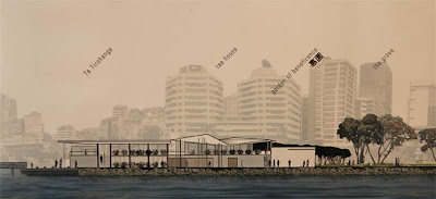
Option C consists of one continuous structure, the one that in earlier posts became known as "the conniptions building". This rendering should make the reason clear: if Waterfront Watchers lament four-storey "high rises" elsewhere on the waterfront, what will they make of this 18-storey "A Tower"?

Kumutoto competition - Option C - A towerInstead of leaving the Whitmore St viewshaft completely open, it sets out to create a frame for it. Instead of building on all three sites, it leaves site 8 as a lawn and creates continuous, elongated buildings on sites 9 and 10 that rear up and join together like amorous serpents. The result is a megastructure, complete with elevated viewing deck, conference centre and galleria, that sets out to break down the distinctions between public and private; landscape and building.

Kumutoto competition - Option C - masterplanThe chances of this being selected are vanishingly small: it departs from the framework and brief so radically that even if it were appropriate for the site (and even I have my doubts), opponents of waterfront development would be right to question the process. I think it's an exciting concept, but it would be so structurally and politically difficult that it would be hard to see anyone fighting for it. It's also not a completely resolved design: the swoops from ground into tower are grand and graceful, but the tower terminates so abruptly that the soaring momentum is lost. A better expression of the upwards sweep could conceivably have created a much more compelling design, one that might have justified breaking all the rules in order to get built. As it is, I don't think it's worth it.

Nevertheless, this is one of the most thoroughly thought-through entries of the lot. It's hard to tell from the posters, but a lot of analysis has gone into the design: city grid, sea wall, tacking lines, view lines and all sorts of considerations of city-wide planning have fed into the concepts behind this scheme. It explicitly addresses the problem of the specified plots being too small to generate a sense of urban continuity, and encourages further connections to the capital precinct. More of this sort of thoughtfulness and daring would be most welcome in other parts of the city (Harbour Quays, for example), and while I don't think it will work here, I admire it for its provocation.

Tuesday, October 30, 2007

Kumutoto Option B


Back when the Kumutoto exhibition first opened, I wrote that the most rectilinear building was also one of the most radical. This is it: an enormous grid of wooden beams, with cascading walls of vegetation and Tetris-like translucent modules inserted into the frame.

Kumutoto sites 8, 9 and 10 competition - option B - Site 10 buildingThis is just the site 10 building. I can't quite work out whether there's a render of the other sites, but the plan suggests that site 9 is a smaller version of the same thing, while site 8 is left unbuilt. In between, there's a lively tangle of jetties, pontoons, wetlands and small pavilions, which is spanned by the open latticework of the grid to form a gateway to Whitmore St.

Kumutoto sites 8, 9 and 10 competition - option B - planWhile in many ways this is one of the most innovative and exciting schemes in the competition, it looks very much as if the designers have never been to Wellington. Check out those images of happy people strolling, posing or tapping at their laptops on 1m-wide catwalks suspended above a serenely shimmering harbour; or strutting through wide-open office floors to gardens elevated four floors above the street. Quite apart from the social and economic unlikelihood of such scenarios, there would be only a handful of days a year when such activities would be desirable, and many days in which they'd be dangerous or physically impossible.

I think, though, that this entry is proposed more as a provocation or to stimulate lateral thinking than as a buildable scheme. So let's take it in that spirit and see what there is to learn from it. On a practical level, I like the car stacker at the northern end, as an alternative to underground or first-floor carparks. This is covered in foliage, which seems less impractical when you consider the hardy vegetation that clings to coastal cliffs around the harbour. The incremental "plug-in" growth of office modules within the grid may be redundant, given the rumours that a large office tenant is ready to go for this site, but it's worth considering elsewhere in the city. The dissolving of borders between public space and building interior is an idea worth exploring, despite the climatic impracticalities, as is the idea of a three-dimensional gateway at the Whitmore St entrance.

Finally, I like the contrast between exposed industrial-style girders and the fact that it's all built out of wood. There's a weaving of the grand and the domestic, the practical and the playful, organic and high-tech, that makes me really want to imagine this is possible. I don't think it is, but maybe we can take some of the more unusual elements from this entry and apply them to whichever scheme is chosen.

Monday, October 29, 2007

Mystery bar number 64

File under: , ,

It took a few guesses before the previous mystery bar was identified (by the highly knowledgeable Gemma) as Superfino. It's a truly delightful little café and bar that brings a welcome touch of style to a dull stretch of Ghuznee St.

Mystery bar #64 - the barToday's mystery bar is a much bigger place, though only a small section is set aside for the café and bar part of the operation. Food is the dominant part of the business, with pizza and other mains alongside all sorts of little morsels, but there's a reasonably well-stocked little bar and it looks like a good spot for a relatively civilised drink. There's a limited range of spirits and no cocktail glasses in sight, so I wouldn't expect to order a Martini here, but there are some interesting wines (including a decent rosé) and boutique beers such as Moa, so you won't go thirsty.

It's in a location that's changed a lot recently, and this operation might evolve slightly over time as it establishes a clientèle. It's a very impressive operation, with a highly professional fit-out, though there are some pseudo-rustic and bourgeois touches that sit oddly with the building's contemporary look of steel, glass and concrete. That may suit the target audience, though, given the well-to-do and comfortable look of many of the punters, and uproarious drinking behaviour is unlikely to go down well with the neighbours. For that first, mellow drink after work on a fine day, or for a weekend tipple, it'll be well worth a look. Besides, the bar snacks ought to be good.

Mystery bar #64 - tables and chairs

Kumutoto Option A


Public feedback closes on both the Frank Kitts Park redesign and Kumutoto sites 8-10 scheme this Friday, so I've got a lot to get through by then. After discussing all the Frank Kitts options, let's move on to the first of the six Kumutoto entries.

This scheme sticks fairly closely to the plan in the brief, and though sites 8 & 9 are conceived as a single building (dubbed "the fossil") they are really two separate buildings joined by bridges at the upper levels. The site 10 building (referred to as "the Stacks and the Crane") also has a similar footprint to the brief, but breaks out at the upper levels with an interesting extension.

Kumutoto sites 8-10 Option A - overview
The "fossil" is described as "something found - now unearthed and exposed", it explores the language of geomorphology, all tilted planes and cuttings. On a more urbanist level, these angles help the transitions in scale from Shed 13 to site 10 and from the Meridian building down to the water, and invites the public to climb up the slope of the smaller harbourside building to a series of roof terraces. I'm not quite convinced that these would be so inviting in real life, though I like the idea of a basement-level "Old Sea Wall Bar" as a further exploration of these layers. The "cutting" between the two halves looks a bit gloomy on the renderings, but from the plans it seems like the edges look active enough, so it might be more appealing when realised.

Kumutoto sites 8-10 Option A - from the southBy contrast, the site 10 building "is conceived as a piece of maritime infrastructure - trussed, technical, robust and wharfly" (no, that's not a real word). In one way that makes contextual sense, and the curving extension is a clever way to mark the transition in orientation between Waterloo Quay and the wharves. I like the robust concrete truss that supports the extension over the water, and the way that it does double duty as a conduit for sea water to the cooling systems, though I'm a little ambivalent about the way it looms over the old ferry building.

What's most obvious about the site 10 building, though, is the fact that, at eight storeys, it goes well over the "indicative height" of six storeys specified in the brief. While I don't necessarily have a problem with that, and in fact its massing helps step down from the aggressive lump of NZ Post House more effectively than a more modest building would do, it would give Waterfront Watch and their ilk an excuse to get up in arms. Many of the entries do the same thing, though in most cases they counter that by using less of the plan. Of course, the brief also states that "Buildings may exceed (in part or in whole) the indicative heights ... if the design and/or impact on public space are such that they warrant consideration", but I'm not sure that this design is good enough to justify that.

There are quite a few things I like about this scheme. The angular geometry of "the fossil" is distinctively different, yet it doesn't seem to be too much of an arbitrary "look at moi" design. There are a few environmental features (seawater cooling, planted roofs, glazed chimneys topped by turbines) that would be interesting to see implemented. But I'm concerned by the fact that the guiding metaphors are derived from geological landscapes and industrial areas, neither of which are cities. Is this to blame for some of the awkward pathways and inactive edges? In real cities, people don't walk among fossils or cranes; nor do they wander up narrow stairways to roof terraces or enjoy walking beside ground-floor carparks or offices. These flaws may not be insurmountable, but the architecture isn't aesthetically compelling enough to put metaphor and theory ahead of a pleasant pedestrian environment.

Saturday, October 27, 2007

Frank Kitts Option E


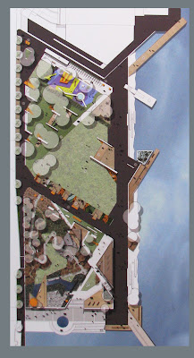
The last of the schemes is one that didn't appeal to me at first: it seemed too busy, too arbitrary with its jagged lines and deconstructivist forms. But after going through each of the schemes in detail, this one began to stand out for its liveliness and invention.

Frank Kitts Park redesign - Option EIt's very simply divided into thirds: from north to south they are the Chinese Garden, open "activity lawn", and raised garden. The last area contains the playground and an arrangement of small lawns, and is made much more accessible than at present by wide steps on three sides. The northern steps act as an amphitheatre for the lawn, which is big and flat enough for events but has some of its expanse broken up by paths at the eastern edge. The Chinese Garden is subtly different from the other entries in that it is neither completely traditional nor contemporary; and while not a walled garden it plays with enclosure in interesting ways.

It's based on the concept of a net, woven from intersecting paths. Overlaid on this is an array of parallel screens and bamboo, strategically pierced to create sightlines and outdoor "rooms": just enough to give a hint of seclusion without creating dangerously isolated pockets. Together with the water features they set the Chinese Garden apart from the rest of the park, but by breaking out in places across the promenade and towards Jervois Quay it engages the garden with its surroundings, and the bright red paths highlight passages and viewshafts to the city and sea.

Frank Kitts Park redesign - Option E - from the northThat bright red theme has been a bit of a talking point, and while I can see how it could be a bit over the top, it visually complements the predominant green tones, has cultural significance, and gives a burst of cheerful colour that could lift the spirits on a grey day. Both the colour and the geometries of these paths are echoed by the four small built structures. While these would presumably be kiosks of some kind, their purpose isn't spelled out. Even if they're not inhabited, they could have a valuable visual function; though the similarity to Parc de la Vilette and its follies is rather too obvious. But if they do become centres of activity, then they could be vital waypoints along the promenades, especially lit up at night. Two of them actually extend into the harbour, which I find refreshing: no-one else has had the courage to suggest this.

There are a couple of flaws, but they're not fundamental. There's a linear wetland right at the bottom of the steps between the raised area and the activity lawn, cutting off what should be a natural flow between them, but this could either be relocated or spanned by a series of boardwalks. The harbourside kiosks create unnecessary bottlenecks in the promenade, which really needs the width on a busy day, but either the promenade could be widened here or the kiosks could be shifted further seawards.

These quibbles aside, I've come to like the layout and use of space. The "shipyard play environment" is a promising change from predictable playground design, and it seems to be in the most sensible location. The monotony of the promenade is broken up just enough, without obscuring its essentially linear nature. But it's the use of sharp angles and vivid colour that really enlivens the space and could entice people into and through the park rather than just around it.

Frank Kitts Option D


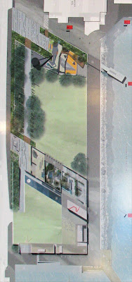
The fourth option is perhaps the cleanest and simplest of the lot. In fact, looking at the plan, it's hard to work out where they've put everything:

Frank Kitts Park redesign - Option DIn particular, where's the Chinese Garden? It took me a while to work out that it's the elongated, vaguely L-shaped arrangement of ponds and planting near the centre of the park. That doesn't look nearly big enough to provide the specified 3000 sq m, but it turns out that the row of pavilions along the Jervois Quay edge have generally Chinese themes (tea pavilion, Beijing and Xiamen sister city pavilions etc), so the Chinese "Garden" could be thought of as spanning the narrow stream and incorporating the whole reconstructed "historic wharf edge" linear space. That's either a very clever use of space for multiple purposes and meanings; or a sidestep that misses the whole point of a Chinese Garden. While I can appreciate a contemporary take on traditional principles, by omitting the sense of enclosure, framed views and twisting paths, many of the unique spatial properties of a Chinese Garden are lost.

Frank Kitts Park redesign - Option D - oblique viewWhat I do like about this scheme is the manipulation of the third dimension to create varied aspects and experiences while retaining a crisp, constructed aesthetic. The explanatory text claims that the "folding and creasing" is a reference to the ridgelines and faults of the Wellington landscape, and while that's an allusion that perhaps only other landscape architects will pick up, it makes a virtue out of the awkward topographical transition to the top of the carpark. By sloping down below grade at the northeast corner, it at least attempts to recreate some of the shelter lost in favour of open views, though I'm not sure that it will be enough to stop both the lawn and the promenade becoming quite bleak when the wind picks up. There's also no attempt to improve connection to the lagoon edge, and while I like the idea of building slides into a "playmound" that extend the topography, the relocated lighthouse slide seems to sit awkwardly in the new context.

I like the attempt to engage with Jervois Quay, but I wonder whether a string of separate pavilions would be enough to create the real activity, closure and sense of shelter that such an engagement would require. Their appeal as cafés would also be limited by the distance from the harbour, while their proximity to both the busy road and the streams and pools of the Chinese Garden might compromise their child-friendliness. The other built element in this scheme is an attempt to improve the edge of the TSB Arena: but is a tiny box labelled simply as "potential active edge" really any more than an afterthought?

This scheme impresses with its clarity, conceptual strength and contemporary aesthetics, but I wonder whether some of the practical, urbanist and climatological factors have been overlooked. Or perhaps the tagline "a great place to fly your kite" is a tacit recognition of the contradiction between the brief's requirements for both shelter and improved views?

Friday, October 26, 2007

Frank Kitts Option C


Option C looks like a real wildcard:. In contrast to the slick presentation and hard lines of the other entries, it has a homespun look and messily organic structure that really stands out. It's also the only one that doesn't "incorporate" a Chinese Garden; instead, Chinese elements and feng shui principles are spread throughout the whole park.

Frank Kitts Park redesign - Option CI'm actually surprised how much I like it, given my modernist tendencies. It works hard to break down the monotony of the long promenade, and to bring the land into the water and vice versa. It restructures the carpark into a circular configuration, slightly reducing the total number of parks while setting a café into the northeast side of the raised area. It has a lot of detail and complexity, but within a strong organising framework that respects the city grid more than it seems at first glance. It appears to take Chinese, Maori and European cultural signifiers much more seriously than some of the entries, there's a lot of sheltered space, and it actually looks quite fun.

Frank Kitts Park redesign - Option C sectionSurprisingly, this may be the scheme that has the least open green space, since all of the yellow-shaded area seems to be hard landscaping. This may not appeal to those who want a game of football or to stage a big event, but it creates a lot of sheltered nooks and crannies for quiet contemplation and picnics. It plays around a lot with sinuous grass berms, to the extent of having one snaking up to the TSB Arena, though I doubt that it and a small stage would be enough to humanise the edge of such a nasty building.

But despite all that, and despite my guarded admiration for mad old hippies like Hundertwasser, this all looks too twee and Seventies for my liking. If it wasn't for some of the more technical accompanying diagrams, I'd have assumed this was a school project, and while it has some admirably inventive ideas (such as the curving breakwater and the dragon boat display cases) the plan as a whole looks too amateurish. There's something about all the circles, triangles and squiggles which, while full of symbolism and a nice change in some people's eyes, just seems to set up a discord with the urban context.

Thursday, October 25, 2007

Frank Kitts Option B


This is an anonymous competition, but based upon the formalised use of oblique grids, the emphasis on ecological "filter fields" and the rendering style, I think I can guess who it's by.

Frank Kitts Park redesign - Option B master planThe play area and Chinese Garden are both confined to relatively narrow diagonal strips, at the northern edge and along the Willeston St viewshaft respectively. The latter makes some sense, in that it can engage with the slope along the edge of the carpark, but it makes no attempt to open up the view to the water, opting instead to frame the view of St Gerard's with walls and sloping roofs.

It is these structures that appeal most to me about this scheme, since they're part of a tight cluster of small buildings at the southeast corner: not just a teahouse, but a gallery and a canopy that extends out over the promenade. They're hard to make out in the plan, but they dominate the image that the DomPost chose to illustrate this scheme:

Small buildings at the southeast end of Option B for Frank Kitts ParkNo doubt this will have horrified Waterfront Watch, despite the fact that they're little more than pavilions that add only a single storey to the existing carpark structure. Apart from that, this could be the sort of plan to appeal to them, given that it has two very plain open expanses of grass. These look far too featureless and windswept for my liking, and I'm especially concerned about the one above the carpark: this area is underused already, and despite some new steps, it will take more than an empty lawn and the relocated Albatross fountain to entice people up here. There's also a "plaza" at the northwest corner that looks far from inviting.

There are some elements that I like about this scheme: the Chinese Garden seems to be a good combination of tradition and modernist geometry, and it integrates well with a complex of low-rise buildings that could form a much-needed beacon of activity at one corner. But this concentration of activity has left the rest looking bare and monotonous, and there appears to be no attempt at all to engage with or mitigate the effects of the TSB Arena.

Meridian media


Meridian building at KumutotoThe Meridian building has been getting a lot of media love since it was officially opened yesterday, with video clips on TV1 and TV3 news, and a major article in today's Dominion Post. Meridian have also set up a website specifically for the building, though all it has so far is one video (Update: this is now fully operational, and has some useful content about the ESD features in the building).

All the news interest has centred on its environmental features, and justifiably so, for it seems to be truly innovative. The only article I've seen so far that assesses it aesthetically is in the latest edition of Architecture NZ (not online), which is generally full of praise but quibbles about the "busyness" of some of the detailing, such as the quasi-random wooden slats and the projecting bay on the harbour side. Now, I'm enough of a Modernist that I would have liked it without them, since it would have been a sleek and elegant minimalist building; but the details give it a sense of personality, scale and warmth that makes it even better.

Meridian building - 'bay window' detailIt's a bit too early to properly assess it from an urbanist point of view, so I'll wait until the ground floor tenants are in (I've read that Mojo were planning to open in November, but that seems a little optimistic) and the public space to the north has been completed. All of the signs are good though: all except a few metres of the perimeter have active edges; there's plenty of detail to engage human interest; and its L-shaped plan seems just right to create well-defined and sheltered spaces around it. If all of that turns out as planned, this could be Welllington's best new building in a long, long time.

Wednesday, October 24, 2007

Frank Kitts Option A


This is the option that was subtitled "Celebration of people - body & soul", which is a rather apple pie sort of feel-good statement, but it underlines the fact that it seems aimed at practicality and human-scale experience rather than grand formal gestures. That might account for its current lead in the Dominion Post poll, and while it might lack drama or theoretical interest, that may not be a problem for such a park.

Frank Kitts Park redesign - option AOne of the things I like about this entry is that it emphasises incremental improvements rather than a "big bang" approach. Elements such as the deck stepping down to the water, the "sea planter", canopy and cafe, toilet block/kiosk and a bridge link south of Shed 6 (a very sensible approach to eliminating the bottleneck there) are all labelled "optional". Given the budget constraints, this might be a realistic strategy.

The playground hardly moves, and most of the rip-rap and trees along the harbour edge are retained. The Willeston St viewshaft is reinstated, and the carpark appears to be untouched. One thing that sets this apart from the other entries is that the Chinese Garden goes on top of the carpark, which seems odd given that the technical difficulty of building such a garden above a carpark was given as one reason for relocating it from the Waitangi Precinct! The Chinese Garden design itself seems fairly traditional, with a tiny octagonal tea kiosk at the southwest corner and a second ("optional") cafe on the eastern edge. Breaking into the southern wall creates new steps down to the lagoon, improving access to the raised garden and plaza.

It's the central "harbour lawn" section that shows some subtly clever touches. While it's quite a large and exposed expanse of grass, there are several elements that break up the expanse into more intimate areas without reducing the total space. The "harbour walk" (aligned with Willeston St) is lined with raised platforms that double as seating or stages; the northwest corner combines a "native grove" with a slightly sloped lawn, the relocated memorial plaques and more benches; and the diagonal ramp on the harbour side helps to shape and guide the spaces.

Overall, it's a scheme that seems to tick all the boxes, and apart from the location of the Chinese Garden all of the design choices seem safe and uncontroversial. That it lacks the "wow" factor may not be a hindrance to its success as a park, though I'd still prefer to see a bit more boldness and flair.

Waterfront poll


Today's Dominion Post has a large spread on pages A10-11 dedicated to the Frank Kitts Park and Kumutoto design competitions. There's also an online slideshow and poll, inviting you to vote for your preferred entries.

An entry in the Kumutoto design competitionThat's an admirable step towards engaging the public, but I'd urge some caution before voting online. I've been to both exhibitions several times and mulled over the entries, and I don't think I'm ready to play favourites yet. Between the two competitions, there are 11 schemes, each of which deals with multiple buildings, functions and public spaces. That's a huge amount to take in, and given that the online images only give you a tiny overview of the whole scheme or a small rendering of a single building, without the multiple perspectives, plans and explanatory text of the entries themselves, there's nowhere near enough information to make an informed decision.

An entry in the Frank Kitts Park redesign competitionFor the sake of participation, I'll probably click one of the boxes on the poll today based on a gut feeling, but I'm still planning a series of in-depth posts about each entry, and it won't be until I've gone through the analysis required for that that I'll be able to know which I prefer. If you are planning to take part in the (totally unofficial) online survey, please make sure you get down to the Waterfront Project Information Centre and spend some time with the full entries before casting your vote.

Tuesday, October 23, 2007

In the saltmines


There's been a lot of talk lately about the end of the 40-hour week, given the startlingly high numbers of people in this country working long hours. I thought it would be interesting to see where these busy bees were, so I started by looking at the census figures for Wellington to see if there were any patterns. Here's a map showing the proportion of employed people working more than 50 hours per week in their main job:

Proportion of employed people working more than 50 hours per week - Wellington, 2006 censusActually, it's hard to discern any patterns. There's a hint that there are more hard workers in the affluent suburbs, which could be used by the well-off to justify their success as the result of good old-fashioned hard yakka. On the other hand, since this is just for one's "main job", it might hide a lot of poorer people struggling through an assortment of part-time jobs.

It looks as if I've made a bad choice of colour palette for that map, since very few meshblocks are up in the 50%+ bracket, so everything gets lumped down in the dark reds. But the choice was based on national data distributions, and if we zoom out we can see that there are indeed large areas that are humming with bright red activity:

Proportion of employed people working more than 50 hours per week - All NZ, 2006 censusBut not in the cities! Contrary to the cliché about highly stressed corporate office workers, it seems that New Zealand's hardest workers are in rural areas. This leads one to suspect that perhaps it's all those farmers, up at the crack of dawn to milk cows and not resting until the fences are fixed, who are skewing our national figures. The multi-dimensional Census data isn't out for 2006 yet, but here's a breakdown of working hours by industry from 2001:

Hours worked per week - 2001 censusAs you can see (if you click on the graph for a larger version), agriculture and mining do indeed dominate the figures for long hours. The Transport and Storage industry also stands out, and much of that might be associated with the rural sector too.

So, what does this suggest? Firstly, perhaps New Zealand's reputation of having the longest working hours in the world is mostly due to our largely agricultural economy, and that legislation aimed at giving us office drones a bit more time off won't actually change anything at all. I'm surprised that this hasn't been mentioned in any of the discussion in the media. Secondly, forget all that nonsense about escaping the rat race for a quiet life in the country: if you want to chill out, move in to the city!

Saturday, October 20, 2007

A Freaky place

File under: , ,

As Cuba Street gradually becomes slicker and more expensive, it becomes harder for new or marginal businesses to establish themselves there. Luckily, there are still side streets and tucked-away little alleys that offer cheap opportunities to start a shop. The Left Bank is one such place, and the latest example is FREAK!space, which has just opened in shop 206.

Mr Freak at FREAK!spaceI've written about Mr Freak and his productions before, and in July I mentioned his search for a venue. While I don't think I've got quite the style (or figure) to carry off his outfits, they're a great example of upcycling: turning second-hand suits into spectacular custom creations.

Exhibition at FREAK!spaceThe space will also be used for exhibitions and events, and the current exhibition offers a cheeky take on colonialism, complete with a sign reading "Blankets 4 Sale. Will trade for land, beads or guns." In fact, with Oblong and the Freedom Shop just a few doors down, this could become quite a hotbed of dissent: so much so that when I saw a couple of police officers walking through the Left Bank today I wondered for a moment whether an Abel Smith Street style of raid was on the way. The spirit of Cuba St hasn't died; it's just moved around the corner.

Friday, October 19, 2007

Building rumours 19: Featherston Tower


With so many new buildings planned or rumoured at the moment, it's hard to know where to start. I'll round up some of the apartment developments soon, but for the moment here's something to show that, despite predictions from the anti-Harbour Quays lobby, there's still plenty of interest in building office towers in the core CBD.

A sign has popped up on the corner of Featherston and Waring Taylor streets advertising "Featherston Tower". This is an unusual development, since while most of it will be built on the site of what's now a low-rise building at 128 Featherston St, a lot of it will be constructed on top of the 11-storey Laptop Company Building next door.

Featherston Tower - current render?Interestingly, this is not the first we've seen of this project. DeepRed over at SkyscraperCity posted a link to the engineers' website, and that has some rather different renders:

Featherston Tower - old render?Apart from the apparent façade differences, which may just be because the engineers are concentrating on the structural details, the main difference is that the southern section is significantly taller and appears to have an angled roof. Given the timing, I'd expect that the top render is what will actually be built, and I think it's quite an improvement.

Rather than a single, rather heavy slab, the building now reads as a slender tower adjacent to a floating glassy volume. The vertical fins on the tower section seem to extend slightly above the building itself, increasing the sense of slenderness and, if the detailing is handled well, giving a sense of the top of the building dissolving into the sky. While there's something to be said for the argument that a building's top and bottom should be marked architecturally, too often the tops of office towers have been capped with pseudo-domestic pitched roofs or quasi-Classical frippery: this seems like a more appropriate way to treat the top of a skyscraper without descending into pastiche.

It will be a shame to lose the existing brick building, partly because of the warmth of its materials and restrained Deco-ish details, but mostly because it's been a rare example of a cheap old building in the CBD that's allowed small and interesting businesses to get a start. Still, the signs are good that this will be a decent enough replacement, if not a brilliant piece of architecture. The earlier design was by ArcHaus: does anyone know whether the new version is the work of a different firm, or just an evolution of the design?

Tuesday, October 16, 2007

Kumutoto Kapers


The publicly-displayed entries in the Kumutoto sites 8-10 competition are, as I said yesterday, now on show upstairs at the Waterfront Project Information Centre. Most of the entries really pull out all the architectural stops, and there's very little in the way of "variations on a cube" to be seen amid all the swoops, bubbles, facets, folded planes and hovering mushroomy forms. Actually, the most cubical of the lot is one of the most striking: a huge wooden grid with plug-in fluorescent containers and cascading green walls, evoking Archigram doing Musée du quai Branly in a lumber yard. Even the more sedate designs would stand out from the run of the developers' mill, and among the most daring there's some dynamism and excitement going on that we so rarely get in Wellington architecture.

Exhibition of entries for Kumutoto sites 8-10I'll try to get hold of some images to post here, so that I can discuss them in depth, but in the meantime you owe it to yourself to get down there and get your head around these complex and sometimes bewildering designs.

There is one caveat, though: you may have noticed that I didn't say "shortlisted entries" or "finalists" but "publicly-displayed entries". That's because not all of these are being considered further by the judges, and it's not made clear which ones are actually in the running. There still seems to be some confusion surrounding this, but as I understand it, the panel is considering each site separately and has chosen two options for each of the three sites from among the schemes on display. Even then, I gather that at least one of the entries here is definitely not going any further: I'm glad that the public will get to see it, since it's deeply thought-through and definitely iconic, but it seems strange to have it here if there's no chance that any element of it will be built.

I'd like to think otherwise, but I have a sneaking suspicion that some of the more pedestrian buildings will get the nod, and that the more extravagant designs are just there to give the impression of unbounded creativity. If that is the strategy, it might backfire, since it seems to me that most of the buildings are at the very least inventive and attractive, and would make fine additions to the waterfront; but in this company they look safe and conventional. Even so, all of the schemes seem to have played fast and loose with the brief, and the height limits in particular: what might become known as "the conniptions building" is only the most extreme (at about 20 storeys). I don't necessarily mind that, since going over-height in one area has usually been countered by opening up views or intriguing public spaces in others. What is somewhat disheartening is that none seem to have room for indoor sports on the ground floor.

But you do have the chance to give your feedback, and I encourage you to do so. If a particular building captures your heart or turns your stomach, say so! If you think a particular aspect or problem hasn't been addressed, let them know. This is not a public vote for your favourite scheme, but a chance to give reasoned and thoughtful feedback: if you just say "I like option X" or "Option Y sucks" or "I'm appalled and outraged! Give us a paddock", then you're much less likely to be taken seriously than if you say "I like the way that X engages with the existing buildings, but the pedestrian access is poorly resolved", or "Y is spectacular, but I wish there was a way to combine it with the winter garden idea from scheme Z". I already have some gut favourites, but I will take some time to work through all the pros and cons before coming to any decisions, and so should you.

Monday, October 15, 2007

Green water


Today is Blog Action Day for the environment, so I thought about posting something about sustainable urbanism (for a change ;-). On the other hand, there's a lot going on relating to the waterfront, so why not combine the two? First though, in a slight digression, I don't suppose there's any irony in the fact that on such as day, a Wellington house used by environmental activists was raided by police? The discussion is heating up over on Indymedia and Hard News.

Lobby of the new Meridian Energy buildingBut back to the waterfront, where Meridian Energy moved into their new green offices at Kumutoto today. I hope to wangle myself a site visit soon so that I can do a proper review, but in the meantime I'll just say that the building looks even better than I'd originally expected, with a rather spectacular cantilevered staircase. Given the changeable weather today, it looks like both the water capture systems and solar panels will be getting busy, though I wonder how much photovoltaics it will take to power those display screens in the lobby?

It'll be interesting to see how well the bike lockers get used, though given the absence of carpark and the location close to the CBD and transport hub, I'd be willing to bet that the proportion of workers using public transport or leg power will be greater than if exactly the same building had been in a suburban office park. If the weather continues like this, I suspect they'll be hanging out for Mojo to open downstairs: the last I heard it was expected to be ready in November, though the liquor license notice has only just appeared. Mixed use on a brownfield site, without carparks, close to public transport, and with high-quality public spaces taking shape around it: that's my idea of sustainable urbanism, even without all the innovative features of the building itself.

Shortlisted entries for the redesign of Frank Kitts ParkThe shortlisted entries for the redesign of Frank Kitts Park are now on display at the Waterfront Project Information Centre, and the entries for Sites 8, 9 and 10 at Kumutoto will be on display from tomorrow (not next Tuesday, as originally stated). I'm expecting most of the controversy to come from the latter (because it involves buildings, of course, and in the case of one sneak peek that I've seen, buildings to give Waterfront Watch conniptions!), but there's already a lot to get your head around with the five Frank Kitts designs. All of them have a Chinese Garden, most of them don't fiddle with the existing carpark very much, and all keep the lighthouse slide as the centrepiece of a relocated playground; but otherwise there's quite a variety of ideas. Semi-circular jetties, memorial walls, filter beds, "crustacean playspaces", "landscape containers", Feng Shui circles, bright red waterside kiosks, "gift lines" and native groves are all in there somewhere, along with more prosaic elements such as lawns, promenades and viewlines. I'll try to get hold of some images and write up some analysis here, but in the meantime, you have until November the 2nd to see them and put in your feedback.

New sculpture at Waitangi ParkFinally, the previous major park development is still evolving and coming into its own. The long-awaited sculpture to mark the eastern entrance to Waitangi Park has finally been installed, and when the sun arrived yesterday it was great to see the variety of uses going on throughout the park. It was fine (and almost dry) enough for some to play on the field, while the skatepark and playground were packed as usual, and people were even playing petanque! The wind turbine was spinning away silently, and Empire Skate & Street seemed to be doing good business with its gelato and Havana coffee. The species of reed (whichever one it is: I'm looking forward to some interpretive plaques) that dies down over winter was starting to show some spring growth, and the graving dock garden, while I'm sure that traditionalists would prefer roses, is alive with subtle flowers and brightly coloured foliage.

Mövenpick might have to wait until high summer before it starts raking in the cash, and Port Café really needs to work out whether it's going to be a cheap fish 'n' chip joint or a gourmet seafood restaurant: at the moment it's too expensive to be the former and lacks the décor for the latter, although the collection of Greek brandies in oddly-shaped bottles might be amusing to sample one night. The Herd St Brasserie is always busy, despite a disappointing review in Cuisine, but it's Zarbo that might really pull in a wide range of customers. When it opens later this month, it will have a bar and pizzeria as well as being a deli and café, and given how popular Caffé Italiano is proving to be, it should be a winner. A gallery and hairdresser's are also supposed to be opening in the atrium, though as yet I've heard nothing more concrete.

What do the last few paragraphs have to do with environmental issues? Simple: when recreational, commercial, hospitality, residential, retail and cultural uses are brought together into a relatively small area, rather than dispersed around the place, we save not only precious land but minimise the transport required to travel between them. Not only that, but if it's done right, the uses need not compete with one another but enhance each other and make everything more viable and lively. There may not be as many square metres of open space, and not everywhere will have panoramic views, but the public spaces will be better and there will be more to look at.

Sunday, October 14, 2007

Tracking the council


It seems there were no major upheavals this weekend (at least not regarding the council), and the incumbent mayor was returned with a large margin, to a less than rapturous reception in some quarters. The mayor is only one vote on the council, however, and shifts in the balance of power there might have more effect. So, what's the overall effect of the changes, particularly on my main hobbyhorses (transport and the waterfront)? Here's the list of past and present councillors, with new ones in bold and deposed councillors struck out:
Alick Shaw Iona Pannett
Jack Ruben Jo Coughlan
Robert Armstrong Ngaire Best
Andy Foster
Helene Ritchie
Bryan Pepperell
Celia Wade-Brown
John Morrison
Ray Ahipene-Mercer
Leonie Gill
Rob Goulden
Hayley Wain
Stephanie Cook
Ian McKinnon
Of the new ones, the one with whom I'm most familiar is Iona Pannett. She stood for the Greens, so as you would expect I'm delighted with the prospect of a stronger voice for public transport, sustainability and social housing. However, she's also involved with Waterfront Watch, so it's clear that her vision for sustainable urbanism is different from mine, which involves a high density mixed-use CBD, including the waterfront (not that going from roughly 75% to 70% open space is exactly "high density"). Perhaps she can be convinced that, as I put it earlier, "a quality public realm isn't always the same as maximising unbuilt space", and that "green" politics is not always about "green space". She has struck me as less dogmatic on this subject than Jack Ruben, so maybe if (for example) the public spaces at Kumutoto prove to be as popular and attractive as I think they will be, her policies can adapt to the idea that urban can mean sustainable.

I know next to nothing of the others. According to Ngaire Best's website, it would appear that she's been mainly concerned with local issues for the northern suburbs, and it's only by reading her responses to the Chamber of Commerce questionnaire that I've managed to get a sense of her policies on larger issues. For instance, while she does talk about "increas[ing] the quality and availability of Public Transport within the city and across the region", this seems subsidiary to building more and bigger roads, "including connections from the Churton Park Interchange through to the Hutt Valley, ... Transmission Gully and improved roads from the city to the airport and tertiary hospital". With the Ngauranga to Airport study still looming, I think we can sense her priorities there. I haven't found any statements from her regarding the waterfront or inner-city density, though I do get the impression that she promotes suburban values, so I'm not hopeful.

It's even harder to find out Jo Coughlan's policies, as she didn't appear to have a campaign website. She generally appears to be centre-right, which would suit her background and connections, and some approving comments on Kiwiblog had me very worried. Still, if her answers to the Chamber's questions are anything to go by, she may not be as far right as that might suggest: for example, she supports a differential between business and residential rates (though she doesn't say whether she'd keep the current ratio). She's heartily in favour of the waterfront developments, and I agree to some extent with her when she says "Why can't Wellington CBD and Te Aro be like Manhattan?" - though I would caution that even in Manhattan, there is a distinction in urban form between Wall Street or the Upper East Side and Greenwich Village or Chelsea. But her statement on climate change ("I am of course in favor of reducing green house gases – but we must be careful that we keep a balanced perspective on this. Given our relative clean, green status internationally, I would expect we pose little threat to the planet compared to hundreds of other cities internationally.") made me slap my forehead, and while there are the usual soothing comments about public transport, roading seems to come first.

So, how have the balances shifted? Not a lot, it would seem. On waterfront development, Pannett has in some sense replaced Ruben and Coughlan replaced Armstrong, though it's hard to tell how Best compares to Shaw on the issue. On the balance of public and private transport, there seems to be a slight shift in favour of the former, since Pannett is a stronger advocate than any of the three now ex-councillors, and the others seem vaguely similar to their predecessors. All in all, it seems fairly much like steady-as-she-goes on the waterfront, while any slight shift in favour of public transport might be less momentous than decisions made at Regional Council and Central Government levels.

Friday, October 12, 2007

Gangs of Khandallah


There was a bit of heated discussion around here a few months ago about whether it would be a good thing to restrict ad-hoc infill while encouraging infill in places that have the infrastructure to support it. I put in a submission in favour of that approach, and since then, there's been a lot of generally negative media noise about infill in general, but very little about the notion of targeting such intensification where it would be most appropriate.

A case in point was the recent furore about architect Denis Fortune's threat to build a gang pad on a large Khandallah section, saying that it would be easier to get consent than for the townhouses he was planning. Let's leave aside for the moment the question of whether that was a scurrilous threat, a bad joke or an amusing way of ruffling a few expensive feathers. For me, the question is: is this a sensible location for this sort of infill?

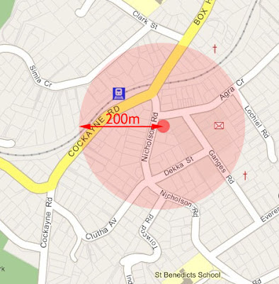
The vicinity of 9 Nicholson Rd, KhandallahA map of the neighbourhood shows that the section is a short walk from the nearest railway station, just around the corner from the local shops, and has three schools within a few minutes' walk. The area is reasonably well served by buses, and looking slightly further afield, there is a large playing field, swimming pool and access to the town belt within 500m. The immediate vicinity is relatively flat, and in general everything suggests that it is a walkable neighbourhood with good access to the city and to local amenities.

What about the section itself?

9 Nicholson Rd, KhandallahAt about 825 sq m, it's slightly less than a quarter acre, but about 4.5 times the size of the sections that the well-loved Wright St houses in Mt Cook are built on. So, putting six townhouses here would be just slightly higher density than was being built 100 years ago. The shape of the section is a bit awkward for that sort of street-facing development, but it could suit a courtyard typology. The fact that it is a corner site means that there's one fewer neighbour to worry about; immediately to the east is what appears to be the carpark for Taste restaurant; and to the south the nearest house is separated from the boundary by what looks to be quite a wide driveway or access strip. Increasing density will of course have some effect on the neighbours, but hardly catastrophic.

Without having seen the site in person, I'd have to say that this is just about as good a candidate site for suburban infill as you can get. It would be sad to lose the trees, but compared to the damage done by scraping the vegetation off six large sections on the outskirts of Churton Park or Newland, it's a relatively low-impact way of housing six households. Of course the character of the neighbourhood will change, but I've never been particularly keen on preserving the "character" of low-density suburbia anyway.

I find the tone of some of the opponents rather grating, especially a letter in today's Dominion Post saying:
"There's still time to do the honourable thing. They should eschew the predicted profit and sell the existing house and property to someone who wants to live there and who will take care of it. The entire neighbourhood will thank them for it."
You have to wonder how much the neighbourhood's thanks will be due to preservation of actual quality of life, and how much because they don't want their fat property values to be diluted by allowing more residents into a tightly-held and desirable suburb. No doubt the good burghers of Khandallah see the proponents of such intensification as "dishonourable" and worse than bikie gangs, but there's something rather reminiscent of cartels in the restriction of supply to maintain high prices.

Of course, Fortune's statements don't really help. I can understand his frustration at the delays and the anomalies in the District Plan, but such a development really should go through the proper process. Perhaps once the District Plan changes have reached the point of specifically identifying "areas of change", this will be one of those parts of town where such infill should be able to happen through a streamlined, non-notified process. I'd still like to see strict controls on the quality of architecture, though not to enforce "historic" character: I'd even prefer an uncompromising Bauhaus design to the sort of gruesome quasi-vernacular pastiche that so often gives infill a bad name. More than that, I'd like to see a coherent plan for the entire neighbourhood, including the adjacent shopping strip and the nearby station, to set this on the way to becoming a proper little town centre rather than disparate assortment of one-off developments.

Thursday, October 11, 2007

Wooly Bully


Local body democracy doesn't end with the elections: there are always submissions and feedback processes going on. The submissions on plan change 58, which proposes to add 16 buildings to the heritage inventory, have now been summarised and are open for further submissions.

Old Wool House (centre), 139-141 Featherston St WellingtonThere's the usual mix of pro- and anti-submissions on many different buildings, but one thing that stood out for me was the number of submissions objecting to the inclusion of Old Wool House in Featherston St. To those without a specific interest in Modernist architecture, it probably never attracts a second glance, but here's what the Architectural Centre has to say about the building (taken from the brochure for Wellington Architecture Week 2005 - 7.86MB PDF):
Wool House was built for the New Zealand Wool Board in 1955-1957. It was designed by Johns and Whitwell in association with S. William Toomath. The articulated façade of the building avoids the "dullness of the regular curtain wall grid" Toomath had observed in buildings by second-rate architects in New York. It is, as Toomath has noted "a pure expression of the concrete frame ... the regular grid was the only solid surface in the façade."

Conceptually the building is a five storey box standing on two major columns, 26 feet (or 8m) high. These were spot-punched Coromandel granite columns. The projecting baywindows were carefully glazed with a green-tinted antisun glass, in beautiful bronze sashes. These are reminiscent of the villa baywindow, providing clear views up and down the street, designed for maximum views, maximum light, and ease of cleaning. They deliberately took advantage of a city bylaw intended for architectural features such as pediments and cornices which allowed projections over the footpath of up to two feet. Old Wool House was a recipient of a N.Z.I.A. Wellington Branch 2002 Enduring Architecture Award.
And here are some of the justifications for its non-listing, from the summary of submissions (231kB PDF):
"it is a modern building and has no decorative value interest. It is better to conserve actual old buildings of value."

"it looks far too modern to be considered a heritage building"

"it shows no architectural value whatsoever and is of no significance to the city"

"it is so simple, plain and has no architectural features to be listed as heritage"

"the building has no architectural features, just a plain box with holes in the concrete walls. The submitter cannot see any hallmarks that this building has to qualify its heritage. It has no decorative features and has been wrongly recommended to be listed as a heritage building."

"it is simply an ordinary 1950's commercial building with no historic value and should not be given heritage status"

"it shows no sign or character of coming into the category of being a heritage building. There are buildings that have been erected in Wellington city with the same boring character – does the Council intend to turn these into heritage also?"
Is it not old enough to be heritage, at a mere half-century? That argument could have been used in the 1980s to demolish Art Deco buildings, and in the 1950s to dispense with Victoriana. But it's the use of terms like "simple", "plain box" and "no decorative features" that is most revealing: to some people, Modernism is not part of our heritage.

Many of the objectors clearly have a connection to the owners of the building, and some other names are familiar from the property industry, and thus one can spot the usual financial motivation behind such opposition. But others sound like they might just be members of the public or heritage enthusiasts bemused and angry at the idea that Modernist buildings might be considered worthy of preservation. To such people, "heritage" is all about wooden colonial cottages, or grand Victorian piles festooned with twiddly bits, rather than a recognition of the dynamic physical and cultural evolution of the city.

Old Wool House - detailIn Stuart Niven's IntensCITY talk, he spoke of heritage in terms of "a popular need for a sense of the continuum of time" and "meaningful evidence of where we've come from". There is more than a little irony that Modernism, which in its most extreme forms was actively hostile to "the continuum of time", is now part of that continuum. But of course it is, and Old Wool House is an early and notable example, with connections to one of Wellington's most influential Modernist architects. Even "ordinary 1950's commercial buildings" are a significant part of the architectural fabric and history of Wellington, and to those with a sympathetic eye for the period it's a handsome example of the most significant architectural movement of the last century.