WellUrban

Personal reflections on urbanism, urban life and sustainable urban design in Wellington, New Zealand.

Monday, July 30, 2007

Art at your feet


While there's a lot going on around the Buckle St section of the bypass, Karo Drive itself is going to take a long time to integrate into the texture of the city (sad, empty buildings don't help). Some citizens have taken things into their own hands and decided to give that most anonymous and downtrodden of icons, the pedestrian walkway pictogram, a bit of individuality.

Modified pictograms beside Karo DriveI think these are clever, playful and creative, and make a small but significant step towards humanising the asphalt deserts of Karo Drive without sacrificing the legibility of the original. But not everyone thinks so. Over on solidstate's Flickr stream, there's been a bit of debate about whether these are art or vandalism: some graffiti is clearly both, but in this case I really can't see a downside. To my eyes, Emo Walker, Dressing-gown Walker, All Black Walker and Windy Walker aren't destruction of private property so much as unsolicited improvements to the public realm. As solidstate so eloquently puts it, "A city is a work forever in progress, forever built on the additions of others".

Buckling


Apologies for the lack of posts recently: what with the film festival and Road Works design competition over the weekend, I've been a bit short of blogging time. More on the latter soon, but in the meantime here's a couple of quick notes about the Buckle St area.

Among all the architects, engineers and historians, there was also a presentation from Mt Cook residents. It always seemed a bit strange that moving such a major road closer to a school was proposed in so cavalier a manner, but the locals have done some calculations based upon MfE formulae to conclude that reducing the distance from 40m to 10m would increase pollution at the school by 260%. I think the competition entrants took tunnel or trench options a lot more seriously after hearing that. The Mt Cookers have also set up the Mt Cook Mobilised blog to discuss that and their other concerns (such as the proposed Tasman St supermarket).

Fumes of a different sort were seen rising from the vicinity of Buckle St yesterday morning as an old two storey building in the adjacent Martin Square burnt down. According to the news report, "the building was due to be demolished and replaced by an apartment block." I haven't seen any plans or consent applications for a building there, so does anyone else know more details? It could be relevant to the wider context of the changes along Buckle St.

Friday, July 27, 2007

So long, Cowboy


The neon cowboy being removed from Dixon StDoes anyone know what's happened to the neon cowboy sign outside what used to be Chevy's in Dixon St? It had been a sad shadow of its formerly bright self after the former Chevy's changed from Quarter to MVP, then a few weeks ago I saw it being loaded onto a truck. At the time, I hoped that it was just being removed temporarily for repairs, but it's been a while and there's now a naff little "Gaming" sign in its place.

So, has the lonesome cowboy gone West for good? That would be a dang shame, consarn it!

Thursday, July 26, 2007

Kumutoto khazis


It may not have as rarefied a subject as the Memorial Park, but there has been another design competition going on: an internal contest among staff at Studio of Pacific Architecture, who have co-designed the public space at Kumutoto, for a combined public toilet and "folly" to go near the southwest corner of the Steamship Wharf building. The results are currently on show at the Waterfront Project Information Centre in Shed 6.

Kumutoto toilet design competition - modelsThe contributions are, in various measures, beautiful, funny, relevant, playful, innovative and (one assumes) practical. Some include drinking fountains and telephone boxes, others are shaped like links in a nautical chain or are covered in living green walls. Unlike the unofficial Road Works competition, one of these will get built, and the winner will be decided tomorrow. With so many great ideas to choose from, whatever gets built should be really special, and in no time Wellington will be right up there with Kawakawa.

Kumutoto toilet design competition - Green Folly

Road working


Excerpt from Road Works design competition flyerThe School of Architecture, VUW and the Architectural Centre are joining forces to run Road Works, a 24-hour design competition this weekend for the Memorial Park on Buckle St. Unfortunately, this isn't the actual competition to design the park, but it's free, open to everyone, the winning entrant receives $1000 and all entries will be on display next week at the School of Architecture.

The competition kicks off with a seminar on Saturday morning, then you'll have from 1 o'clock that afternoon until 1pm Sunday to develop your design. Even if you're not planning to enter the competition, the seminar could offer some important insights into this significant project.

Memorial Park Seminar, Lecture Theatre 2, School of Architecture, 139 Vivian St, Sat 28th July 2007

9.30-11.00
Opening/Introduction
Motivation and Background to the Ministry of Culture and Heritage competition
Historical Context
Archaeological and heritage issues
RNZRSA services and protocols
Discussion

11:00 – 11:30 morning tea

11.30 – 13:00
Urban Design Principles/Site analysis
Traffic Issues - getting the best for pedestrians, cyclists and automobile traffic
International Examples of Memorial Parks
Park Design - a C21st approach
Discussion

13:00 Scenario Brief & Conclusion

13:00 Competition briefing

13:00 Sunday Competition hand-in


If you want to enter the competition, register your interest with rhys.williams@vuw.ac.nz. The judging panel includes: Jim Beard (well-known commentator and practitioner of landscape architecture and architecture - no relation), Judy Keith-Brown (Wellington architect) and Rhys Williams (Landscape Architecture Programme, VUW). I think you should feel free to make your entry as serious, practical, frivolous, conceptual or idealistic as you wish. Remember: this is all about stimulating debate, so wider concerns such as the role of urban space, traffic and the very idea of a "memorial park" should all be open to question.

Tuesday, July 24, 2007

Walk this way


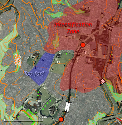
My last post on the Johnsonville Town Centre Plan seem to have generated a little bit of controversy, primarily involving an anonymous commenter with a familiar style. Just for the record: no, I'm not intimately familiar with J'ville and its environs, which is why I was asking for those with local knowledge to assist me with understanding why some seemingly handy blocks were omitted from the "intensification zone". It does sound like there are some access difficulties, though as this map (adapted from NZTopoOnline) shows, the overall gradient between there and the station seems relatively gentle by Wellington standards: only about 20m rise over a distance of 500m.

Johnsonville intensification zone with contoursThis all goes to show how complicated it is to define what a "walkable" distance is. The website Walk Score (via Lifehacker) allows you to search for an (American) address, then tells you how walkable that neighbourhood is by working out how far it is to the nearest shops, schools, parks and other amenities. Most of Manhattan scores near 100, while typical suburban and exurban locations are way below 50. It's a good concept, but the methods they use a far from perfect.

For a start, they use direct "as the crow flies" distances, thereby assuming that people could walk through the middle of rivers, buildings, railway tracks and motorways. This thereby ignores connectedness of the pedestrian network, which is a vital ingredient in a walkable neighbourhood. It also ignores terrain, which as the recent comment-storm has shown, is an important influence in a place like Wellington. The location and classification of the amenities they show is only as good as the data in the Google API, which is one reason why it won't work here yet: even though ZoomIn, for instance, has a database of many such amenities, it's not quite complete or organised enough to use for this purpose at the moment. Nevertheless, the Walk Score site gives a moderately useful indicator of mixed use and density, and is promoting a very important message.

Walk Score analysis for southern Las VegasI've been thinking about setting up some routing algorithms for walking distance in NZ, and while the basic concept should be simpler than for driving (there are no one-way streets or turn restrictions to worry about), it's much more complicated to come up with a truly realistic model. As well as distance, one would have to think about:
  • slope
  • waiting time at crossings (and we know how important that is!)
  • joining up the entrances and exits of parks and squares
  • opening hours of "quasi-public" shortcuts (e.g the lifts between Lambton Quay and the Terrace)
  • foot traffic (grr, slow walkers on Willis St at rush hour!)
That should give a pretty good estimate of the shortest time it would take someone to walk from A to B, and thus the number of Bs there are within a given number of minutes from A (if that makes any sense). But even that is only part of the story: sure, maybe you can walk from A to B in five minutes, but would you want to? A blank, featureless environment makes a given distance feel much longer (hello, Harbour Quays), and shelter can have a major impact too: I'll often choose a longer route to work via Lambton Quay than the shorter but bitterly exposed walk along Customhouse Quay. Safety (or at least the perception thereof) is another factor, especially at night when routes that are too dark and deserted (most parks) or too rowdy (Courtenay Place late on a Friday night) will be avoided by many.

To their credit, Walk Score recognises the limitations of their technique, and link to some good articles on the complexities of walkable communities, much of which will escape the analytical capabilities of even the most subtle GIS system. It takes more than a direct, flat path to make people want to walk somewhere for something other than the daily trudge to and from work, and the irregular shape of the intensification zone shows that the planners have been taking at least some of these into account. The plan seems to be aiming for all the right things to make central Johnsonville into a place where people would not only be able to walk to work or the station, but actually feel good doing so and feel like hanging around at the weekends too. They've got a long way to go, but it's the necessary first step.

Monday, July 23, 2007

Greening Ghuznee

File under: ,

Tree pits in Ghuznee StThe pavements are still being dug up all along Ghuznee St, four months after the bypass was completed and a couple of months after the "remaining work" was supposed to be done. Some of it is finally starting to look like the pretty renders suggested, though it's hard to tell whether that will make up for the bits where the pavements have been sacrificed for more parking. On the plus side, the trees that were hinted at by those drawings seem to be on their way, as these recently-added tree pits suggest.

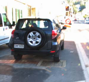
That should help the place feel more pleasant, and there seems to be at least one new café on the way to help out. It's also good to see that pedestrians can finally cross on both sides at the intersections with Cuba and Taranaki Streets, so perhaps the loathsome red poles and chains can be abolished now that they're no longer required to put pedestrians in their place. And with any luck, Budget Rentals will have to stop blocking the public footpath with their big ugly SUVs once the trees arrive.

Ghuznee St pavement blocked by rental SUV

Thursday, July 19, 2007

Stupidly lazy?


A perceptive (though perhaps less than tactful) commenter said, in response to my post on the Johnsonville Town Centre Plan:
The major flaw seems to be the assumption that J'Ville becomes a walkable community. People are stupidly lazy and will drive 5 minutes instead of walking 10. Take the ugly car parks away and they'll probably just drive somewhere else.
In my response, I suggested that it's a valid concern, but that evidence suggests that those who live close to the centre are less likely to drive. The Census data that I analysed some time ago applies only to driving to work, rather than for shopping or entertainment, but it gives some indication that car use among those within walking distance of the town centre and transport hub is much lower than further out. Here's a repeat of my previous map, with shades of red for places where more than 50% of people drive to work and blue for less than 50%, but this time with the Johnsonville "intensification zone" highlighted in green.

Use of cars for commuting in Johnsonville, with intensification zoneIt's clear that most people in the intensification zone don't use a car to get to work, while by the time you get out to the further reaches of the northern suburbs, car use is dominant. Thus, it seems sensible to encourage more residents in the inner zone (which, it should be noted, doesn't include the controversial Woodland Rd subdivision), given that most current residents find that walking or using public transport is feasible. I'm not so ready to label those further out as "stupidly lazy", though: I don't think I'd be keen on walking 20 minutes up a steep hill on a Wellington winter's day.

One possible anomaly stands out. The zone contracts to exclude Alex Moore Park, which is sensible enough, but the blocks just southwest of there are pretty close to the transport hub, and it evidently seems to be a location that is convenient for public transport. Can anyone think of why it was excluded from the townhouse zone? Is it an area of outstanding built or natural heritage (don't laugh)? Does a councillor live there?

Farewell 158


The demolition of 158 Cuba St started early this week, and it's all happening very quickly. Here's a couple of shots of the process (courtesy of a certain prolific commenter).

Demolition of 158 Cuba StI won't rehash the arguments that we've been over several times before, but to summarise: it's a shame to lose a characterful old building, but it was pretty close to falling down of its own accord and the replacement, while a couple of storeys taller than I'd prefer, looks pretty good.

Interestingly, there's an article on page 8 of today's Wellingtonian about David Roil (aka Mr Freak) and his thus-far fruitless search for an affordable Cuba St shop for his planned fashion, hairdressing and exhibition venture Freak!space. Given the developer's well-known quote about "cheap rents attract[ing] funky new businesses [that] give the street its reputation", perhaps Ms Krogh should offer the new ground floor tenancy to Mr Freak at below-market rates to ensure that even with a new building, Cuba St doesn't lose its soul".

Tuesday, July 17, 2007

Waterfront: reasons to be cheerful


The Draft Waterfront Development Plan for 2007/08 is going through the public consultation stage, but there's nothing too surprising in there. If anything, there's been something of a backward step, since the financial implications of delays to the OPT and Hilton developments have had a flow-on effect to the Taranaki St Wharf West and Frank Kitts Park redevelopments.

Meridian Energy building at Site 7, KumutotoNever mind: there are some other parts of the waterfront that are making excellent progress. The Meridian building is expected to be completed in October, with the surrounding public spaces all ready for December, and I've heard that ground floor tenants have been secured. Now that the overall shape of the building is visible and the cladding is going on, it's looking even better than I imagined. The wooden louvres are being installed on the western pavilion, and I was surprised to find that they have a semi-random arrangement, with a variety of widths to give the façade plenty of animation. Actually, "animation" will be a much more literal description here than it usually is in that context, since the louvres will automatically tilt throughout the day to provide light or shade as required. It's that sort of combination of environmental practicality and imaginative detail, not to mention the emphasis on buildings that create and support public space rather than ignore or callously feed off it, that restores my rather dented confidence in the ability of architecture to bring delight to the city.

Movenpick at Chaffers DockAt the other end of the waterfront, the ground floor of Chaffers Dock continues to gradually open up: Subway and Herd Street Brasserie have been open for a while now, Mövenpick opened on Saturday, and I've heard that the Port Café may open as soon as this weekend. While the weather may not exactly be conducive to ice creams or fish 'n' chips in the park, all it takes is a rare fine day like Saturday and Wellingtonians are out in force. As expected, Mövenpick is fairly chain-like in appearance, with plastic tables and a huge oddly-coloured photo-mural of the Wellington skyline, but the offer of Supreme coffee and opening well into the evening for dessert is a pleasant prospect. The last remaining "For Lease" sign has gone, and the word is that it may be a pizza joint. I've already mentioned Zarbo deli, Empire Skate and Chaffers Store, and there will also be a hairdressers and some sort of gallery. It's already an encouraging example of residential, hospitality and recreational uses supporting one another, and given how popular the place is already on a pleasant day, it should be really humming by summertime.

Chaffers Dock promenade on a sunny winter's day

Monday, July 16, 2007

D-Day for J-Ville


If you want to have your say on the Johnsonville Town Centre Plan, you'll have to do so by 5pm today. It's mostly a conceptual framework rather than a detailed urban plan, but the sentiments and the broad practical suggestions all seem to be just what's needed for sustainable transit-oriented development.

In fact, some of the goals are quite ambitious. The plan (1.85MB PDF) states that:
Johnsonville will become the 'capital' of the northern suburbs and Wellington City’s second largest centre. It will provide a wide range of employment opportunities, quality shopping and leisure experiences and be a great place to live ... Future growth will be unlocked to provide much greater housing choice with apartment living in the town centre and different housing styles in the surrounding area – making Johnsonville an attractive home for young professionals, families and the older generation. The local economy will also be boosted by the growth of small dynamic companies.
I hope it doesn't sound too rude to Johnsonvillians to say that there's a long way to go! The plan goes beyond the narrow definitions of urban design to look at economics and employment balance, and they certainly have a point. It says that "employment in Johnsonville is dominated by the retail, construction and service sectors with much lower representation in other sectors," and that the council should "promote opportunities to grow under-represented employment sectors, including: small-scale offices, start-up business premises, 'new economy' businesses, creative industries and tourism-related businesses".

That all makes sense, but it's difficult for at least two reasons. First, economic trends are very hard to "engineer", and it's not just a matter of adjusting the District Plan. Secondly, it's a bit of a "chicken & egg" situation: the vitality and variety of a neighbourhood can definitely be improved by the presence of lots of energetic small businesses, but it takes more than cheap rent to encourage hip start-ups to move to a place. I know I'm probably being a bit of a snob, and I do actually know people who've started tech companies there, but I'd think twice about taking a job there, and I can't envisage a horde of "creative industries and tourism-related businesses" clamouring to establish themselves in edgy, happening Johnsonville.

The plan also includes some fairly detailed suggestions of how and where increased density should be achieved. The map in the PDF has been JPEGed to death, so here's a reconstructed version, showing where townhouse and apartment development should be encouraged. All of the intensification is less than ten minutes' walk from the town centre, and the apartment zone is concentrated in the existing under-utilised mall-centric commercial district. In other words, this looks to be everything that infill should be.

Proposed intensification zones for JohnsonvilleNote the marker showing the location of a proposed development at 62 Woodland Rd. Thanks to Michael D for drawing my attention to this, which is a notified consent that breaks all the rules. I'm all for greater density, but 42 units on what looks to be greenfield land, near a stream, and more than ten minutes' walk from the transport hub, is not the right way to do it. Even in the right locations, there will be a struggle to ensure that new developments actually put any effort into good design, especially if recent proposals for Te Aro are anything to go by.

An integrated plan like this, which takes transport, economic and social factors into account, is a vital starting point. But it requires residents, businesses and developers to get behind it if Johnsonville really is to become the "capital of the northern suburbs" rather than a dormitory suburb with a mall, or a random mix of bad apartments and quarter-acre sections. If you've got an opinion, go online now and let the council know.

Saturday, July 14, 2007

Mystery bar number 61

File under: , ,

Mystery bar #61 - stairsIt didn't take long to identify the previous mystery bar as the Herd Street Brasserie, and I'm expecting this one to be a bit of a doddle as well. A few of the recent mystery bars have been primarily cafés, but this place is all bar, and if the food is not quite an afterthought, then it definitely comes after drink and possibly music in the list of priorities. The décor is eclectic (part glamour, part dishevelled retro), and glittering decorative touches are mixed up with plain dark wood and a rather alarming carpet. It's been described to me as "very masculine", and I guess it is in a gentlemen's club sort of way, but there are a few frilly and feathery bits and pieces that I doubt would be well received among the clubbable gents of Pall Mall.

The wine and beer lists seemed adequate if predictable, but this is a place that specialises in spirits. There are brands and rare bottle here that I've never seen anywhere else, some from parts of the world (such as India and Guyana) that one doesn't usually associate with liquor. It would take the most dedicated lush connoisseur many weeks of arduous, expensive yet undeniably delicious toil to sample every bottle here.

There are plenty of leather booths and mismatched armchairs in which such an exhausted adventurer could rest between drinks, though the proximity of some of the seating to the dancefloor could make it less than relaxing. While there's plenty of emphasis on comfort, this is also a place made for raucous late-night shenanigans.

Mystery bar #61 - candle-lit booths

Thursday, July 12, 2007

Patchwork city


I haven't had the chance to do as much demographic analysis of the 2006 Census data as I would have liked, but I have been experimenting with some mapping techniques to show multiple variables. Here's an example of trying to show the distribution of residents, office workers and other workers (such as retail and industrial) on a single map of central Wellington, using a different colour channel for each. The brightness shows the combined density, while the colour shows the mixture of uses.

'Trivariate choropleth map' of WellingtonI've explained this particular visualisation technique, with its advantages and shortfalls, over on the ProjectX blog, so I won't repeat that here. Instead, I'll concentrate on analysing what it says about the city.

In the other post, I compared this to a mosaic, and the other thing it reminds me of is a patchwork or quilt. While there are distinct colour differences from one part of downtown to the next, even with each district there are significant variations between blocks. This would please Jane Jacobs, who wrote (The Death and Life of Great American Cities, p150) that "the district, and indeed as many of its internal parts as possible, must serve more than one primary function; preferably more than two" (my emphasis). In most of the inner city, but especially Te Aro, not only is it rare to find a block of pure red, green or blue, but there are often quite contrasting colours right next to one another. This indicates to me that residential, office and other activities are generally mixed together at quite a fine scale throughout the city.

There are some exceptions. Most of the Lambton Quarter is distinctly cyan, indicating a lot of office and other (presumably retail) workers, but very little residential. Parts of Thorndon tend more towards plain blue, confirming the general impression of the government precinct as a monotonous swathe of office blocks. Both quarters could thus do with a bit more diversity, and that may indeed be starting to happen: as large companies and government departments move towards the north end of the city it will leave older office buildings with small floor plates that may end up being converted to apartments; and as more office workers end up in Thorndon, it might make retail more viable there.

There are a few caveats that you should bear in mind with this map. First, it may already be out of date: a year ago I plotted the location of new apartments that have been built or proposed since the 2006 Census, and there have been many more proposals since then. I might have a go at redoing this map with projected residents included, and I expect that much of Te Aro and the waterfront will tend away from green towards yellow, brown or red.

Secondly, I've scaled each of the three dimensions so that the brightest colours represent the greatest density for that component across the map as a whole, meaning that the brightest blue represents about twice the density that the brightest red indicates, and five times that of the brightest green. This is partly practical (so that the office workers don't overwhelm everything else) but may also be more meaningful from an urbanist perspective. For example, 100 retail workers on a street will give quite a strong impression of lots of retail activity, whereas 100 office workers on the same street doesn't seem like a lot. Thus, a block that is pure grey doesn't mean that there exactly the same number of each type of person there, but it should indicate what appears to the observer as a balanced mixture of residential, office and other uses.

Thirdly, it doesn't show the presence of students or the users of recreational areas. Thus schools, universities, squares, parks and theatres show up as much darker and less active than they would be in real life. I might have to look for sources other than Census data in order to fill in these gaps.

Wednesday, July 11, 2007

Keeping it real

File under:

The bypass on ZoomIn maps<day job>In the aftermath of the bypass, Ghuznee St is still a mess of roadworks, but all the actual road changes associated with the bypass construction were completed a while ago. So far, the maps at ZoomIn and Smaps are the only accurate online representations of the new layout, and Wises, Google Maps, Yellow Pages etc still have outdated information.

But the world doesn't stand still, and there are plenty of other changes to be incorporated into the next ZoomIn/Smaps update. We (at ProjectX) are working on that now, and while in a perfect world all it would require would be to load in the up-to-date, quality-checked base data from our providers (plus a lot of rendering time), the real world is not perfect. We already have a list of manual changes that we're planning to make to the "official" data update before rendering, but since ZoomIn is all about community involvement, we're asking for your help.

So, if there are any spots on our maps that are out-of-date, inaccurate, or just plain wrong, leave a comment either here or (preferably) on the ProjectX blog. A link to the relevant ZoomIn page (remember that all cities, suburbs, streets and addresses on ZoomIn have their own URL) would be very helpful, but otherwise a thorough description would do. Also, if you want to suggest any changes to the styling of our maps (e.g. should pedestrian streets like Cuba Mall and Woodward St appear the same as walking tracks in the bush, or do they deserve their own style?), please let us know. We can't guarantee that every suggestion will get into the next cut of the maps, but we want to get as much public input as we can.</day job>

Tuesday, July 10, 2007

Fowler & Jones


A couple of architecture-related snippets:

I may have found some of his pronouncements perplexing, but Sir Michael Fowler's recent interview on Radio NZ National is worth a listen. He reminisces on his time as mayor, and as an architect, and gives a defence of the 80s "demolition derby". I partly agree with him on that: while we lost some beautiful buildings, I just couldn't imagine Lambton Quay without our little skyscrapers. But mentioning ArcHaus in the same breath as Athfield & Walker?!?

So, Bob Jones thinks that green buildings are "a fad" and "fashionable inanity", because NZ doesn't have power or water shortages? Given that he has long since descended into self-parody, I can't work out why the papers think his self-consciously curmudgeonly outbursts are worth wasting ink and bandwidth on. With any luck, it's stereotypical, short-sighted, money-grabbing "property tycoons" like him that are the fad that will be forgotten in a decade's time. On the other hand, maybe not.

Monday, July 09, 2007

More market


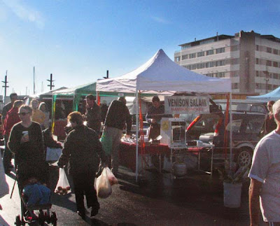
While I've always thought that outdoor markets are great (they promote local produce, enliven public space, and help small businesses get started), I have to admit that I haven't been a frequent visitor to the two downtown Sunday markets at Waitangi Park and upper Willis St. They have certainly been popular with bargain hunters, but somehow I just don't find the idea of strolling among a dozen trucks all selling the same range of cheap vegetables to be an enticing way to spend a Sunday morning.

Stalls at Waitangi Park MarketRecently, though, the Waitangi Park Market has been getting more interesting. Among the mountains of broccoli and bok choy, there's now some stalls selling a wider range of produce. The venison salami is particularly good, and there's an artisan baker who comes in from Upper Hutt with a wide range of goodies. There are various stalls selling eggs, honey, noodles and the inevitable cheap sunglasses, but it's especially encouraging to see a farmer from Feilding bringing in cuts of fresh lamb. It doesn't quite count as a farmers' market yet, but it's heading in the right direction.

Sunday, July 08, 2007

Building rumours 15: Forest and Turd


Thanks to DeepRed for pointing this out: the so-called "Te Aro Towers" on the former Forest & Bird site on the corner of Taranaki and Wigan streets.

Perspectives of the proposed Te Aro TowersOh god. I'd been forewarned of its awfulness, but with higher-res images now available it looks worse than I expected. It really doesn't make it easy to promote high density urban living when unimaginative crap like this is what the market provides. I'm all for greater density, and not averse to the odd tall apartment tower, but this is a bad building in the wrong place.

The use of retail on the ground floor is good, and there are some half-hearted attempts to vary the façade in the bottom six storeys. If they' stopped there, the results might have been half-decent, and even though the architecture is banal its urbanist virtues might have made up for it. But they've continued by repeating exactly the same floor all the way to thirteen storeys, resulting in two "towers" that neither fit in graciously nor soar gracefully, but loom balefully over what could and should be one of Wellington's most important streets.

The question that has to be asked is: how the hell did they get away with thirteen storeys in this part of Te Aro? The height limit here is supposed to be 27m, and while it was always naive to believe that this would equate to six storeys as the guidelines suggested (a floor-to-ceiling height of 4.5m is very generous), anything over 10 storeys would surely have to breach the plan. Either these apartments will have a 2m stud, and they're aiming at the hitherto-unexploited Oompa-Loompa market, or the developers have the council well under control.

Elevations of the proposed Te Aro TowersThere are supposed to be dispensations for buildings of exceptional design quality, but this doesn't even aspire to mediocrity. The world's greatest architects would struggle to produce something beautiful given that basic mass, but it looks like our old friends at ArcHaus haven't even tried. The real estate site and home page for the development laughably claim that "this building brings a significant design and style element to the Te Aro district", but I can't believe that they even believe that themselves.

Even ten storeys, while legal, would not be what I would think is ideal for Te Aro. Not only is six or seven storeys more like the norm for human-scaled mixed-use and residential urban areas around the world, it's much easier to achieve spatial interest and variety at that scale. For instance, even by taking the fairly poor design of the lower storeys of this development as a starting point, notice how much more humane and detailed it would look if it stopped at seven storeys:

Mock-up of a 7-storey version of Te Aro TowersThat provides much less residential density, but there are still many hectares of Te Aro that are wasted on car parking, bulk retail and car sales yards. How much better it would be to develop all that poorly-used land to a similar height, while still allowing the odd tall and slender tower near the middle of large blocks or closer to the "high city". It is possible to significantly increase the residential population of Te Aro while retaining the elements that make it special, and without ugly, cynical developments like this.

Of course, I'm thinking like an urbanist rather than like a property developer. But isn't that exactly what the council should be doing?

Saturday, July 07, 2007

Drink of the month: absinthe

File under: ,

Well, I said that this month's "drink of the month" would be healthier than last month's, and it's true: absinthe is much less fattening than hot chocolate. There's an old saying that "absinthe makes the heart grow larger", but it definitely has more of a reputation for expanding minds than waistlines.

Absinthe starting to loucheI've heard people ask whether you can even get real absinthe in New Zealand. Well, that depends upon what you mean by "real". Can you get stuff made with real wormwood (Artemisia absinthium)? Yes indeed. Ah, but does it have any of the supposed "active ingredient", thujone? Apparently so, but it really makes no difference at all, for two reasons. First, contrary to some stories, pre-ban absinthe didn't contain very much thujone; and second, thujone won't get you high anyway. Any brands that emphasise their thujone content are just trying to appeal to the gullible munter market.

According to another criterion, though, I've never found any real absinthe for sale in Wellington. Traditionally, absinthe was the product of distilling wormwood, anise and other herbs, and while there are indeed proper absinthes being made today according to this process, everything I've seen on the local shelves is made by the cheaper and much less satisfactory techniques of macerating herbs in raw alcohol or mixing herb oils with alcohol. The only locally available absinthe that scores higher than 50% on the Absinthe Buyer's Guide website (and only just, at 51 out of 100!) is La Fée Parisian (not to be confused with their inferior "Bohemian" version), and even that is apparently still an "oil mixed" version. It's certainly better than Hapsburg, Absente, Dedo and the other travesties on sale around town, but the artificial colouring and lack of complexity would lead a pedantic absintheur to doubt whether it's a real absinthe at all.

Nevertheless, it has enough flavour for one to enjoy the proper absinthe ritual. Not, of course, anything involving fire: that's a "tradition" that dates all the way back to the dark days of the, erm, 1990s, and has more to do with disguising the unpalatable flavours of cheap Czech pseudo-absinthes than anything resembling history. Even the use of sugar and a slotted absinthe spoon, while delightful and historically accurate, is probably overkill today since we have less of a sweet tooth, and a good-quality absinthe should be perfectly palatable without added sweetness. On the other hand, anyone ordering shots of straight absinthe is either attempting a pointless display of bibulous cojones or is seeking a quick path to oblivion.

The best way to enjoy absinthe is by slowly adding cold water until the essential oils are released from the alcohol and the drink turns cloudy. This not only releases the complexity of aromas and flavours, but is a visually engaging and metaphorically powerful process. When the opalescence appears the drink is said to "louche", a word which bears not only the literal but the figurative implications of "shadiness". When a place or person is described as "louche", it implies that they are disreputable and shady, though not in a scungy way, but in a manner that is decadent, morally questionable, unconventional and even seductively dangerous. In other words, all the qualities that are associated with absinthe.

So where should one enjoy absinthe? Anywhere that stocks La Fée Parisian (or better) would be a good start, as they should know enough to present it properly. Matterhorn and Imbibe are two bars where I've enjoyed it recently, and no doubt most of the proper cocktail bars would also be worth a visit at the green hour. The two cities most associated with absinthe are Paris and New Orleans, so Simply Paris (which has only recently been granted a liquor license, and is about to expand its evening operations) and the one-year-old Sweet Mother's Kitchen (which does a good Sazerac, one of the few absinthe-related cocktails worth trying) could be interesting places to try. I've heard that the absinthe nights run by Eddy (the very personification of the green fairy!) may make a comeback soon, so I'll keep you posted about that. And if anyone knows of a place that serves one of the really good absinthes (such as Duplais , Eichelberger or anything by Jade), let me know, and I'll be there before you can say Enivrez-vous!

Thursday, July 05, 2007

Just the ticket


Many thanks to Greg for pointing out something that should be more widely known: for the month of July, Daytripper passes (unlimited bus travel within zones 1-3 after 9am weekdays and all day at weekends) are half price. At $3, that brings it down to the same cost as the carbon-unfriendly cheap weekend parking that was announced with much more fanfare than this bus deal. Conspiracy theorists, take note

$3 Daytripper bus faresIn less positive news, Stagecoach (or is it Go Wellington? Or NZBus? There's a real mishmash of branding at the moment) also announced that the City Circular service has been withdrawn. They put the blame on the fact that "patronage has fallen as the frequency of our other services through the city have improved", but might it not also have something to do with the fact that a couple of years ago they doubled the fares, making it more expensive than a standard zone 1 ticket? It's fair enough, I guess: I can't remember the last time I used it. But perhaps in the long term there'll be a place for a replacement service, perhaps even a free one.

Musical stadia

File under: , ,

Where will the Indoor Sports Centre end up?I've pretty much given up trying to follow the convoluted saga of the Indoor Sports Centre. The initial vision was to locate it above the Westpac Stadium concourse: a great use of space and a sensible location. Then in February last year the council decided it would be too expensive, so it would have to go on Cobham Park in Kilbirnie: a terrible location for a regional stadium, but not so bad for a facility aimed at local schools. But in August they changed their minds again, and wanted to put it at Harbour Quays, just across the road from the original site. Almost immediately, CentrePort said "Not so fast, we're still using that site", but reports a few months later sounded very positive and just before Christmas, it sounded like a done deal. Then last week, the council decided to go back to Kilbirnie, citing "more complex site issues [at Harbour Quays] that would have been expensive to resolve and delayed construction". Despite a leaked report about traffic problems with the Kilbirnie site, and Cr Andy Foster calling the decision "mad" and a "terrible idea", that sounded like a final decision.

But is anything "final" when it comes to this farce? According to today's Wellingtonian, "the decision does not necessarily rule out the regional stadium also being built on port land within the next 10 years". The council have apparently placed a ten-year moratorium on use of the port land, and the Mayor maintains that it's the best site for some sort of "multi-use facility", which the Wellingtonian's editor interprets as possibly "an 8000 to 10,000 seat stadium that could host indoor sports games and concerts". That may end up being the best result overall: a community-oriented facility at Kilbirnie serving the schools and clubs of the eastern suburbs, and a world-class indoor facility near the city and transport hub. But I wouldn't hold my breath!

One thing remains unresolved. While the Capital Times article refers to the indoor sports centre as intended "to replace the sports facilities in Shed One and Six on the waterfront", I don't think that's ever been the plan, as neither Kilbirnie nor the northern end of Harbour Quays are convenient for inner-city lunchtime sport. I've made at least two suggestions for alternative indoor sports facilities near the CBD, but perhaps if we do end up with a high-quality multi-use events centre at Harbour Quays, with twice the capacity of the TSB Arena (formerly the Queens Wharf Events Centre), perhaps that contentious old pile could end up being the CBD's recreational centre again?

Wednesday, July 04, 2007

Chit-chat


Wellington's first Pecha Kucha night is on its way.

NZ Pecha Kucha bannerSay what?

"Pecha Kucha", from a Japanese phrase approximately translating to "chit-chat", is a form of presentation based around allowing each speaker to show 20 images for 20 seconds each. They tend to concentrate on architecture and other creative fields, and this one is no different, featuring architects Julie Stout, Natalie Butts, Sam Kebbell; designers Ross Stevens and Nicola Pennington; filmmaker Gaylene Preston; actor Jeremy Randerson and Cuba Street Carnival director Chris Morley-Hall.

This inaugural event is part of a wider happening, Ctrl Shift 07, an architectural congress with a slickly-designed website and a less-than-conventional agenda (including a public performance from Spartacus R at the Paramount tonight). Some of that energy is expected to spill over into the Pecha Kucha session tomorrow night, which is open to the public for a $7 door charge at Hope Bros from 9pm.

Monday, July 02, 2007

Hot chocolate roundup

File under: , ,

Last month, I didn't quite get a chance to sample all the purveyors of hot chocolate that you kindly suggested, but I did get enough to put my arteries in harm's way. Scopa's gusto cioccolata was better than I remembered, though the layer of thick cream on top tended towards overkill. Schoc's chilli version is as good as ever, but the lavender-enhanced one was only just on the right side of sickly, and the novelty of stirring the lump of ganache into the frothed milk yourself and sucking the result through the metal straw/spoon wears off after a while. Likewise, Butlers may be tipping into the realm of self-parody by chucking bits of broken biscuits into their otherwise fairly standard concoctions.

Cubita, Herd St Brasserie, St Johns, Lido and even Floriditas (despite the excellent dipping chocolate they serve with their churros) stuck with the standard Kiwi/American milky hot cocoa with marshmallows. Crepes a Go-Go provide something in between, and while they claim "the best hot chocolate in town", that's a fairly common claim these days, and once you've had a properly gooey hot chocolate without milk, it's hard to go back. The chocolate shot I had at Kaffee Eis would probably have to be my favourite of the month, which is not surprising given that as a chain, they're pretty much just Mojo with ice cream.

This month, after all that sweet and fattening indulgence, it's time to try a drink that's not as sweet and much better for me.

In-fill your submission form


My post about the proposed new infill regulations, and its follow-up concentrating on car use in the suburbs, turned out to be more controversial than I thought. If you want to have your own say to council about the changes, you'll have to hurry, since submissions close at 5pm today. There are more details and a submission form online, and in case you're interested, here's what I wrote on my submission.

1. Should the Council direct housing development to areas with supporting infrastructure and good access to public transport?

Yes: the key benefits of increased density require it to be in the right places.

2. Should the Council direct housing development away from areas sensitive to residential development including coastlines, steep slopes and key employment areas?

Yes, though I'm not sure what is meant by "key employment areas" - surely it's good to encourage more people to live close to workplaces?

3. Do you support the current approach of being able to build townhouses, terrace houses and low rise apartments anywhere in the suburbs and commercial areas?

No: Allowing moderate increases in density in places far from infrastructure will just result in more people living car-dependent lifestyles.

4. Do you support identifying areas of stability - where infill housing would be tightly controlled or not allowed at all? Provide examples.

Yes, but only a few. The most outstanding examples of heritage or character areas (e.g. a few parts of Thorndon or Mt Vic) could be adversely affected by infill, but most suburbs could benefit from increased density if it's well designed.

5. Do you support identifying areas of limited change - where infill housing would be allowed but with a greater focus on quality? Provide examples.

Yes: Pretty much anywhere with good public transport, or with the potential for good public transport, except for the examples above. Greater focus on design quality is needed everywhere.

6. Do you support identifying areas of change - where housing re-development would be encouraged, resulting in moderate to significant increases in residential density? Provide examples.

Absolutely! Harbour Quays, Lambton, Te Aro and Adelaide Rd can sustain much higher population densities than at present. There are also specific areas along the J'ville line (e.g. at Crofton Downs) and along the Basin Reserve - Newtown - Kilbirne - Airport spine that could support medium- to high-density housing.

7. Do you think a targeted approach to infill housing would better meet the needs of our population and lead to a more efficient, sustainable and better quality city?

Yes: urban form and transport infrastructure have to be tightly integrated and planned together.

8. Other comments:

Southeast Te Aro has great potential for increased density, but rather than allowing building random towers to the current limits or above (ten storeys is often too high) while other sites are vacant or used for low-rise bulk retail, there should be a coordinated approach that ensures appropriate heights (6 storeys is good for most of that area) and consistent streetscapes.

There also needs to be an emphasis on quality public space, with housing arranged along the lines of "terraces and mews" on public streets rather than tucked into private driveways or gated communities. Shared pedestrian streets or shared gardens could provide better amenity for families in the absence of private gardens.

Once plans are in place for population growth along the J'ville-CBD-hospital-airport spine, high-capacity sustainable public transit (e.g. light rail) is a must, even if it seems expensive based on current population levels.